Make Modern Designs with the iOS System Font, Helvetica Neue
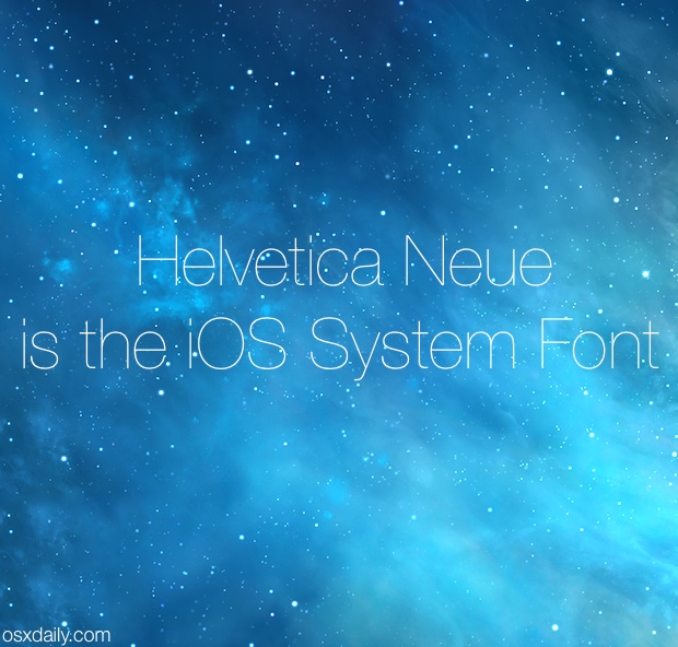
Whether you love it or hate it, there’s no denying the new system font of iOS is slimmer, lighter, and more modern looking. If you’re a graphic artist, developer, or designer looking to make your own designs or mockups that fit into Apple’s new design language, using the proper font is a good place to start, and that new font is Helvetica Neue. It’s bundled by default with every version of OS X so you don’t need to download or add any fonts to use the look.
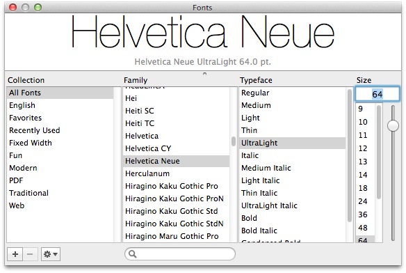
There are actually a few variations of Helvetica Neue that are used by Apple on our iPhones, iPads, and iPods, including:
- Helvetica Neue – UltraLight
- Helvetica Neue – Light
- Helvetica Neue – Thin
- Helvetica Neue – Regular
- Helvetica Neue – Medium
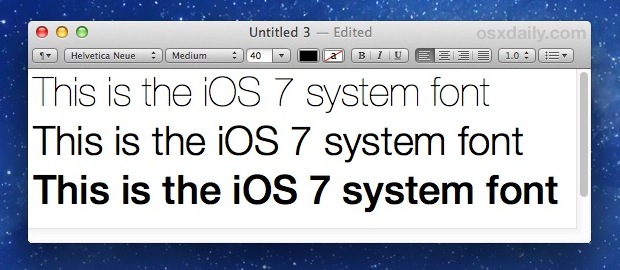
The default system fonts are generally the Light and Regular weights. The Medium weight is used when “Bold Fonts” are enabled, which makes the fonts much easier to read for many of us, while the UltraLight variation was used much more aggressively in the earliest beta release builds of 7.0 before they opted to go with “Light” and “Regular” for the shipping versions.
If you’re looking to storyboard an app or do some general UI/UX mockups, the Teehan+Lax iOS 7 GUI template PSD file is a great launching pad, and it loads fine in Photoshop or Pixelmator.
The thinner renditions of Helvetica Neue look best on retina displays with tons of pixels, and on a regular computer screen they can be hard to read and just too thin, perhaps why Apple opted for a slightly thicker version for iOS.
First introduced to iOS with the major 7.0 overhaul and sticking around since, the current rumors and expectations are that Helvetica Neue has also come to the Mac as the primary system font with the major release of OS X 10.10.
If you’re a font geek, you can learn a bit more about Helvetica Neue from Typographica.org.

Yes. It is bearable, but Apple should be better than bearable. Personally I use the Proxima Nova family – put in place by Tinker Tool. All free.
Perfect!
I am 68 and have had my cataracts done …
… and I simply love the look of iOS7
I love the look of iOS 7! And I’m 56 and have lousy eyesight. :)
I like Helvetica Neue and I’ve never had any trouble using iOS 7 as a result of the change.
Am I the only one that is just reminded of Swiss Design rather than Apple when it comes to Helvetica?
Plus, I would not recommend this article to someone who is starting out in design. (sorry Paul!)
No offense taken, I’m not a designer! But I’ve had quite a few inquiries about what font Apple is using these days for iOS, so it may be interesting to some out there.
Coming to the Mac in 10.10? All I can say is Yuck! Hard on our older eyes, many of whom purchase Macs.
Helvetica Neue Regular is the new default, Medium is what you get when you enable the chubby fonts in iOS Accessibility.