Access the Two Different Mini-Players in iTunes 12
 If you’d rather your iTunes player take up less screen real estate, iTunes has two alternative player appearance options available, the album cover player, and the popular mini player. These are not new features to iTunes 12, but like many other things which have been switched up in the latest version, accessing them has changed from prior versions again for whatever reason. This has led some users to believe the mini-players are no longer available in the latest version, but much like the sidebar, it’s still there, you just have to learn how to get to it.
So fear not iTunes mini-player fans, not only is the mini player still there in v12, it’s actually really easy to access! There are a few different ways to get there, so we’ll show you two different tricks to access the mini player and the album art player in the latest iTunes version.
Toggle Into the iTunes Mini-Player with a Keyboard Shortcut
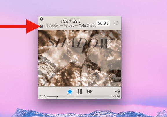
Hit Command+Shift+M to toggle into the Mini Player instantly. This will default to go to the album art view, which isn’t particularly small by default. You can resize that album art player to be fairly small, or go a step further and turn to the classic iTunes Mini Player:

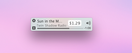
To get into the iTunes micro-player view, press the tiny arrow buttons under the close button. You can hit those little tiny arrow buttons again to switch between album cover player and the minelayer at any time. To make the mini-player even smaller, just resize it like any other window, it can shrink to be quite small this way:

Hitting the Close button returns to the full size default iTunes Player view.
Accessing the Mini Player & Album Art Player from the iTunes Window
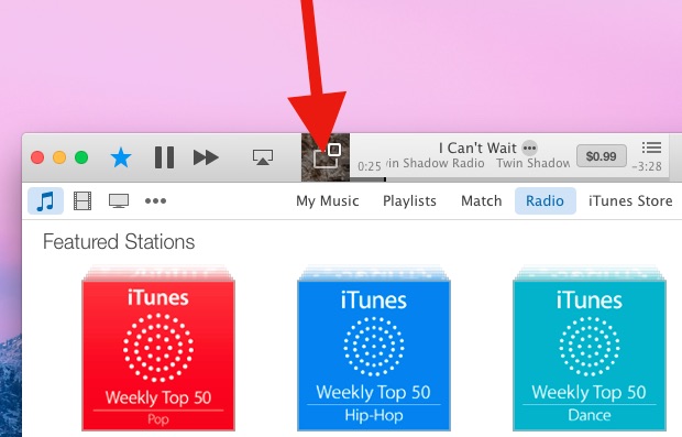
- While playing any song or iTunes Radio station, click on the small album cover artwork in the iTunes player titlebar
- This defaults to the Album Cover Player, press the little tiny arrow button to switch to the mini-player


Exiting the Mini Player and returning to the normal iTunes view is just a matter of hitting the (X) close button, or toggling the keystroke again.
The mini player is a great feature if you prefer a minimalist look to your music player or just want something less distracting for you workflow.


I am using Version 12.3.2.35 (PC) On the mini-player, how do I get the menu bar (upper) and play bar (lower) to automatically disappear after the song starts?
It was doing this yesterday, but today they are stuck.
I want the mini player to show the album art without upper and lower menus constantly displayed. Recently it would show these at the beginning and when I hovered over the art.
HI, On a similar note: I bought an 11.6″ notebook just ot play my 1TB plus music library via itunes. So. I was forced to learn the new itunes 12. I want to just have a mini player on the screen while i listen to shuffled songs, advance to next, previous or pause and see what is playing. But, even the art version minitunes seemed small and hard to hit the play, pause buttons. I discovered I could magnify the screen and thus enlarge the player to half screen; full top to bottom with about a fourth of the background showing on each side. it is perfect for me. It is like having my own music player at my elbow on my end table next to where I set. I send the volume to my home stereo and studio speakers. LOVE IT>
I know I’m late to reply here… was trying to figure out how to turn off the “Playing” content under the Album artwork… I echo the sentiments about iTunes becoming a mell of a hess. I dread updating it everytime a new one comes out.
Anyway, I couldn’t get rid of the “Played from Smooth Jazz” playlist underneath where the album artwork would go. It’s not very mini with the hard space beneath. Tried clicking the mini arrows (which just toggles the album artwork), tried looking at settings in the full menu… tried the gray “…” elipses button that appears when you hover over the control area. FINALLY tried the upper right corner which looks like perhaps it’s a settings menus. Well, it’s a play list. Turns out clicking that toggles the “Playlist” on and off in mini-player. Thankfully I abandoned my iPhone for an Android, or I’d still be struggling with iTunes on a daily basis.
For me on a PC, there is an icon right above the time on the bottom right. It has three dots and three lines, and when clicked it toggles the playlist view.
I have the same problem, the playlist will not go away no matter what I click on, lol, I’ve looked through the whole thing and cannot find a way to get rid of it I have a little icon at the top right of the miniplayer that is three tiny dots but no options to close the playlist, the dots only offer a way to edit the playlist… any help would be greatly appreciated …
I don’t know if this has been mentioned before. But, I recently found the old QuickTime-looking player. A 3’rd “miniplayer”.
⌘-click on the icon will open it up.
:)
I’d like a setting to enable the mini player to reside on a desktop of its own separate from where my iTunes desktop space is set-up. Right now I just set iTunes to all desktops and then hide the main window right now so I can keep the mini player available on my second monitor at all times in all my separate desktop spaces.
Ah! I already knew of the new fun-sized mini player, but didn’t know the small one was still available. Very handy or keeping it out of the way, but still able to see track name real quick.
I like the mini player. but it will not stay at the bottom of the screen alongside the dock. Toggling between album and micro views will move the player up the screen and toggling the “up next” list will shift the player into the middle of the screen. Annoying. Poor programming. It is easy to store an app position before toggling and to restore it afterwards.
itunes is one of those things apple seems to have gotten off track with…they need someone to head up iTunes separately from other departments…iTunes has been going downhill in a lot of ways, not doing things well at all anymore…it’s a mess. The other possibility is that they have something totally new in the works, but, in conjunction with a new apple TV, and, have loosened the reigns on current version.
I still use iTunes for iOS device syncing, and will continue to do so. I hope they don’t kill this…it’s easier to manage 3 devices with iTunes than to deal with them individually.
When did apple delete the option to open multiple windows? This made making playlists soooooooo much easier…I’d like to go back to that version of iTunes, make it compatible with current OS/iOS devices, please, and thank you!! …arg.
No kidding. The older versions of iTunes were MUCH better. Why even bother to change iTunes if you’re just gonna make it WORSE? Smooth move, Apple.
If you press ⌥ anc click the icon, it will open the miniplayer as before – as an xtra window.
Same thing with the shortcut: ⇧⌘M … ⌥⌘M will open it as an xtra.
Great when you just want to bring up the CD cover.
:)
thanks!
Question, just recently, perhaps after the last update (to pc version 12.1.0.71), the large mini player ALWAYS shows the buttons like this image: http://cdn.osxdaily.com/wp-content/uploads/2014/11/access-itunes-mini-player-from-album-cover-view.jpg, whereas it used to allow you click the cover to hide the buttons. Is there a way to hide the buttons that I’m not aware of?
I’ve been having the same issue. It’s annoying, because I like to just see the album art, not the buttons.
Apple is so full of themselves. Why should I prefer to have the album cover cluttered with Apple’s semi transparant mayonaise? Sick.
The all new iTunes 12 Album Mayonaise Player, it’s the most Mayonaise slathered iTunes Player ever made.
Perhaps so that you can operate the software? That would be my guess, which is an informed one as I use this feature practically daily.
When you switch to the mini-player, it displays the art and when your arrow enters the window, the controls appear. The vibrancy effect gives them a soft glow from the art behind them when they exist, and when they don’t exist, then they clearly…
… Do not exist.
Yeah. What we want is semi-transparent graphics, not functionality. SURE! I hate having the album art show up. I don’t want to see it. I want the name of the song and the artist. Can you even turn off the album art? Apparently NOT! Geesh!
Why to do simple when you can do complex?……
Apple never wants you to keep features that work and have them in the same place. Never mind that you’re a loyal Apple customer of 20+ years. Apple has no respect for you. All Apple cares about is glamorizing things up to make a good impression on reviewers, so there’s a lot of hype, but anything worthwhile is gone. I had to find what other people said about how to minimize the iTunes, when before it was just a little click. Some upgrade. And where’s the iDVD in the Yosemite version of the Mac? Yeah. And good luck buying a copy of the older releases. Version 7 works, but find a good price on it. Sure. And it used to be free. And easier to use. Hello!