How to Flip FaceTime Camera in iOS 12 on iPhone or iPad
![]()
How do you flip the FaceTime Camera in iOS 12? Where did the Flip camera button go in FaceTime for iOS 12? You’re probably not the only person wondering the answer to these questions.
FaceTime video chat is very popular amongst iPhone and iPad users, and a common component of many FaceTime video conversations involves flipping the camera around so that whoever you are FaceTiming with can see things with either the front or rear cameras. Switching the FaceTime camera used to be really easy and obvious with a nearly always visible Flip Camera button on screen in iOS during FaceTime chats, but iOS 12 has changed that. Flipping the FaceTime camera is still possible in iOS 12 but it is a slower process now that is hidden behind other options in the FaceTime app.
We’ll show you the steps necessary to flip the FaceTime Camera in iOS 12, on either an iPhone or iPad.
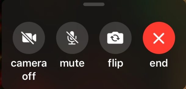
Note: the newest versions of iOS 12 have made the “Flip” button much more prominent and immediately visible on FaceTime Video screens, update to the latest iOS 12.1.1 or later release to find this easier method on your iPhone or iPad!

If you’re on an earlier version of iOS 12 then read on to learn how to find the Flip button in FaceTime.
How to Flip FaceTime Camera in iOS 12 for iPhone or iPad
Can’t find the ‘flip camera’ button in iOS 12 FaceTime? Here is where to look and how to switch the cameras at any time during a FaceTime video call:
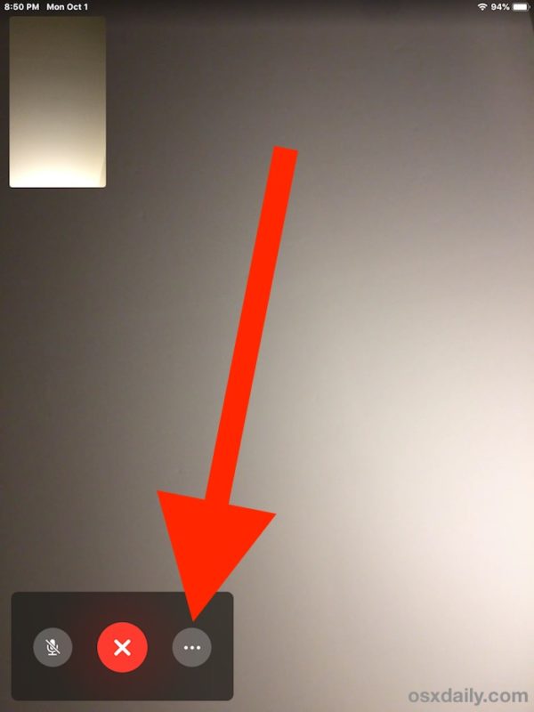
- During an active FaceTime video chat (or during the call to initiate a FaceTime chat), tap on the screen
- Tapping on the FaceTime screen will reveal a few additional buttons like mute and hangup, but no “Flip Camera” setting, so instead tap on the three dots button that looks like “(…)”
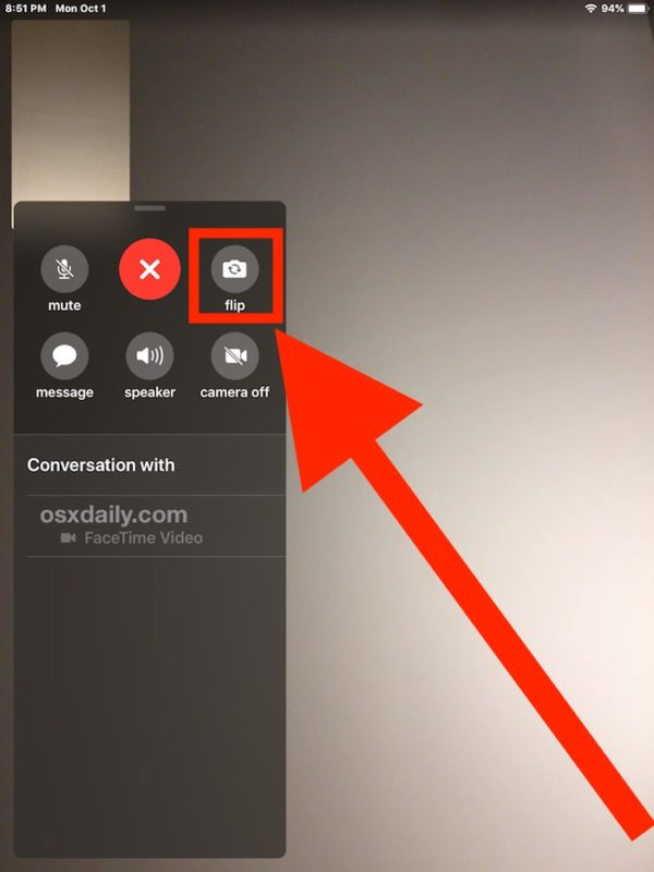
- This will reveal an additional control panel of FaceTime buttons, including the now hidden “Flip” camera button in FaceTime for iOS 12
- Tap the “flip” button to switch the FaceTime camera


You can access the hidden Flip camera button anytime during a FaceTime video call, just remember to tap the screen first, then tap the “…” triple dot circle button, then tap on “flip”. Once you do it a few times it’ll stick with you.
The “Flip” button will switch the FaceTime camera to either the front facing or the rear facing camera, depending on which camera is actively in use. Typically FaceTime calls start off using the front-facing camera, so tapping “Flip” would switch the camera to the rear-facing camera. Of course you can tap it again to switch the cameras again and flip them at any time.
It may feel a little cumbersome to access the “Flip” camera feature in FaceTime for iOS 12, and given the frequency of flipping the camera around during FaceTime video chat, it wouldn’t be too surprising if Apple made a change to this control panel in a future iOS software update to make the “Flip” camera button more visible and more accessible. But that change may not happen to, so for now all iPhone and iPad users who regularly use FaceTime video chat will want to learn how to flip the camera in iOS 12 FaceTime calls using the method described.
Enjoy using FaceTime, and flip that camera however you want!


Me too Erin! This is the worst ever. I hung up on my husband 3 times yesterday trying to figure what happened to the flip. I finally gave up and took a picture of what I was trying to show him and emailed him. Ugh. I have had apple because I thought it was user friendly but this is just the WORST 😡😡
The removal of the camera flip has really irritated me. It takes too long to use it now, and causes missed opportunities. Wow, what a let down. Wish I could downgrade just for that aspect. I’m not too interested in the new features. Nothing I see as useful.
I’ve never left a comment on an electronic device ever! But this FaceTime phone flip view option is so horrific I had to find a forum and see if everyone else felt the same way! Absolutely horrific! The worst part is getting back to the call. Swiping down to return to the view isn’t easy and I usually end up hanging up because the end call option is right there. Apple please please change!
This is super annoying to have to navigate to find the flip button. An easy fix would be to replace that useless star for adding stupidness to your FaceTime call, put the flip on to the main Mac page instead of the star and navigate to all the FaceTime additives through the … navigation.
Apple has definitely been slipping as of late adding this that don’t need to be added and removing things that of of use and ease of use. I just spent two days trying to figure out how to add airdrop back onto a friends new iPhone XR.
Well they are clearly getting ready for group FaceTime and conserving real estate but definitely an annoying change and that red X already food me. First time I saw it I thought it was to close the control window but instead I hung up on someone so why there is no Disconnect word under neath it is a mystery.
I am so POed over this! I missed a bunch of cute things my little grandson was doing because this process is so long by the time my daughter went through the process, he wasn’t doing it anymore. When he started doing it again a little later, she tried just turning the whole phone but didn’t get but the top of his head. I HATE that they did this! Why on earth would they think this was a good idea? MORONS!
I completely agree with previous commenters. What happened to Apple being “intuitive?” Can’t find anything anymore without having to open a ton of different drop downs or tabs or windows. Speaking of which… did they change the “add to conversation” or what ever it was called in iMessage? I can’t find that anymore so I can’t make a group chat after starting a conversation. Ridiculous!
I don’t like it either, why didn’t they make it. Possible to tailor the control panel to your own needs?
To flip the camera is now cumbersome. Perhaps Apple are running out of ideas and are making changes for change sake? The one touch method was so quick and easy.
less time is spent turning your hand and focusing with the front camera what you want to show
This is the dumbest thing apple has done I have apple everything and it has been good but these prices are crazy as it is but to make the camera flip in FaceTime harder takes the cake. The changes like that was not a good choice. I love apple products. But this one is terrible.
I know Apple are changing FaceTime, but how did they break it so badly in IOS 12 ? If I have my own window in the bottom left corner…when the menu pops up, it covers the window!! Flippping the camera takes too long….why not slide your finger down (or tap and hold) on the selfie window. Why can’t you enlarge your own window? Or move it to the left/right middle of the screen (which is where the camera is). Fix it quick please!
Why!!!!!!???? So inconvenient!
Yeah, thanks but I figured it out by necessity…
Why Apple does need to change things in a stupid and non useful fashion! It’s not Easter and we don’t need an egg hunt
There are so many other problems they never solved that needed to change 🙄
Yep. This is a sh** change
Thanks for the tip, I had already figured it out on my own during a facetime call. Why did apple make it more complicated? the button was fine right on the bottom one’s own thumbnail, where it was until iOS 11. There was no need to move it from there and group it with the other controls, but Apple had to make changes just for the sake of changing and with no other apparent reason because they need the OS to have differences every year. Now it’s a pain in the neck to switch cameras. It’s the only thing I hate of the new facetime, along with the new hang up button, which now shows just an x in a red circle instead of the telephone handset icon inside the red circle as it did until iOS 11.
I hate things like this but it’s just another example of how confusing interface design has been mainstreamed and normalized. It’s not a good user experience. It is design for minimalist designers, not design for people.
Design is how it works.
Apple has consistently focused on adding interface complexity to iOS ever since they ‘redesigned’ it in the 7.0 release and it has only gotten more complex with more hidden or disguised capabilities or features with each release. Each release is more confusing than the last, more things changed for the sake of change, or for maybe no reason at all. Maybe it was too easy before, so it must be obfuscated, hidden behind a button that is hidden behind a tap or a touch or a swipe or a gesture or a pinch or poke or whatever other mystery element controls the experience.
Once upon a time Apple prided their computing experience in being completely obvious, easy, streamlined, so obvious you’d never need to look something up or wonder, you just did it because it was obvious and easy. That approach, which was old Apple and one of Steve Jobs master strokes of genius, is long gone. Now you need to read a manual to learn how to flip a camera in FaceTime… oy vey.
Exactly my thoughts!
Couldn’t agree more. This is a really STUPID change. I was in the first Facetime call I had with the new IOS and needed to flip only to find out it wasn’t there. in my anxiety to try to find it i tried the menu but saw the icon as only a camera, it didn’t register that this was the flip. That change of putting it where it’s NOT intuitive like it was in 11 and putting it in a black circle was enough, under pressure, to make it not easy. Then there is this tip by the so pro apple site that apple can do nothing wrong, where they say “oh you’ll get used to it”. Really good interface design doesn’t take going to the web to find it and then taking “a few times” to get used to, especially when the legacy design was perfect. STUPID
You can get the Flip FaceTime Camera button back if you update iOS to the latest version, iOS 12.1.1 or later has the flip button visible again https://osxdaily.com/2018/12/05/ios-12-1-1-update-download-ipsw/