How to Use a Hidden *Darker* Dark Mode Theme in MacOS Mojave
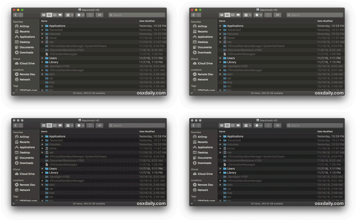
If you like Dark Mode in MacOS, you may appreciate knowing that MacOS Mojave has a secondary secret darker version of the Dark interface theme available with slightly greater contrast, and it’s easy to enable despite being unlabeled and almost entirely hidden in plain sight.
The difference is subtle, but if you enable this you’ll end up with a slightly darker version of the dark theme in MacOS. Or if you happen to be using the slightly darker version of the Dark Mode theme already (and perhaps aren’t even aware of it), you can easily change to the slightly lighter version too.
How to Enable the Darker Dark Theme in MacOS
It turns out that switching the Accent colors in MacOS also impacts the Dark Theme, specifically if you choose the Grayscale / Graphite option as the color accent. The effect is a darker version of the Dark theme, here’s how to get this effect yourself:
- Go to Apple menu and choose “System Preferences”
- Go to the “General” preference panel
- Choose the “Dark” theme if you have not done so already, then under the ‘Accent’ section choose the graphite / gray option furthest on the right
- Wait a moment and you should see the Dark Mode theme shift to slightly darker colors with slightly higher contrast
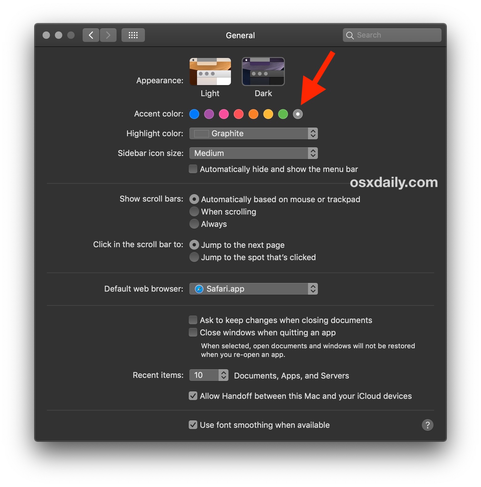
Some users may not even notice a change as it is quite subtle, but if you use Dark Mode often you should be able to tell, particularly in low light situations as the contrast is slightly boosted, and the grays are a shade or few darker.
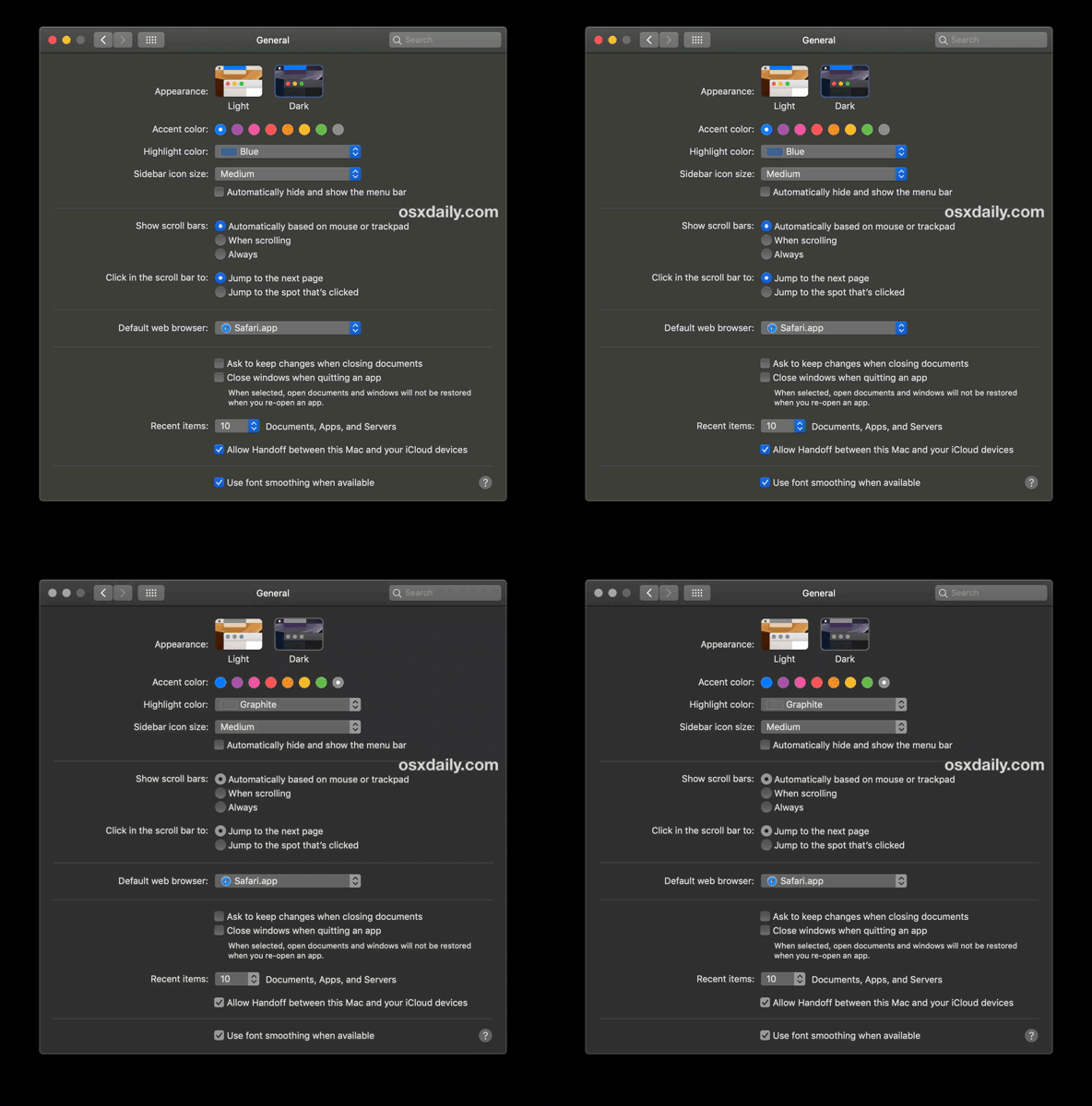
The animated GIF images flip between the two versions of Dark mode theme in the Mac Finder, as you can see it’s not a dramatically different appearance between the two, but the one with gray accent colors is notably darker and offers higher contrast than the other with a color accent chosen.

In still images, the screenshots below demonstrate the two variations of the Dark theme as well.
Here’s the standard Dark theme, with color accents:
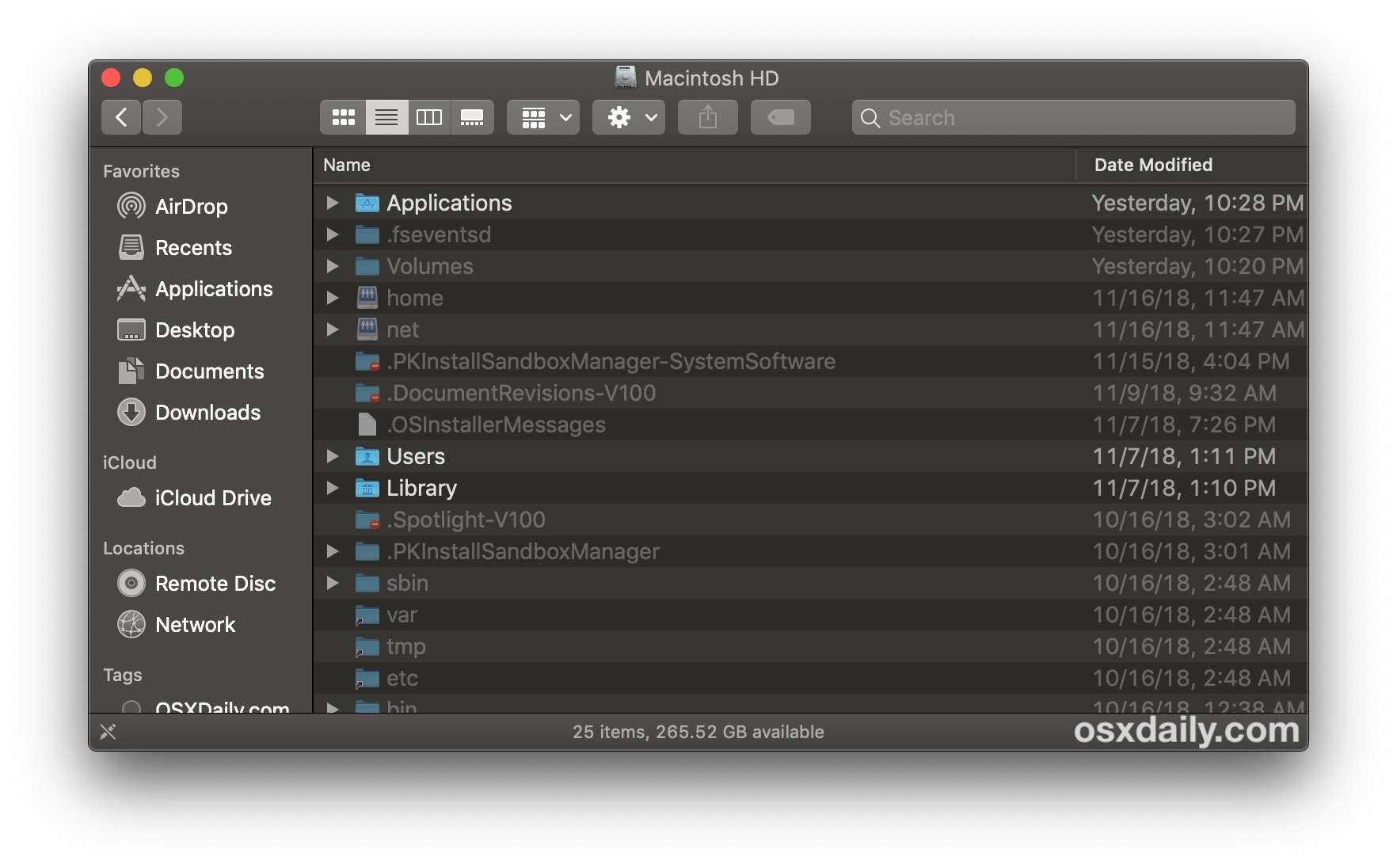
And here’s the darker Dark theme with the gray accents, which features darker grays on all interface elements, and a bit higher contrast:
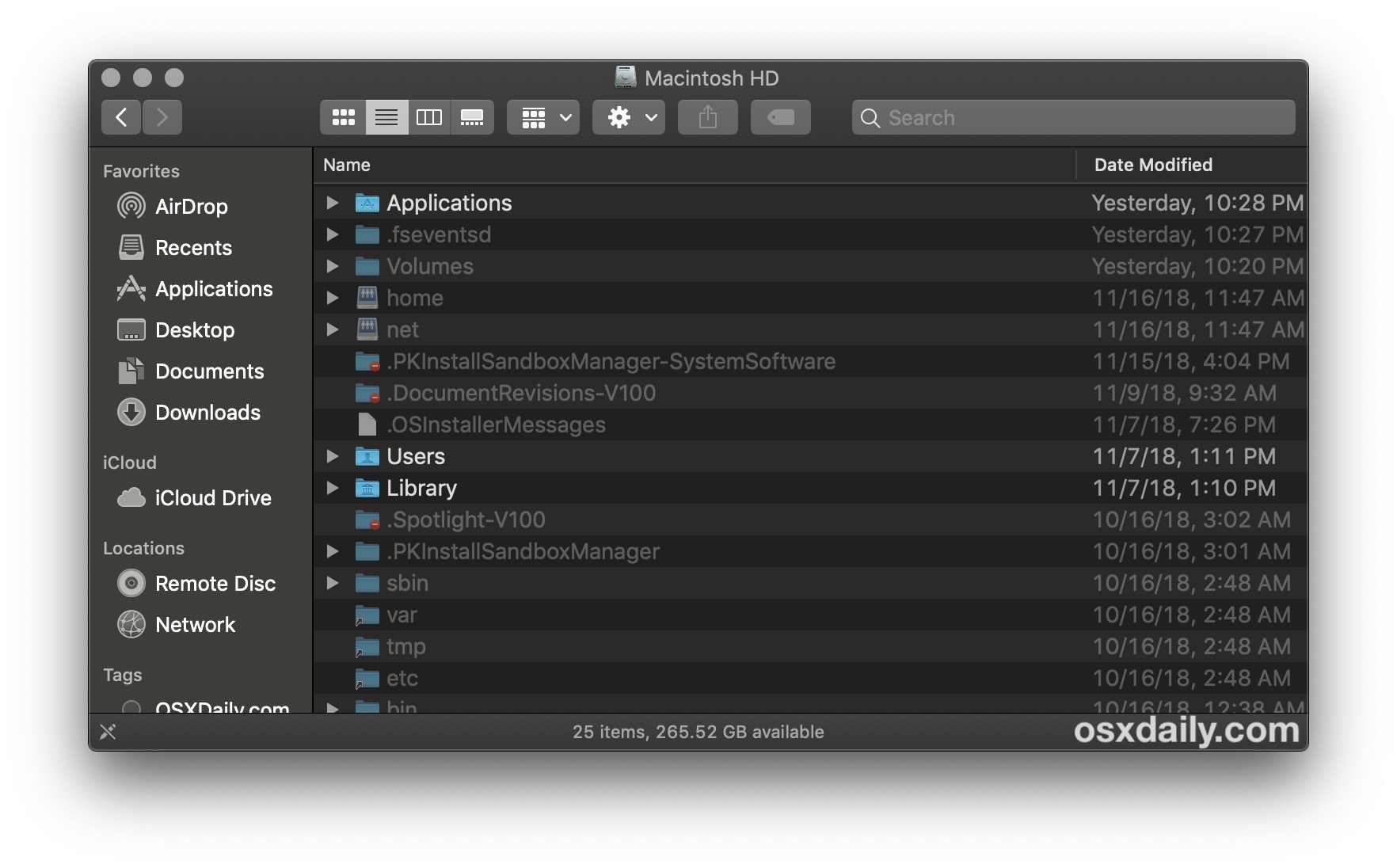
Whether you find the differences to be subtle or not, it’s quite nice having two alternative versions of the Dark theme available, and the gray / graphite accent color looks quite nice with Dark mode too.
You can make this darker theme effect a bit more pronounced by disabling transparency in macOS too (which can also speed up some Macs), and you can also use the Increase Contrast option with Dark Mode if you’d like.
As long as you leave the gray/graphite accent color chosen, then you can toggle between enabling Dark Mode and Light Mode, or even using our trick to schedule Dark Mode in macOS Mojave, and the darker version of the Dark theme will be enabled.
And no, there are not two different versions of the Light theme, in case you were wondering.
Update: some versions of MacOS Mojave seem to not have the dual dark mode intensity options, while others do. Share with us your experiences in the comments below, including your system version.


For Reference – this is a feautre built into macOS as part of their HIG
The feature is called Desktop Tinting
https://developer.apple.com/design/human-interface-guidelines/macos/visual-design/dark-mode/
> Users who prefer not to have the additional tinting, perhaps because they work with color-sensitive content, can disable this effect by choosing the graphite accent color in System Preferences.
Thank you. I’d calibrated my screens several times and it was driving me crazy that the finder window had a slight blue shift. This fixed the issue.
Bear in mind that if you have turned on the “Reduce Transparency” option in System Preferences->Accessibility, you won’t see any change at all.
If anything the blue accent which I was on makes the background slightly darker than graphite. Certainly graphite is no darker. MBA 2018 10.14.3
Pity, the screen on this MBA is pretty washed out and I would have liked it darker.
What the hell? For me it is the other way around: All accents have the darker dark and the graphite has the brownish more bright one???
Not working on my 2015 rMBP.Seems more grainy looking after update.
This is so messed up.
The slighter darkness that you experience when choosing the graphite color accent is because Dark Mode isn’t just dark-as-in-desaturated. In order to prevent clashes, the system samples what’s behind a window, including the system wallpaper. Then, it subtly tints the window — and controls because of their slight translucency — based on the average colors, and mixes that with a base gray, so that the color temperature of the window matches the rest of the environment and your wallpaper. It’s a dynamic process that updates as you move windows around, so all the elements on your screen always feel part of a cohesive whole.
That doesn’t work in graphite mode.
How do I get the alternate black and dark grey between the lines?
“Darker” mode is working but it is very subtle. It’s hardly noticeable.
Useful tip.
I like it so much; while the red button (to close windows, apps) is missing. :)
Just tried this, so far nothing yet. iMac 2017
In my opinion as a visually impaired user Apple has screwed up the dark mode by not using #ffff as the text color. The current text color is hard for me to read. Sigh.
You can also do something similar on older systems (Sierra, and probably High Sierra as well, and maybe even earlier).
Preferences > General, then:
At the top is a “Appearance” drop-down. Change the color from blue to graphite.
Click on “Use dark menu bar and Dock” (right below it).
Did this change in new Mojave’s. I have this in Mack’s os 10.14.1 but when I updates to 1”0.14.3 jr to no longer appears
I’m using an iPhone r as you can tell by my horrible typing. Apple experience all the way!!!
Did you know you can correct typos even on an iPhone? ;P