New MacBook Pro 15″ Hi-Res Screen Comparison


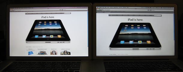
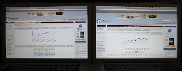
Here’s a good side-by-side comparison showing the viewable difference between the new MacBook Pro hi-res screen option and the standard display. The new 2010 MacBook Pro 15″ model with optional high-resolution screen running at 1680×1050 sits on the left, alongside an older MacBook Pro with the standard 15″ display running at 1440×900 on the right. Note the additional visible images and information on the high resolution screens display.
Thank you Andrew for pointing us to the pictures over at MacRumors forums, check out the thread if you want to see the full resolution shots. The original poster has this to say about the screens:
1) The difference in resolution is very noticeable; especially websites with a lot of text or images; if the site has a lot of white space and they are not coded to stay together, then there is even more white space.
2) The color is alright, but the brightness seems a bit dimmer than the older anti glare; I have both set to the same brightness and both have been calibrated with a Huey Pro.
3) The vertical viewing angles still sucks; it’s a TN panel, so I’m not surprised; look like the older one. I tried taking a picture of this, but my P&S is also a POS.
4) Horizontal angles are also like the older one. I took a picture, but I don’t if you can tell, but the high-resolution one looks a bit yellow from the right
It’s worth mentioning that both of the MacBook Pro’s featured in the pictures are also the antiglare screen model, which is why the black bezel and glass isn’t seen. In fact, you can’t get a new MacBook Pro 15″ with an antiglare screen unless you also get the hi-res screen upgrade. The classic glass & black bezel screen is available at both standard resolution and HD models though.
If you’re shopping for a new MacBook Pro, Amazon offers the new models at 3% to 5% discounts![]() depending on the model, with free shipping included.
depending on the model, with free shipping included.
Update: also from MacRumors, here’s a picture of the new MacBook Pro 15″ high-res anti-glare matte screen version vs the new MacBook Pro standard res glossy version.


[…] […]
[…] seem significant, one can visibile see a diference between these resolutions. Comparison is here: New MacBook Pro 15″ Hi-Res Screen Comparison G __________________ Unsharp At Any Speed My Snaps are […]
I was looking in the apple store and saw that there were high res solutions for the latest MBP 15″ glossy or antiglare. I got really excited thinking it was “retina display” but after reading this article I don’t know if it’s worth the extra 100 (150 for antiglare).
Think I’m going to wait for retina display support instead of a few more pixels at 72dpi. I always end up doing accessibility zooms or browser zoom to see most of the content out there already and I have two other monitors to support my screen real estate needs.
Does anyone here have some detailed tech. specs on the two screens (lo-res&hi-res)? I`m mainly interested in the power consumption of the hi-res vs the low-res one… is the higher-res one eating more power? (and if anybody know how much more…)
[…] add an Apple Cinema Display. This particular desk has a MacBook Pro 15″ with a matte display (vs glossy) connected to the always beautiful 27″ Apple Cinema […]
I’ve just bought a brand new MBP with regular glossy display (not hi-res)
Is my MBP lame, if you compare with Hi-res?
by the way it is 15″
For those willing to be converted if some one can offer up a serious professional reason why they should spend another $200 on a anti glare screen, remember that $200 is not for the antiglare alone. Antiglare is in fact only about $40, but requires a hi-res upgrade which accounts for most of that $200.
I personally think a person needs to decide whether they want a hi-res display first. As others have said, it isn’t always ideal for all situations, but on occassions where it is I agree that most (if not all) software you need to use allows you to scale anything you find uncomfortable. You just have the advantage with a hi-res display, to opt for hi-res. Whereas there is no luxury to do it otherwise, without hooking your macbook up to an external display (which in itself, is a seperate requirement).
As for the antiglare itself, some people are simply not going to like the silver. I don’t like the silver myself, but I like matt (antiglare) displays personally and am happy to pay a little more for that feature, at the compromise of the aesthetics.
In fact, I really really don’t like the silver frame, but I stress, it doesn’t bother me when actually using the display. That said, although I will always try to put function before aesthetics, in the case of the silver frame not being to my liking, I did opt for the hi-res as a result of wanting a matt display and agree that I often find it more comfortable to increase text. But generally, graphical applications give me so much more space to work with and icon-based applications are generally easier to work with at scales where text would not.
To me, it is about maximizing everything you want. Sometimes, that means a tradeoff or two, but in the case of antiglare it can be the tradeoff between actual comfort of use and happiness in aesthetic.
I agree with your logic! I myself do not like matt screens in a laptop, unless its a HP (I like the brightness and contrast on their matt displays) and also hate the silver bezel. But I do need the high resolution. I do quite a bit of work in Photoshop and it would be great to have more space to see the whole of a 1440×900 picture. I also am just starting out in 3D modelling using Blender (thank goodness its availible for Mac and Windows), and would value the screen space for that too. As for text I can already read (with my glasses) very small text, smaller than most people with perfect eyesight can read (100% in Microsoft Word for Mac is about half the size as 100% in MS Word in Windows on any screen size) so I do not think that would be a problem for me. I would enjoy seeing as much of websites and documents as I can see on my 20″ HP 2010 monitor at home when I am on the road.
having been a professional photographer based in the motion picture industry for over 12 years , using mbps in the most glariest of locations , im am still massively unconvinced by the comments in this thread . are the people whining about the glossy screen , industry professionals …, or just a bunch of nit picking mac geeks with nothing better to do. i am completely willing to be converted if some one can offer up a serious professional reason why i should spend another $200 on a anti glare screen
You probably already know all the characteristics of both the screen types and have made up your decision. Either way you are right. Relax & enjoy what you have.
i personally like the antiglare in antiglare and for this reason I have gone with the antiglare.
UPDATE: Most importantly, DO NOT BUY the high-res screen, if you’re a programmer. Designers can get away with it because they zoom in / out all the time, and high-res graphics are great, but writing code / reading, etc is very difficult.
You could always set the resolution to a lower setting. B)
Running any LCD at less than its natural resolution will increase fuzziness. If you want a lower resolution screen, buy one; don’t “turn down” a higher resolution screen.
Hmm.. how about increasing the font size in your code editor?
DO NOT BUY the high-res, if you ever have even the smallest amount of eye strain when using a computer. It makes all text very small, and unreadable to almost anybody more than 15″ from the screen. The low resolution option is the same resolution that you’re used to on most computer displays.
That’s a very strong, overgeneralized statement. For those of us with good eyesight who are used to working on even higher-res screens, the the high-res mbp is the only way to go.. I’m an IT guy and developer — i need all the screen real estate i can get.
Statements like that make you look like you only learned to use a computer yesterday.
If you have a problem with reading some text, just increase the magnification in the application. All web browsers let you increase the magnification, as do most word processing applications and image processing applications. For other applications, you can try increase the size of the font used.
I beg to differ…
I have vision problems that are correctable via glasses or contacts and I bought a Hi-Res 15″ in spite of comments like yours. I’m glad I did! I love the Hi-Res display! Yes type is small and it requires a little more effort to see clearly, but well worth the effort to me. I am still able to sustain long hours of work with this screen. I am no stranger to eye strain, and yet I get along fine with the 1680X1050.
heys I happen to purchase a hi-res 15″ MBP the min it came out.
didn’t know about the silver bezel tho…
was wondering if anyone knows where can I find a black bezel to put onto my 15″ MBP?
the silver bezel is only on the anti-glare models and macbook airs
[…] a look at this article. It shows the difference between the upgraded screen and the standard. The upgrade makes everything […]
Interesting… I am sitting in a coffee shop and just realized my mbp has the silver bezel, whereas all the MBPs I see around me have the black…
At first I thought something had gone horribly wrong (secrete prototype perhaps?), but now the mystery is solved… Personally, I really like the silver as opposed to shiny black, and the HD is AWESOME compared to my previous MBP, I feel like I’m traveling around with my 23″ cinema display… great in Adobe apps with lots of tool panes ; )
~t
[…] New MacBook Pro 15″ Hi-Res Screen Comparison – OS X Daily […]
Question. Do you know if the high-res standard (gloss) monitor got the silver frame around it (like the anti-gloss) or does it look like the standard model?
The standard high-res glossy screen has the black bezel, only the anti-glare matte finish has the silver frame.
[…] img{border:2px solid #cfcfcf}#gallery-1 .gallery-caption{margin-left:0} Vía: OS X Daily | Fotos: MacRumos forumsLeer más: Comparación, MacBook Pro, Resolución Enviar a Twitter […]
In the lower resolution Macbook pro he has another tab open making the page a little smaller than it should be.
It’s a clever remark. Did not notice that. Just compare the size of that iPad I guess.
Yesterday I bought the lower res. I think the antigloss monitor makes the notebook look bad, don’t like the silver around it and they did not have the gloss hire
He actually doesn’t have another tab open, just check it. The tab bar is there, but just the one tab is present.
haha james, we know there is only one tab, but tab toolbar is open that makes screen smaller than normal.