Touch Spiral Interface to Replace Cover Flow in iTunes, Mac OS X, and iOS?

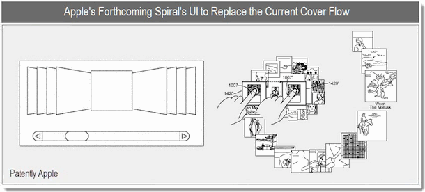
I’ve always liked the way Cover Flow looked and I found it a pretty nice way to flip through albums in iTunes and files in Mac OS X. Well, Cover Flow’s days may be numbered, as a recently discovered Apple patent reveals a touch responsive spiral user interface to navigate through iTunes albums, and possibly, files in both Mac OS X Finder and iOS apps.
As you can see in the patent image above, the items in the file spiral will be touch responsive allowing someone to ‘grab’ one of the items in the spiral and manipulate it in a virtual 3D space. It looks like the patent is specific to iTunes playlists, but considering Cover Flow is included in iTunes, iOS, and Mac OS X, it’s quite possible this touch spiral could appear everywhere that Cover Flow currently exists.
The patent also details an alternative “V” style interface that may look and function similar to how the Time Machine interface works, with items moving back and forth in a virtual space. Here is the patent image of the “V” style UI:

Uncovered by PatentlyApple, they interpret the patents use as follows:
At the end of the day, I think that both the sprial and receding-v designs have their place. The receding-v design would appear to be a natural for replacing Cover Flow in Apple’s Finder. It’s not overly drastic and would provide us with a superior viewing angle, which is the purpose for the change to begin with. Apple’s proposed Spiral design is more geared for iTunes. Apple could simply make it another viewing option or replace Cover Flow. It appears to be geared for a touch display like the iPad where it’s better suited. It would provide more room to maneuver than an iPhone. So it’ll be interesting to see how Apple introduces these new UI elements in the future.
Assuming this spiral and V UI does appear in Mac OS X, I imagine it would respond to both multitouch input devices and a mouse by using the scrollwheel to navigate through the spiral, just like the existing Cover Flow interface does.


[…] not quite as flashy as the spiral interface that may replace Cover Flow, this would be an interesting feature to have in Mac OS X Lion. Remember, a patent does not […]
Interesting, maybe this is how you will make playlists on the iPad from now on. Kind of a gimmick and I can’t see it working that well in Mac OS X except maybe to replace the Dock and flip through Apps maybe. Who knows, it’s Apple so I am sure it will be nice.