Get the Classic iTunes Search List Style Back in iTunes 11

A lot of things changed when the latest version of iTunes was released, much of which represented user interface and behavior changes that weren’t always popular. For many of us, the best solution of handling the new UI was to basically revert the changes to make iTunes look normal and familiar again, and we’re about to do the same thing with the Search feature.
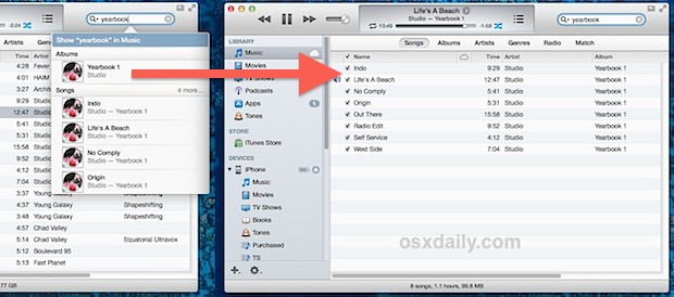
First an explanation: in iTunes 11, searching brings up a nice looking pop-up window that let’s you interact with music and add songs to the Up Next. You’ll no longer get direct access to a simple list of songs that match the results, which is a view that is pretty much essential if you want to make a bulk edit of a group of songs, update album art, or even just make a simple playlist the old fashioned way. A fair amount of users experience this as a bug, assuming that search is broken or not working correctly, but it is, the results are just different looking. Before iTunes 11, searching would bring up a simple results list from the media library that would let you highlight multiple songs and easily make adjustments, and frankly that was useful enough that many people want that ability back.
Make iTunes Search Return Lists and Be Useful Again
In order for this to work across all future searches, the iTunes Search box must be cleared:
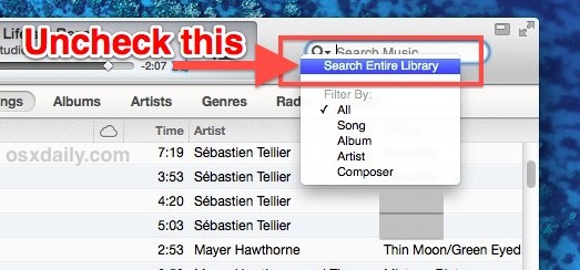
- Open iTunes and click the tiny magnifying glass icon within the “Search Music” box
- Uncheck ‘Search Entire Library’
- Test a new search and hit return to discover the classic results list style

The difference is night and day in presentation, and you regain the ability to select bulk songs in the results, plus you can now make group edits to songs again. If you’re not quite sure what we’re talking about here the screenshots below convey this fairly well.
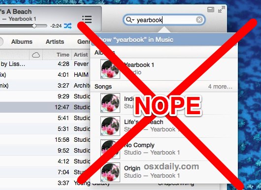
Here is before, which is the new default search appearance in iTunes 11+:

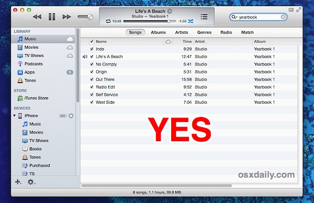
And here is after, with the same search being performed, but returned to the classic search list style having been restored:

Though a lot of users probably won’t care much about this change, it makes a world of difference to those who do bulk adjustments or who would rather just have the classic media search look back. This tip works exactly the same in both Windows and Mac OS X versions of iTunes 11 and later.
A big thanks to a commenter for pointing out this neat little trick.


Love it! Thaaaanks! and the pressing ‘return’ technique above switches it over too each time
Excellent. I often enter additional search tags or alternate names to songs in the composer field, so I need it to search everything, not just songs or artists.
PRAISE GOD! THANK YOU so much!! How stupid I was that never searched this before! 2 YEARS of torture while searching music in library. Damned I almost had an orgasm when I saw this beautiful organized search results. You made my life so much easier
OH MY GOD I LOVE YOU. That is all. Thank yoooooouuuuuuuu!
YES! Thank you!
amazing tip! thx! keep them coming!
Yup, as others have said. Just press return to get the list of results instead of the popover. Best of both worlds.
Excellent tip – many thanks, makes iTunes more useable again. I love progress, but not at the expense of functionality/quickness.
*This* is why I like OsXdaily!!!
:)
Thank you for the tip – that missing functionality was the biggest thing that was bugging me about the new iTunes.
hmmm….. why can’t I find anything from compilations this way?…. doesn’t work…
doh!…. can’t delete my comment but it appears I was w…w… wer… wer…. mistaken…
Sweet baby FSM, this is what I’ve been wanting ever since the update. Thank you a million times!
Good tip from my perspective. Returned the functionality that was irritably missing in my iTunes app.
Don’t know what your talking about. This actually reduces functionality as the previous comments point out. If you just hit enter you get to see the results like the ways of old, and if not, you can push the down arrow and select more discreet results right away…
“Reduced functionality”? Anticipating variations and providing options is good interface design, so I’d call it “added value”.
Good tip. Toggling “Search entire library” to achieve this wasn’t very intuitive on it’s own.
I’m finding that the dynamic search is slowing iTunes’ search response time. I usually prefer dynamic search, as long as it’s fast (Spotlight) or fast enough given the context (Hulu), but I’d rather not search my entire iTunes library based on entering just the first one or two characters if iTunes is going to be so pokey about it. I imagine this problem gets worse for very large libraries.
To be fair, maybe there is, or will be in a future point release, some behind-the-scenes indexing that will make it faster. Until then, thanks for this tip.
When I hit enter my song starts playing in Up Next. Why does iTunes 11 UI complicate longstanding UX tradition?
What? just press enter and you’ll be presented with your results.
Shows the Up Next thing if this isn’t turned off
I’ve been doing what marinomarcoma said (just type and hit Enter) and it does not show the Up Next thing. It filters your current view, be it TV Shows, Music, Movies, whatever, based on your text entered.
I haven’t installed anything screwy, or tweaked any settings or defaults or anything. I’m not sure why it doesn’t work for you, but it works on my Macs (all of them) just fine. Strange.
Excellent tip!!
Thank you, thank you, thank you!