5 Simple Tricks for a Better Reading Experience with iBooks for iOS
The iPad, iPhone, and iPod touch make excellent digital readers, and the iBooks apps is where most people will spend their time reading books on the iOS platform. iBooks is deceptively simple though, and though it works great on it’s own, taking the time to learn a few things and adjust a few simple settings can make a world of difference in the readability of ebooks or anything else in your digital library. With that in mind, here are 5 simple tricks to get a better reading experience in iOS with the iBooks app.
1: Quickly Navigate & Jump to Pages or Chapters
Have you ever noticed those little black dots on the side or bottom of the iBooks window? Those are actually a timeline of sorts of pages and chapters, and by swiping your finger over those dots you can quickly jump around to different pages and chapters.
Try it yourself by opening iBooks and any book, then tap and hold on those black dots to reveal the popup bubble, hold and drag through the timeline to instantly speed between pages and chapters. Assuming the book you are reading has been properly formatted to work with iBooks, the little popup bubble will include the chapter names.
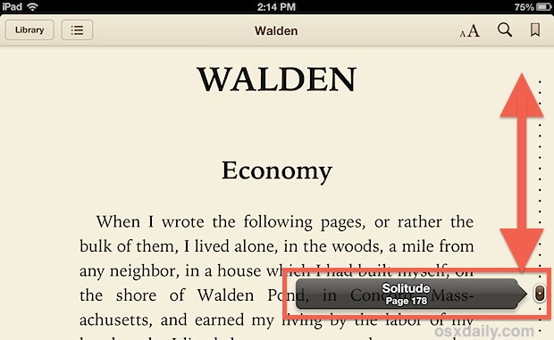
In the “Scroll” view, the page line is on the right side, whereas in the default view it’s along the bottom. Personally, I prefer the Scroll view for reading, and because the iOS device screens are taller than long, the page line is much easier and more accurate to use as well.
This is an excellent feature to use if you want to skip pages and chapters in books, or just want to head to a different section for any other reason. It’s also a very fast way to get back to your place in a book if you forgot to bookmark the page you were on.
2: Choose a Reading & Page Turning Style
The default reading theme is “Book”, which is kind of like a virtual book in the sense that you tap either the left or right side of the screen to change pages in either direction. While that’s an alright experience, the “Scroll” theme may be more familiar to those accustomed to reading on digital displays, which lets you scroll down infinitely between pages.
- In iBooks with a book open, tap on “aA” followed by “Themes”
- Choose the theme you wish to use: “Book” requires taps to flip pages, “Full Screen” is minimalist, and “Scroll” allows for infinite scrolling
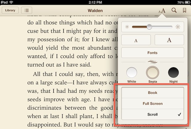
Our preference is for “Scroll”, if you don’t see it in iBooks you need to update to a newer version.
3: Change the Text Size & Font
Using a readable font in a good text size will greatly improve your reading experience. We recommend using a font size larger than what you may be accustomed to, because larger text is easier on the eyes and reduces eye strain.
- From iBooks, tap on “aA”
- Tap the small “A” to decrease font size, and the larger “A” to increase font size
- Tap on “Fonts” to pick and choose a font which works best for you, serif fonts are typically most book-like (the default is quite nice)
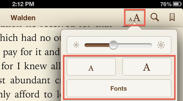
In terms of choosing a font size, it’s a good measure to find one you’re initially comfortable with, then increase it again by one or two taps. Yes, the resulting font size will almost certainly be larger than any standard paper book outside of children’s novels, but bigger text is just easier on the eyes, and with digital screens that is all the more important – particularly for those users who do not have retina screened iPads or iPhones.
4: Change the Color Theme
We’ve discussed how important changing the color theme can be, and alongside adjusting the text size it’s perhaps the next best way to reduce eye strain. You may want to adjust the color scheme depending on the time of day, but a very readable compromise is the “Sepia” theme, which offers warmer tones and less contrast than either the “White” or “Night” modes.
- Again tap on the “aA” button, then tap “Themes” to reveal the color scheme choices
- Choose between “White”, “Sepia”, and “Night”
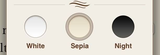
The “White” theme is really best in extraordinarily bright light like daylight, “Sepia” is excellent for general reading indoors and in the evening, and “Night” is a great choice if you’re reading in the dark as it inverts the screen and prevents the technoglow we’ve all become too accustomed to.
5: Adjust Brightness Depending on Lighting Conditions
Just as important as picking a good color scheme is adjusting the screens brightness, this is so easy to do:
- Open “aA” menu and tap and hold the slider left and right
Avoid the brightest setting unless you’re in extremely bright ambient lighting or outdoors. Much like the other recommendations, a lower brightness setting will help to reduce eye strain, so be sure to adjust the setting as lighting conditions change over the course of the day and where you are reading.

BTW, if your iBooks library is a little thin, we point you to the over 38,000 free books available as downloads, all of which are iBooks compatible. Get reading!
Do you have any tips for better reading with iBooks? Let us know in the comments.


Thank you for these useful tips. But for an unknown reason I can’t see any “Text Size & Font” icon in my iBooks app on iPhone. Any idea?
if you read the article well , you should not face any problems.
if you read the article well , you should not face any problems.
When you don’t know the definition of a word, tap and hold on it, and a black bar menu appears. Tap on “Define” to get the definition.
iBooks is one of the most user UNFRIENDLY book readers available.
It needs to have controls to adjust the margin width, paragraph spacing, line spacing, and so on and so on…
I have a great many books that I obtained in text format years ago, which I have converted to epub format and when they are installed in iBooks, the margins are about 1″ on either side, leaving a text line about 2 – 3 words wide.
The library list has problems, too. It’s a real problem for people, unless you create a separate collection for each author name, which is possible but a real pain if you have 200 or 300 books in your library.
Even though it’s mostly broken since Amazon acquired it, Stanza is still one of the most versatile book readers around.