Find the iOS Font Hard to Read? Make It Easier to Read with Bolder Text

One of the biggest complaints we’ve heard regarding iOS is about the font change in iOS 7, iOS 8, iOS 9, iOS 10, iOS 11, and iOS 213 (the other complaint is usually about battery life, which is also extremely easy to fix). The new default system font is fairly narrow in weight, and as a result it can make text difficult to read throughout the various menus, settings, notifications, and even the Home Screen as icon text is quite thin.
If you find the default font and text to be difficult to read in iOS, stop squinting and take a moment to make a simple change that increases the weight of the font, making it bolder. This change is all encompassing and impacts all system fonts, and you will find nearly every text and font element to be much easier to read afterwards.
How to Make the iOS 7 & iOS 8 Font Easier to Read with Bolder Text
- Open Settings and go to “General”, then choose “Accessibility”
- Scroll down to locate “Bold Text” and flip it ON
- Reboot the iPhone, iPad, iPod touch when asked
Don’t worry about the reboot process, it’s extremely fast nowadays so it only takes a few seconds to complete.
When finished, the iPhone, iPad, or iPod touch will have bolder fonts that are much easier on the eyes. If you haven’t seen it yet don’t assume you’ll have big fat fonts, the ‘bold’ text is actually very similar in weight to the default font in prior versions of iOS.
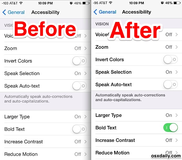
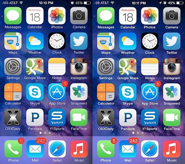
Below are a few screen shots demonstrating the difference of bold text vs normal text in iOS 7 on an iPhone 5.
The most significant change is shown in the Settings menus, where everything is much easier to read:

The home screen text under icons also gets the bold treatment, before is on the left and after is on the right:

You’ll find the lock screen, Notification Center, and Control Center are also impacted by the font change. This really is a systemwide adjustment, but screen shots really don’t do the change justice. If you find the text difficult to read in iOS 7 make the setting adjustment yourself to see just how big of a change it really offers, if you don’t like it you can always toggle it back off again and go back to the narrow text default. It looks great on the retina screens, but non-retina devices may find it to be an even greater improvement.
This seems to apply to everyone, and despite being in the “Accessibility” settings even those with very sharp eyesight tend to appreciate the bolder option. Make the change and you should be a bit happier with the iOS 7 experience, and don’t forget to master these four essential tips to jump ahead of the pack with iOS 7. The overall experience may be a bit different than we’ve all been accustomed to, but once you learn the basics you’ll find it’s very nice.


Seriously can read the font with iOS 8 update. I even bolded the font per recommendation-still no good the original font on my iPhone 5c was great. I have a small astigmatism with old font I didn’t need glasses. New font I can’t even see clearly with glasses!!!!!!!! Please change font back
I liked my ios 6. I thought the update would be better, but I find it very difficult to use. I wish I hadn’t of “upgraded”. I’ve spent from 8:30 am to 3:45 pm trying to familiarize myself with this system. I’m no computer wiz, but I’m pretty efficient. Absolutely not user friendly. I wonder how other people are handling this change. I especially dislike the searching the web change. I still can’t figure out how to use.
If it isn’t broken don’t fix it. I immediately wanted to go back to my prior OS. It looks like apple has a bunch of kids designing the new interface and that they made changes just to justify their jobs, rather than to make a PHONE or TEXTing user interface that looks business professional and is easy to use and read. The IOS7 interfaces are difficult to read and the functions that you need are not where they are easy to see and touch with your finger? The most basic functionality is not better, it is far worse. I will move to Android.
I find the text with OS7 to be unpleasant to read. If with the font set to bold and the font at the largest size it is not even 2nd rate. It appears that Apple is not interested in anyone that doesn’t have perfect eyesight or Apple doesn’t know that black on a gray background is hard to see. I don’t know how they can call this a upgrade when the result of OS& was to degrade the display.
The huge problem is that none of the adjustments and accessibility features affect the menu bar. They went from clearly visible icons to faint outlines. Notes is especially bad because the stick figure icons are in yellow. The calendar is still unreadable when zoomed. I’m not visually impaired and I’m having a hard time seeing things on the new iOS. I can’t imagine how bad the “upgrade” must be for visually impaired people, especially those with difficulty with color perception.