How to Change the Dock Color & Appearance in iOS

The Dock received a significant visual overhaul along with almost everything else in modern iOS versions, and though the days of the OS X look-a-like are gone, you can still customize the coloration and transparency of the Dock a bit. One option is to change the wallpaper, which has a profound effect on the appearance on the Dock along with other user interface elements of iOS, but what if you like your wallpaper and just don’t like the way the Dock looks with it?
That’s what this trick will help, achieved indirectly by using the contrast setting that is intended to improve usability, it removes the sometimes garish hyper color look of the iOS Dock that comes from using certain wallpapers, replacing it with a simple translucent Dock color with much higher contrast, typically a dark color roughly based on the wallpaper. The result is greatly improved readability, and sometimes a much approved appearance of the Dock overall too. Note that there are some other UI changes that will occur with this setting, making it undesirable to some users.
- Set the iOS wallpaper to what you like, but dislike the Dock appearance of
- Head to Settings, then go to “General” and then to “Accessibility”
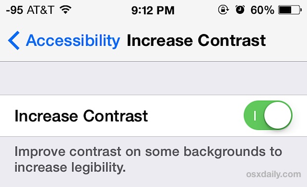
- Choose “Enhanced Contrast” and toggle the switch to ON
- Exit out of Settings to see the new look of the Dock
Enhanced Contrast strips most of the crazy coloration from the iOS 7 Dock and your result will be a much more subtle look, as shown in these two screen shot examples of some fairly subtle wallpapers that happen to have hyper color Docks.

The default option is on the left, with the “Enhanced Contrast” option on the right. The change in coloration and look can be considerable, depending on active wallpaper on the iPhone/iPad/iPod:
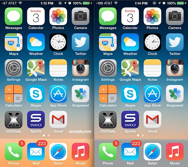
(Odd looking orange juice Dock on the left, with the contrasted grey version on the right)
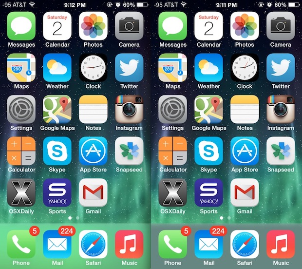
(Clashing toxic waste looking mystery green Dock on the left, with the new contrasted grey version on the right)
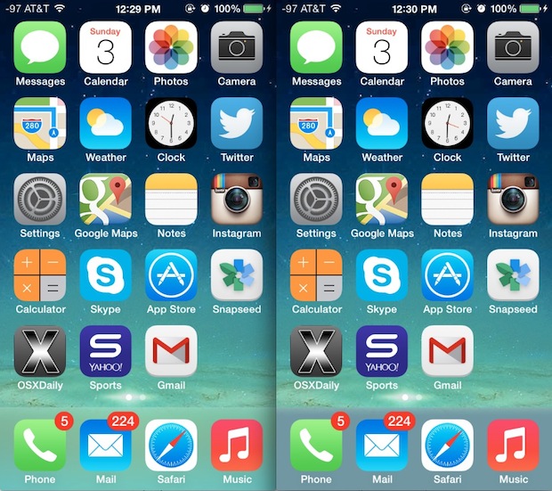
This trick combined with bolding text can make a big difference in overall usability with certain wallpapers, and as such would be a good addition to some general usability improvement tips that users can easily make for the iPhone, iPod, and iPad with iOS 7.0 or newer.
Though it will certainly change the Docks coloration and appearance, using the Enhanced Contrast feature has a potentially unwanted side effect of stripping all transparencies and blurs from elsewhere in iOS. Most prominently, this includes folders, Notification Center, and Control Center, but other smaller changes will be seen elsewhere as well. The result is usually simple flat color for things like Folders, or with Notification Center a black background, but Control Center gets a not-so-contrasty light grey background with white text and icons atop it, which is arguably the worst look of the bunch:
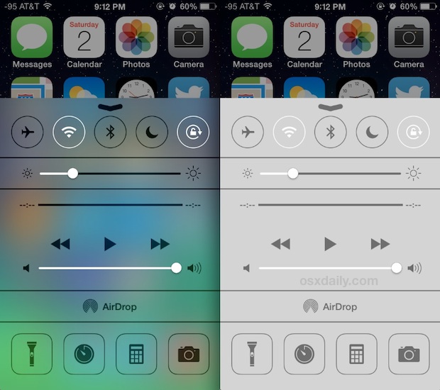
Whether or not the side effect is worth it is up to you and how much you like or dislike the Dock styling on your iPhone or iPad running anything after iOS 7.0, but for now it remains the only way that you can change the look at all. A much more pleasant side effect may occur on older devices running iOS 7, which can experience significant speed increases by disabling the transparencies with this settings toggle.
If you’re displeased with the look, don’t be completely discouraged, because Apple has been fairly responsive to some of the criticism of various interface elements after the major iOS redesign, offering new options like a faster fading transition to replace the zooming effects throughout iOS. That change arrived in a minor point release, thus other small point releases and more significant updates to iOS may offer even more options to customize the look and feel of iOS moving forward.


GREAT article!! I knew there had to be a way with out jail breaking- I have an iPhone that isn’t jail broken yet but was somehow able to adjust.. I also wish OSX plus devices were able to offer more options regarding interface colors, fonts, styles maybe… Tons of the colorful keyboard apps are useless, much more hassle than worth. although more interface customization would rock, and it’s weird we don’t have options (I guess partly why Apple supposed be so secure, bc none of us can access the utility directory to get these options-?? Maybe ? Idk). But til then this page w these instructions was EXACTLY what i needed!! Thanks for perfect perfect post!! Super helpful!!
There’s a way to change the ugly grey everyone. Go to settings then general then accessibility then increase contrast if it is on turn it off n no more grey👌
In addition changing your wall paper can also result in that ugly muddy gray being eliminated.
I just got a new iPad air today because the iPad 2 that I got in July didn’t have enough free memory to upgrade to iOS 7, and I was absolutely shocked at how ugly and garish the new flat appearance is. The keyboard, the folders, the icons, everything. The iOS 6 appearance with its subtle thin 3d icons and widgets and fine textures is so much easier on the eyes. I can’t believe they would do this and leave users no option.
Whatever trick anyone discovers it does not change the fact, that IOS has become ugly. Among tens of iPhone and Ipad users I am surrounded, not even one said that he/she likes this flat design. Jonathan Ive, great respect for the devices you design, but please stay away from the interface! If you manage to spoil the OSX design, it will be the beginning of Apple’s termination.
I definitely agree about the home screen icons and the Dock. I do like the look of new lock screen, the menus, notifications panels, and other elements. But the icons are the ugliest I have ever seen, hard to believe they actually shipped.
I think OS X will get a face lift to look more ‘flat’ and white in the next version, but not as hideous as iOS 7. And I think iOS 8 will have new icons, because come on, nobody likes them.
It’s the exact opposite for me. The small company I work for (about 60 people) uses Apple computers exclusively. The majority of us are Apple users outside of work too all with iPhones and iPads. There isn’t anyone at the office who doesn’t like the flat design. I personally have 2 iPod 4th gen at home and iOS6 looks really antiquated beside the iOS7 devices we also have.
Some of iOS 7 is beautiful, and some of iOS 7 is very ugly. The Dock is often in the latter category, this helps but it’s unfortunate to lose transparency elsewhere as a result.