Use Darken Colors to Increase Text Color Contrast in iOS

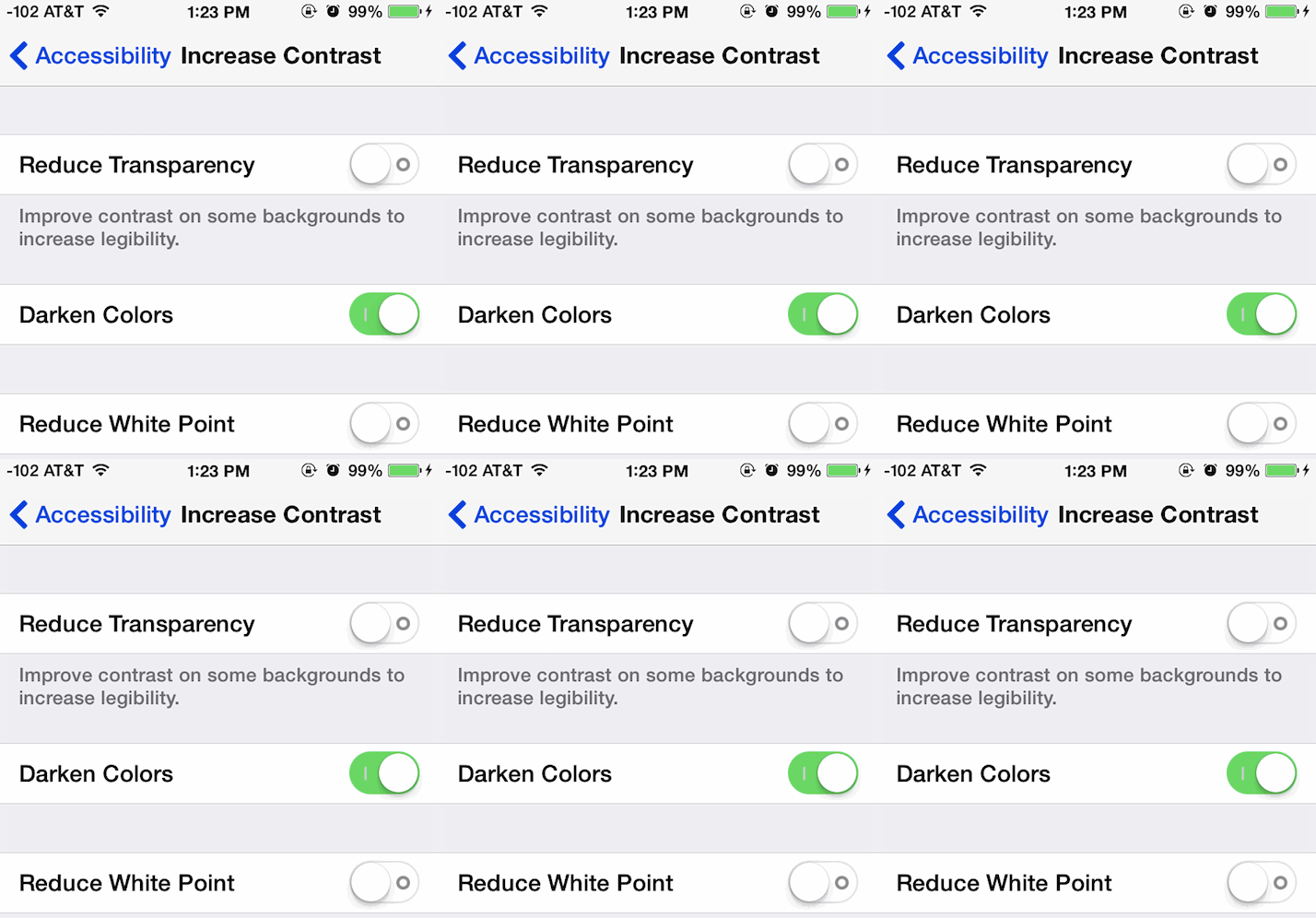
One of the bigger complaints stemming from the iOS redesign is that the stark white interface with thin fonts can be difficult to read. Setting text to Bold makes an enormous difference, but some of the color choices in iOS still lack enough contrast to make things easy on the eyes, particularly for those with less than perfect vision, or even if you just use the iPhone / iPad in bright sunlight often. Fortunately, iOS now includes a “Darken Colors” toggle, and while it doesn’t have as wide-reaching an effect as many would hope for, it does tone down the fluorescent blue text on buttons and UI elements throughout the iOS interface. It also darkens much of the super light grey text into a darker shade of grey. The overall effect is increased contrast on text in critical places, helping visibility and legibility. The change is fairly subtle, as shown in the animated gif.
For accessibility purposes alone, this setting will likely get a lot of use, but it’s also just a nice way to make your iPhone easier to use in direct sunlight, and some users will probably just simply prefer the darker blue text and darker grey elements to the lighter baby blue text elements found everywhere in iOS.
Use “Darken Colors” to Enhance Text Contrast in iOS
The Darken Colors feature was added in iOS 7.1, therefore you’ll need that version of iOS or newer to find this feature.
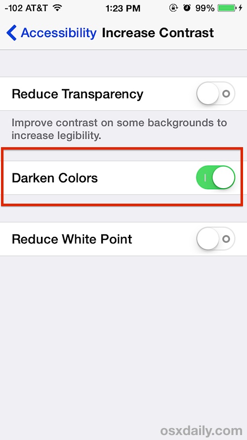
- Open the “Settings” app and head to “Accessibility”
- Go to “Increase Contrast”
- Find “Darken Colors” and toggle the switch ON for immediate effect

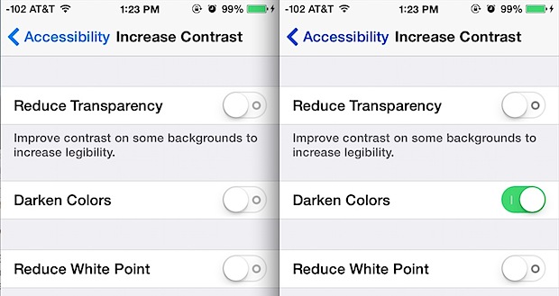
The same Settings panel you’re at will demonstrate the difference when darken colors is on or off, though it’s surprisingly subtle. Can you see the color difference in these two pictures side-by-side?

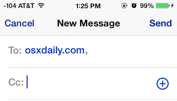
Look at the blue text and arrow for “< Accessibility", and look at the tiny grey circles within the switches. Again, it's quite subtle, but it does help if you've thought the light blue text was hard to read (and you're not alone). This change carries throughout iOS and all iOS apps, here's another example of the darker text shown in a Mail composition window:

If you still find things on the iPhone and iPad difficult to read, don’t forget to bold text, it improves overall readability quite a bit. We have also offered some general usability improvements to make things easier on the eyes for everyone and all devices with iOS 7+, be it an iPad, iPhone, or iPod touch, and realistically, some of these settings should have probably just be turned on by default.


Hi,
do you know how they calculate the new colors?
i.e how the manipulate the colors?
when i’m capturing the screen i get the image before the adjustments.
thanks!
Zach
Does this setting affect battery life?
Yes, darker colors on LCD screens use a tiny bit more power. One of the reasons why iOS 7 was so brightly colored is to save on power.
I don’t think this goes far enough. I use it too but still hard to see things without having brightness 100% when using outdoors
The blue color is also kind of ugly.
I would like “increase whitepoint”
For all the millions 4s with yellowish screens, compared to the iphone 4 “cold white”.
I like my yellowish 4S screen. It is easier on the eyes.
I turned this ON immediately, as well as just about every other thing to disable all the useless glitz and glam of iOS 7. It’s a trainwreck that is HARD TO USE and, yea, things are hard to see and I have pretty good eyesight!
Remember when Apple used to be great for user experience? Now they’re a disaster. So here we are with the new version, iOS 7.1, which it walks back some of the horrendous iOS 7.0 interface elements. Presumably, iOS 8 will continue to roll back the garish interface a little bit more. At that rate, they’ll keep unpeeling the Ugly Onion and maybe by iOS 10 (iOS X?) we’ll be back to a usable iOS again! Oh but don’t you gloat Mac users, your next version of OS X is going to get hit with the over saturated 1993 hypercolor brightness stick too, and you’ll all be wondering how the heck anything works and why you need to use sun glasses to sit at the computer screen.
I know Windows Phone isn’t “popular” but has anyone used it? It is much more intuitive than iOS 7. Even stock Android 4.4 is easier to use, though it is still a maze of taps and mystery back buttons that aren’t quite making sense yet. That says a heck of a lot about where Apple has dove off the cliff with iOS 7. And iOS 7.1 doesn’t do enough, we all know it. YES I’m ranting, because it’s tragic.
I use Android 4.3. Even though it has many more controls and flexibility it is not easier to use and it is much less stable than iOS 7.1. So if I want to play around then yeah Android is fun. If I need something to work then iOS does better.
At this point I would not give Windows 8 the time of the day. Too tired of all of the UI nonsense.