Make iOS Settings Toggles a Bit More Obvious (and Geeky) with Binary On & Off Labels

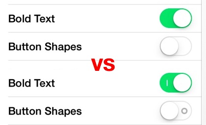
Earlier versions of iOS used to make it very obvious when a Settings toggle was enabled or disabled by showing “ON” and “OFF” text within the button switch itself. While new versions of iOS have removed those word based cues in favor of color indicators (green for on, white for off), there remains an option to make the settings toggle switches a bit more obvious by using binary indicators of a 1 or 0 added atop the color change.
This setting can be helpful for accessibility reasons on any iPhone, iPad, or iPod touch, but it’s also nice to have turned on if you use color inversion as a ‘night mode’ for reading, and even if you’re like me and just prefer obvious visual cues for settings and appreciate the hint of geekiness added by the binary switch indicators.
Enabling On / Off Labels for iOS Settings Switches
Turning this setting on will add a 1 or 0 to show that a settings toggle is in the ON or OFF position. If a settings toggle is ON, the button will show a “1”, if the settings toggle is OFF, the button toggle will show a “0”.
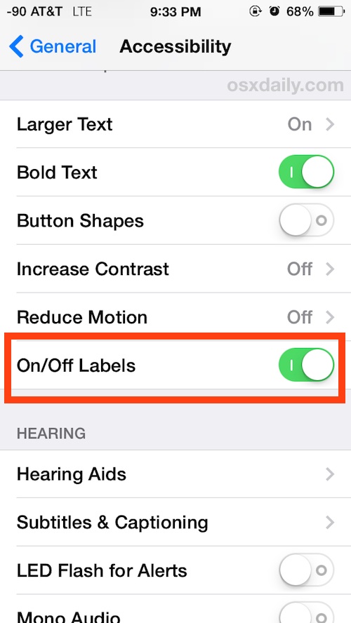
- Open “Settings” and go to “General” and choose “Accessibility”
- Scroll down to find “On/Off Labels” and toggle the switch to ON

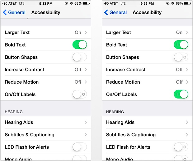
You will see the change take effect immediately and overlay on every settings toggle, though it’s a fairly subtle change:

If the light grey isn’t particularly visible to you, you can make the On/Off 1/0 indicator slightly more obvious by using the Darken Colors option in iOS, which will darken the shade of grey used by the indicators, as well as some other user interface elements.
We’ve recommended this before as one of several simple usability Settings adjustments to devices running iOS 7 and later, it does make a pleasant difference.


Apple should be smart enough to leave the original symbols in place for On and Off! Those symbols were invented long ago to represent sounds on and off. The designers just like to think they earn their keep “cleaning up” the surface while needlessly confusing the screen.
The problem I have and one which Apple themselves cannot solve is that all my wife and my iOS7 devices (iPad Air; iPad 4; iPhone 5 and iPhone 5S) completely fail to respond to the On/Off Labels switch. Whether On or Off, nothing happens, nothing changes. The respective devices work perfectly otherwise.
The On/Off button is there but no longer effects any change on my iPhone 5, iPad Air nor my wife’s iPhone 5S. It used to do exactly what you show, but not since latest update. Any ideas? Ian
If you’re on the latest update (7.1) this should basically work. Just you need to compare your settings with the above screenshots by the author of this article.