How to Reduce Transparency on Apple Watch

The Apple Watch user interface uses transparency in the Glances screens and elsewhere to add a subtle layering effect to the appearance of things on display. This is mostly an eye-candy effect, and while it’s quite subtle some users may wish to turn transparency effects off in WatchOS.
By disabling transparency on Apple Watch, it will improve the contrast of certain on screen elements, and may offer some other mild improvements to performance and battery life as well, simply because less processing power is used for drawing display elements.
Turning Off Transparency Effects on Apple Watch
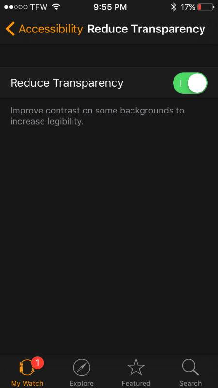
- Open the Watch app on the paired iPhone and go to “My Watch”
- Go to General then to “Accessibility” settings
- Choose “Reduce Transparency” and toggle the switch to the ON position

The effect is immediate, but quite subtle. Many users may not even notice the difference in having transparency on or off on Apple Watch.
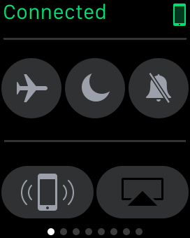
For example, here is a glance screen with transparency turned off:

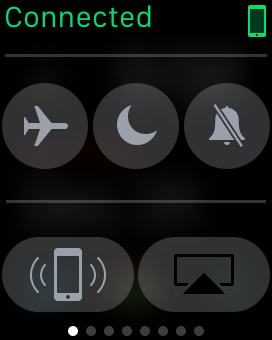
And here is the same glance screen with transparency turned on:

The change is understated, but note the text is slightly brighter and more legible when transparency is off.
Some users report this improves performance and battery life, which it may to some small degree as less Apple Watch resources are devoted to drawing screen elements, but personally I haven’t noticed much to that effect, with the exception of some Glances being a tad smoother to access (like the heart rate monitor Glance, for example). However, it can make the Apple Watch screen a bit easier to read as it boosts the contrast on some parts of the user interface, but ultimately whether or not to use this settings adjustment is a matter of user preference.
While you’re exploring the accessibility settings of WatchOS, another popular adjustment is for using or disabling Reduce Motion on the Apple Watch, which also cuts down on some of the various UI effects in WatchOS.


Does this feature also help save battery by a lot too?
Translucency is a terrible waste of resources for simulating depth. Shadows paired with simple opacity are unmatched in this regard. One of the many reasons I miss Apple’s previous design aesthetic so greatly.
Transparency slows everything down too.