How to Disable Google Chrome UI Theme Redesign and Return to Classic UI

If you have updated Google Chrome web browser recently you likely noticed there is a new themed visual overhaul called Material Design that comes along for the ride. The new themed Chrome appears to come as the default in Chrome version 69 or later. While some users may be pleased with the new theme look in Chrome and the different user interface, others may prefer Chrome to respect the operating systems default visual appearance instead of using a unique theme.
If you’d like to disable the newly redesigned Chrome browser themed interface, you can do so by toggling a vaguely named setting in the Chrome app.
Disabling the theme is demonstrated here on Chrome for a Mac, but the flag and setting to disable the new theme should be the same on Chrome for Windows and Linux too.
How to Disable Chrome UI Redesign in Chrome 69+
Want to return Chrome to the regular classic interface rather than the new themed appearance defaulted in Chrome 69 or later? Here is how to do that:
- In the URL bar of chrome, enter the following link:
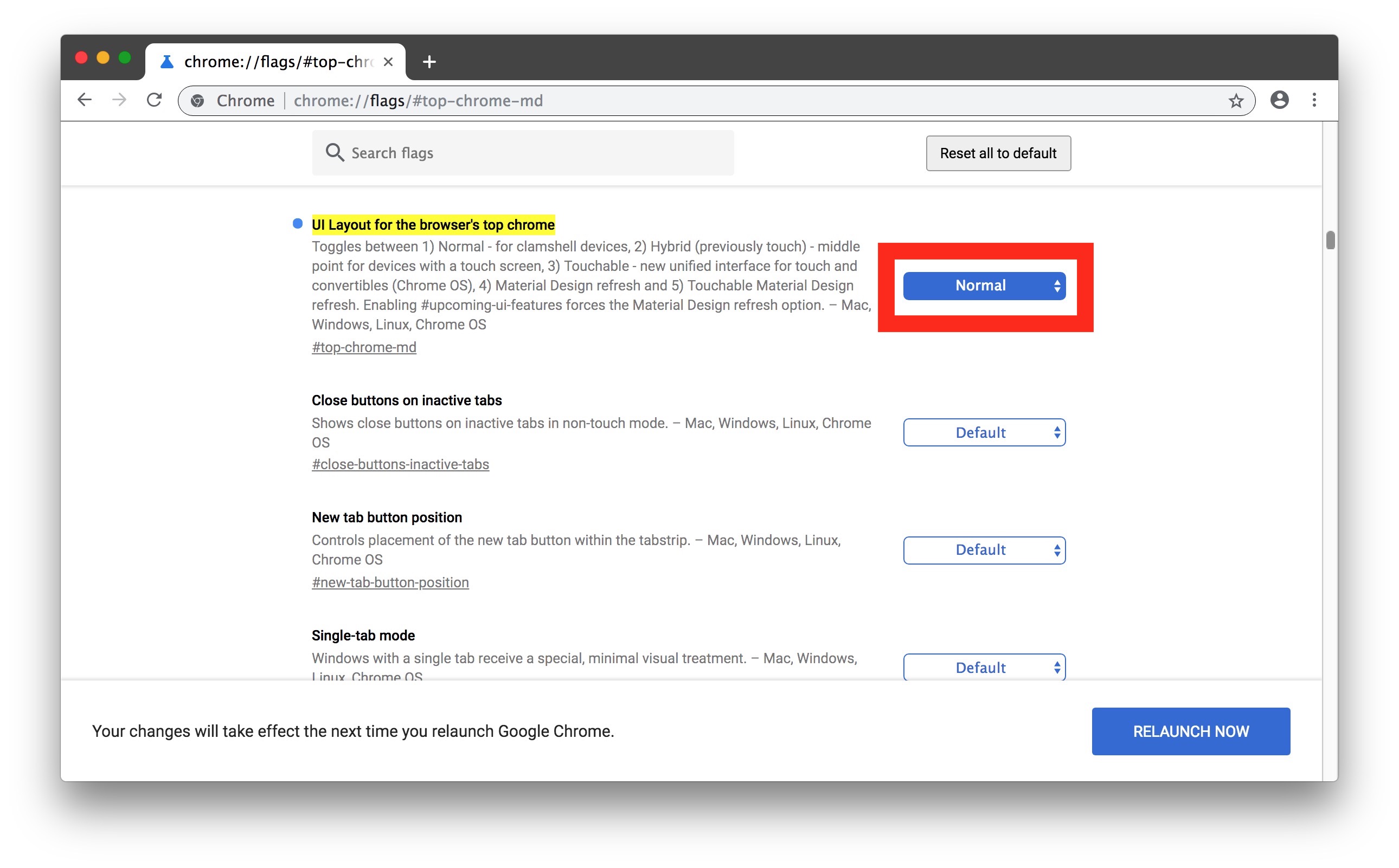
- Search for “UI Layout for the browser’s top chrome” *
- Pull down the submenu next to “UI Layout for the browser’s top chrome” and select “Normal” from the dropdown list of options
- Restart the Chrome browser (quit and relaunch) for the visual change to take effect
chrome://flags/#top-chrome-md

Once Chrome relaunches, Chrome will no longer feature the redesigned rounded interface that differs from the rest of the operating system, and instead it should have the regular classic interface again.
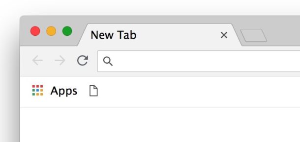
Here’s the regular Chrome interface UI renabled:

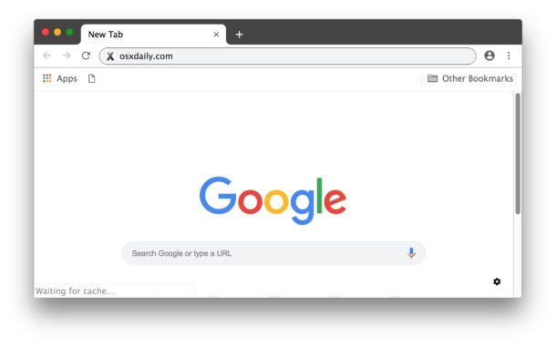
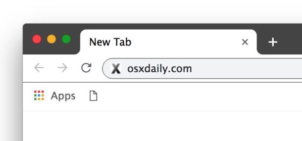
And here’s what the newly redesigned Chrome UI looked like before:

While this is demonstrated on Chrome for Mac, the setting should be the exact same in Chrome for Windows and Chrome for Linux too, because each uses the same settings://flags system, and each now features the redesigned interface for the latest versions.
That’s all there is to it. You can always change the interface back again if you’d like, or choose one of the other drop-down settings from “UI Layout for the browser’s top chrome” and see what it looks like or if it suits your visual preferences.
* The curiously labeled “UI Layout for the browser’s top chrome” and the associated paragraph attempting to explain the setting is a bit of a nondescript word salad, but believe it or not changing that setting to “Normal” will remove the new theme interface in Chrome and return Chrome to the default classic user interface of the operating system.
Another interesting change made in the latest Chrome release is that Chrome defaults to hiding much of a websites URL in current versions, but you can change a setting so that Chrome shows the complete URL and subdomains of a URL if you’re interested in doing so, basically returning the appearance of URLs to what they were prior to the latest versions.
If you enjoyed this tip, you may appreciate some of our other Chrome tips here too.


Ok,i was so glad to find this,but the trouble is,i dont have the option of changing it back to Normal,I have touchable refresh,which is what its on at the moment,then i have Default,Refresh,Dynamic refresh,nut no Normal option,so i dont have a clue at the moment as what i can do,i did try all the options mentioned but it didnt make any difference,hoping there is another option,im using windows 10
Has this option been removed? Chrome crashed on me a little while ago, and when I relaunched it, the nasty new look was back. So I went to chrome://flags/ and searched for “UI Layout for the browser’s top chrome”, and found that now the “Normal” option is GONE!
Now the options are Default / Refresh / Touchable Refresh / Dynamic Refresh. They only seem to affect the way tabs refresh, not the appearance of tabs.
This happened without my permitting any upgrade of Chrome. This is 71.0.3578.98 (Official Build) (64-bit)
WTF happened?!? The NORMAL setting / option is completely gone.
Well, they’ve changed the ‘UI Layout for the browser’s top chrome’ options again. Now there’s no ‘Normal’, etc. Now it’s something totally incomprehensible called ‘Refresh’, ‘Touchable Refresh’ and ‘Dynamic Refresh’. And it’s STUCK on Material Design, you can’t change it back to Classic. Bastards!
Grrr, I’m so upset right now.
While you guys only seem to care about the look of it, I care b/c Google actually REMOVED the tiny part at the top that tells you what Chrome person you are on.
I have multiple chrome persons & I used to be able to load a new one up easily & just glance up at the top to see which one I was on.
Well NO LONGER. Now I have to waste time mousing over what Chrome e-mail address Google has logged me into to see it.
I had no idea your gmail & Chrome e-mails can be completely different.
And it took me 20 minutes to find the mouseover b/c I was freaking out not knowing how I was going to tell what person I was on.
TERRIBLE what Google & MS do to us. They ruin everything.
They moved it to an icon to the left of the Settings icon (the 3 dots stacked vertically.) I didn’t notice til I read your post just now… I only posted b/c I didn’t notice recent posts go to the bottom of this site and I’m far from the first to complain about what Google just did.
I concur with Jonah and David, WTF happened?!? The NORMAL setting / option is completely gone. I am stuck with tabs that look like something out of a design nightmare. Dictatorship anyone?
Well said _ apparently Edge will soon be able to use Chrome extensions _ I will probably ditch the Chrome browser then.
I don’t see option for normal anymore. Like David said above, refresh, default and dyanamic option are avaialble. How do I revert back to old design?
After using the ‘Normal’ feature in the UI Layout for the browser’s top chrome it has now totally reset to the new theme, which gives me only options for Refresh, Default, Touchable Refresh and Dynamic Refresh now. I really would like to revert to having my chrome having the old sharp design back.
Any Ideas?
Thank you
Here is what’s needed to get the scheme (aka protocol) and ‘trivial’ subdomains to be shown on Mac OS 10.13.6 running Chrome 70.0.3538.67:
– chrome://flags/#views-browser-windows set to enabled
– chrome://flags/#omnibox-ui-hide-steady-state-url-scheme-and-subdomains set to disabled
– chrome://flags/#upcoming-ui-features set to Default or disabled.
This worked for me last month, but now my iPad doesn’t show the UI layout for browser as an option when I go to chrome/flags
What gives?
OMGZ THANK YOU!
10-9-2018
Thank you!
This explanation is much clearer than the one on Chrome’s help forum. “Normal” worked for me.
Chrome did not recognize that this is an accessibility issue for anyone who has trouble reading white-print-on-black (not to mention blue or gray print on black). The smaller the font-size, the worse the problem.
While I’m at it, I’ll mention that Chrome’s high-contrast accessibility option (the black/white moon on toolbar) and font size options don’t seem to work on the tab texts or Bookmarks bar.
New chrome UI design on mac is horrible. Now everything seems round.
Glad I searched instead of just accepting this new and horrible reality. So glad to have the classic design back. The new tabs are ridiculous.
THANK YOU!!!! SO MUCH!!!!! The new loook si horrible
thanks its exactly what i was looking for. but if i do that and change the top layout the button where u can directly go into your google account right next to the 3 dots for setting dissapears aswell.
any ideas how to revert the following changes back?
chrome app:
– the tabs appearing as tiny squares lined up instead of a whole rectangular page stacked on top of each other
– the url being shortened into just the main url
chrome (macbook):
– the menu bar disappeared from the top and everytime i move my mouse over the top, the entire chrome moves downwards and the bar then appears
thank you so much for all the help in the article though. really appreciate it since i’m pretty against the new changes
Ah, now i don’t have a glaring white searchbar anymore.
Too bad on the rest though, liked the new rounded style, but the white serach/address bar was making me blind.
Thank you. I don’t like the new design. I cannot easily see the edge of the tabs anymore and accidentally click the close when trying to select a tab. I really don’t want to change the theme that is loaded just to work around a design change that is unnecessary. I wonder what other browsers I can use that don’t try to make my life difficult. Any suggestions?
Safari for Mac is an excellent web browser.
Firefox is OK too but be prepared to turn off a million settings to make Firefox not annoying.
Chrome is pretty good but yes this kind of change and others like hiding URL and other weird things in new versions is making it less likable.
THANK YOU, SUCH A SIMPLE FIX THANKS TO THIS ARTICLE.
I’m OK with the rounded corners and things. The only thing that I really need is to be able to put the tabs under the Omnibar instead of at the top of the window (on a Windows PC). It doesn’t make sense to me to have a “tab” that’s not connected to its content, and there’s too much mouse movement – some of us older users find it hard to do things like drag tabs when a few pixels off and you’re moving the whole window.
I also dislike the extended search results from the Omnibar (I’d actually prefer separate address and search boxes, with the address bar being simply an address with no prediction of any kind – if I’m typing in a URL and not using a shortcut then I already know what I’m typing and don’t need Chrome to try to predict it for me), but I’ve given up on that particular battle.
thank you.
Does anyone know how to also revert back to the old home/start screen for chrome?
I just followed the instructions and the UI did not revert to the old UI. I think this may have been fixed and no longer works.
Which is annoying as the tabs leave me feeling like something’s missing and the rounded edges just look wrong.
You must quit and relaunch Chrome for the change to take effect and the visual to revert to the prior classic UI. It works, I’m using the classic Chrome UI right now to post this comment :)
Thank you
Thank you! I was going crazy with the redesign.
I noticed hat the latest update changed the new tab webpages to icons. Is there a way to revert to the old screenshot type?
The changes this article does deals with pretty much everything BUT this particular issue I am having.
I need this answer too, as the new icons are slowly driving me crazy.
In the chrome://flags page, use the search field at the top of the page to find “tiles”. Look for a setting called “New Tab Page Material Design Icons”, set it to disabled, relaunch and you’ll be back to the old design
thanks it seemed to work, but now it seems to not and its back to icons.
How do I get google back to normal when on my iPad?
Thanks. I did not like the new, default, look because there wasn’t enough contrast between fields which made me waste time looking carefully for buttons and fields that knew were there. Also I did NOT like how the bookmark bar was stretched and held fewer folders and sites than it use to. That really upset how I had carefully arranged it.
I am a little nervous having to use “chrome://flags/…” to correct this as I’ll forget about it in the future if I need to switch back or make new changes. It’d be nice if these sorts of things could be done via a Theme which is a more standard way to make similar changes.
thank you so much! The new look was just not my thing.
What theme is that with the black bar?
The black theme was the default for me when I updated Chrome, I’ve noticed some users end up with a grey theme instead though.
Odd… Maybe It’s a Mac thing? I’m on Windows, but for me it’s always taken a slightly lighter variant of my taskbar color.
Excellent, thank you! I thought I was the only one going crazy with the Chrome redesign.
I am not opposed to themes at all, but I want to be able to turn them off because I ultimately do not want any eye candy, and it’s hard to imagine that drawing a new UI onto windows is not going to add to resource burden. Even if that isn’t the case, I want all my OS windows to match.
Now what WOULD be cool is if you could enable Dark Theme or Light Theme of Mojave per application, since it would be well suited to some apps. But there is no need to apply unique design to each app, just use the operating system defaults.
Aside from all of this though my other complaints with Chrome new design is that because it’s dark it looks like each window is in Incognito Mode and it’s harder to tell them apart from Incognito vs Normal browsing. I use both often as a web developer and need clear visual delineation.
This worked perfectly, now Chrome looks like the rest of the OS again!
chrome://flags/#top-chrome-md
Turning tat setting to ‘Normal’ returned Chrome to the regular appearance, thank you!