How to Tell if Safari Private Browsing is Enabled When in Dark Mode for MacOS
If you’re a Safari web browser user, and you also use the popular Dark Mode appearance theme on Mac OS, then you may have noticed that it’s a bit more challenging to determine if a Safari browser window is in private browsing mode or not.
It turns out there is still a visual cue to indicate that Safari is in Private Browsing mode, it’s just a much more subtle visual cue when Dark Mode is enabled on the Mac.
In the Light appearance theme for Mac, a Safari private browsing window is obvious because the URL and search bar appears as dark gray, but in Dark Mode the same URL and search bar is always dark grey.
When the Mac has the Dark Mode appearance theme enabled, the visual indicator that Safari is in a private browsing mode is that the URL and search bar are a darker shade of dark gray, closer to black in color.
Try this out yourself on a Mac with Dark Mode enabled. Open a new Private Browsing window in Safari, and look at the top URL and search bar to see the darker shade of gray.
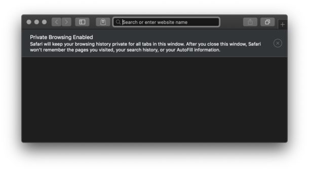
Of course a new private browsing window in Safari also has a short message at the top of that browser window saying “Private Browsing Enabled”, so that serves as a visual indicator as well. But that message only appears when a new window is opened to a blank private browsing page, and not opened links.
The color difference is fairly subtle, but if you compare the two side-by-side, you will likely see the difference, even if it’s not as much of an obvious indicator while in Dark Mode theme as appears when the Mac is in the Light mode theme appearance.
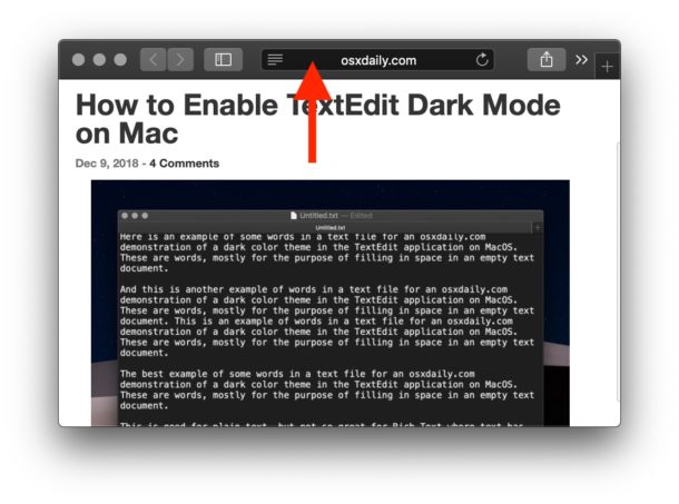
Here’s the normal browsing mode dark gray:
And again here’s the private browsing mode darker dark gray:

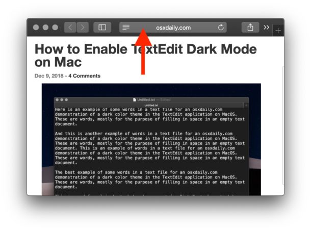
The animated gif below shows the two changing between one another, it’s admittedly subtle but focus on the URL bar where ‘osxdaily.com’ is shown and you’ll hopefully be able to spot the dark gray vs the darker dark gray.
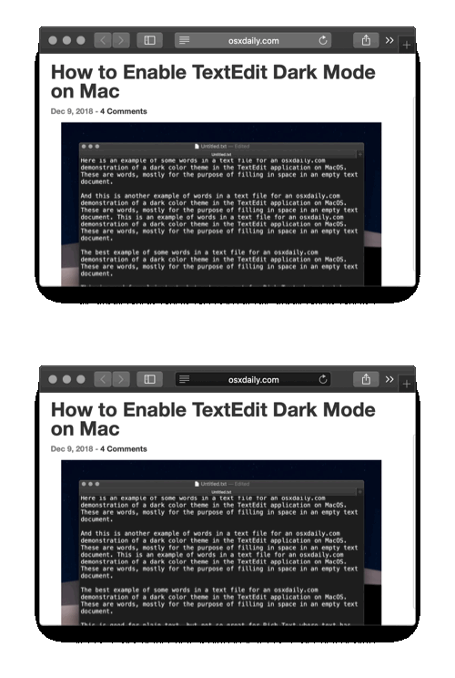
Nonetheless the visual indicator is right there, always at the top of the Safari private browsing screen, it just takes a bit more attention to notice it, and thus it can be easier to miss that private browsing mode is either enabled or disabled.
This private browsing visual indicator has tripped up some Mac Safari users, particularly if you’re opening a new link into a new Private Browsing window, or having a one-off private browsing session, since it’s just not as visually obvious that you’re in private browsing mode.
If you found yourself using Safari but it wasn’t in private browsing mode, and you wish that it was, you can always go back and delete specific Safari history on the Mac, or you can just clear all Safari web history on the Mac too. Remember, private browsing mode just prevents Safari from storing local caches, cookies, and data beyond the currently active browsing session, private browsing is not an anonymizing service or VPN or anything of that nature.
Anyway, look at the shades of gray in the URL bar of Safari, if it’s dark gray it’s the normal browsing window. If it’s a darker dark gray, it’s private browsing.
Or you can save yourself any of the confusion by just disabling Dark Mode and returning to the default Light mode appearance theme of Mac OS too, in which case the private browsing window is obviously marked with a much starker contrast and the dark gray URL / search bar.


Leave it to Apple to take something that should be made completely obvious and hide it so much that you have to google how to know if you are in a private browser and even then it’s difficult to tell. Good luck if you are color blind. Always choosing form over function.
Hey Paul,
It’s a great tips again and I use it since many years in Safari and Chrome Browser only in private window. When cashe is completely full I can clean it , also cookies
too. Thanks for sharing and have a great day.
PS: The first your Tip is very interesting, but I need a
more Time to work with it.
Thanks a lot again!🙏
Seriously, if you need to do all this rather than just click File-new Private Window, you got bigger problems.
It’s not about opening a new private window in Safari, it’s about identifying private windows when in Dark theme
D’uh, if you pay attention when you OPEN the window you would know.
They could have added a little red line or something in the top of the screen. This is still way too confusing, especially for a privacy oriented company.
yeah, but the differentiation with colours is working here (while I know that hard to distinguish these colours – light grey and dark grey because the colour toning is low)