How to Split Screen on iPad to Run Two Apps Side-by-Side
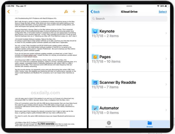
All modern iPad models have the ability to use Split Screen mode, allowing you to have two apps open at once, side-by-side. Using Split Screen on iPad is fairly easy once you learn how it works, but it’s also not necessarily discoverable or intuitive, so if you haven’t learned how to use the multitasking feature on iPad yet to split screen two apps then don’t feel left out.
This article will explain how to use Split Screen on any iPad with iPadOS 13, iOS 12, or later.
How to Use Split Screen to Have Two Apps Open at Once on iPad
Split View allows you to split the iPad screen for two apps, here’s how it works in new iPadOS versions:
- Rotate the iPad into Horizontal orientation if you haven’t done so already
- Open an app on iPad as usual, for example open Safari, Notes, Pages, Files, etc
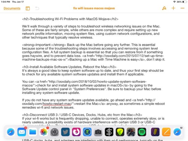
- Swipe up slightly from the bottom of the screen to access the Dock on iPad
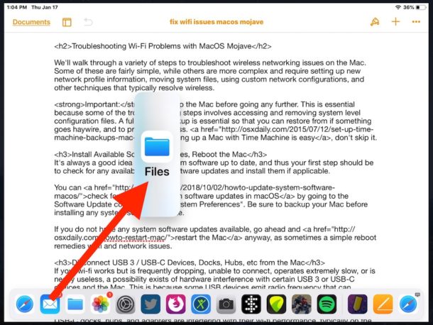
- Tap and hold on the other app you want to open into Split View and drag it off the dock onto the currently open app
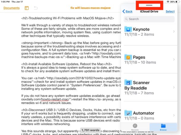
- This opens the second app into Slide Over view, now drag down the little tab dash button thing at the top of that second app to open that app into Split View
- Once the two apps are in Split View you can adjust the size each app takes up on screen by dragging the slider tab button in between the two app panels
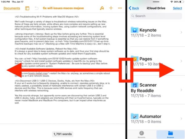
Note that while basically all modern Apple apps support Split View mode on iPad, not all third party apps will support Split View, including some popular apps like Spotify which continue to lack split screen app support.
How to Close a Split View App on iPad
Closing an app from Split Screen View is similar to resizing the size of the app on the screen, except you pull the slider tab all the way across the screen:
- From within Split View of two apps, drag the app dividing slider tab bar all the way over to the app that you want to close (leaving the other app open)
You can also close both apps at the same time (but they’ll remain linked in Split View) by returning to the Home screen of iPad as usual.
How to Resize Split Screen Apps on iPad
Resizing the screen space of an app in Split View is easy:
- From within Split View, drag the app divider slider tab bar in either in either direction to shrink or expand the size of that split screened app
If you drag the app all the way over, it will close out of split view.
How to Return a Split Screen App to Slide Over View on iPad
You can also return a Split Screen app into the Slide Over view:
- From within Split View, swipe down from the top of the app you want to send back into Slide Over view
Using Split Screen View mode on the iPad takes some practice, but once you get the hang of it you’ll find it’s a nice feature, particularly on the larger screen iPad Pro models.
If you find that Split Screen mode is not working, it may be because the app you are trying to enter into split screen doesn’t support the feature, or perhaps you had previously disabled iPad split screen apps and multitasking features.
Another handy multitasking feature for iPad is Picture in Picture mode, which lets you watch a video on the iPad screen hovering over another app.
Also, Safari on iPad supports split web browsing views so you can have two web pages open side-by-side, which is another excellent multitasking tool for iPad users.
The iPad multitasking features are the type of capabilities that are best to explore on your own to understand how they work, so try launching two apps into split screen view yourself. As mentioned earlier, most iPad apps support Split View but not all do.
If the whole split view and multitasking iPad thing seems confusing to you, then you might find the below video tutorial created by Apple to be helpful as it offers a visual video walkthrough of how the Split View multitasking features work on iPad:
This article obviously details using Split Screen view on any iPad with iPadOS 13, iOS 12, or later (and it’s mostly the same on iOS 11 if you’re still running an older version) but it remains to be seen if this approach will persist with future iOS versions, because Apple has changed how this works in the past. If your iPad runs an older version of iOS, then you might be interested in learning about accessing Split Screen on iOS 10 and iOS 9, which was completely different than the approach described here with iPadOS 13, iOS 12, and iOS 11, and presumably going forward with future ipadOS releases.
Of course this is covering split screen apps on iPad, but Split Screen features exist for the Mac too, and not just by having multiple app windows open at the same time. You can learn how to use Split View apps on Mac OS here if that interests you, it’s fairly similar to how it looks and behaves on iPad. The ability to split apps does not currently exist on iPhone, however.
Do you have any thoughts, tips, or tricks about using Split View apps on iPad? Share with us in the comments.


I have something important to say about the numerous variations of historical implementations of split-screen on the iPad.
As an experienced Retired Silicon Valley Designer/Builder, I can say without qualification that most modern, mainstream application design lacks advanced understanding of the far reaching and World changing benefits of first class systematic design and implementation.
In particular, there is a potential hundred fold benefit that is most often missed when true systematic design and implementation is possible.
The reasons are straightforward and testable, because true systematic endeavor will generally map the greater part of the domain of interest with a single set of uniformly applied set of applied precepts. These can be applied in an easily discerned, straight forward way any time that it is needed.
Contrast this to the ad hoc open-ended way that split-screen is implemented on the iPad. It fails to apply to every app, and requires each developer to go to extra unnecessary lengths in order for it to apply to the developer’s app.
But after this is done there is no systematic behavior that any user can depend upon. If you don’t understand this, the missing systematic behavior is called “design”.
The current Apple split screen implementation, being one of several around the Web when one tries to discover the current intended behavior, is a classic case of extraordinarily bad design by Apple. Sadly such cases abound in most, if not all, of the main stream programming World.
What is Apple best course of action? The first step would be to apply the obvious precepts to the problem. There is no good reason that in a well designed OS that prevent the user to treat the display of ANY APP within a split in the app’s particular window as if it were the iPad itself as far as the Particular app is concerned. Then just add the characteristic that this sub-iPad can have a resizable display screen size. That would mean individual developers would not have to do anything for the split screen to always work assuming clearly defined implantation standards for displaying of an app display.
If this turns out to be problematic to Apple or the individual developer, it means that the fundamental design of the iPad display is badly flawed, and needs to be reimplemented in a systematic way.
Yes, such a way of doing things usually does not and will not happen, but the rewards of doing this for split-screen capabilities would would increase the real value of the technology by an order of magnitude.
In fact, the usefulness of a product is roughly proportional to the portion of any particular dimension of substantial productivity that the product is capable of.
Please go back and read this last statement a number of times until you realize it applies to EVERY dimension of design and implementation that is substantially productive.
What you should realize is that very careful, pains taking systematic design could increase each substantial dimension of productive usefulness in a way that can result in multiplied usefulness for the product from a simple linear effort of implementation.
Contrast that with the increasing chaos the currently dominant ad hoc and open ended methods that increase hype, confusion, difficulty, and eventual abandonment which only leads to the next generation of increased seasoned callousness toward the users.
The fact is, a well designed, systematic approach only requires the designer and users to understand a single simple set of easily learned precepts to know how to intuitively use any dimension of the application or system or device.
Since with good design, such implementation map most of the dimension of interest, it reduces the cost of an exponentially growing capability to almost a linear level of effort. (more on that some other time)
Sorry I wandered off in the larger (and more important world) but coming back to the case of split-screen, I have been telling you all this because I spent a day or two trying to walk around this awful implantation of split screen because all I wanted to do is see two or three pages of my ForScore app side by side so I could spend weeks of practice on three different aspects of the music at every step of the way.
If you people had done your job right, I could have read a short paragraph about split-screen, and then could have used my app without having to figure out any other significant considerations, and I would have been happy as a lark for weeks to come as I learned to play my violin more like a lark sings instead of tearing my hair out because of your sinful ways (snicker).
I don’t think anyone clearly understands Split Screen on iPad, which is probably why they keep changing how it works, adding to more confusion if you do sort of use it or learn to. I don’t think it’s widely used either, the iPad screen is too small for dividing the screen. Maybe it works better with the $500 keyboard trackpad thing.
How about those of us on iPad 12.8″ Pro? We would split screen if it actually worked properly every time. Which it doesn’t.
I have something important to say about the numerous variations of historical implementations of split-screen on the iPad.
As an experienced Retired Silicon Valley Designer/Builder, I can say without qualification that most modern, mainstream application design lacks advanced understanding of the far reaching and World changing benefits of first class systematic design and implementation.
In particular, there is a potential hundred fold benefit that is most often missed when true systematic design and implementation is possible.
The reasons are straightforward and testable, because true systematic endeavor will generally map the greater part of the domain of interest with a single set of uniformly applied set of applied precepts. These can be applied in an easily discerned, straight forward way any time that it is needed.
Contrast this to the ad hoc open-ended way that split-screen is implemented on the iPad. It fails to apply to every app, and requires each developer to go to extra unnecessary lengths in order for it to apply to the developer’s app.
But after this is done there is no systematic behavior that any user can depend upon. If you don’t understand this, the missing systematic behavior is called “design”.
The current Apple split screen implementation, being one of several around the Web when one tries to discover the current intended behavior, is a classic case of extraordinarily bad design by Apple. Sadly such cases abound in most, if not all, of the main stream programming World.
What is Apple best course of action? The first step would be to apply the obvious precepts to the problem. There is no good reason that in a well designed OS that prevent the user to treat the display of ANY APP within a split in the app’s particular window as if it were the iPad itself as far as the Particular app is concerned. Then just add the characteristic that this sub-iPad can have a resizable display screen size. That would mean individual developers would not have to do anything for the split screen to always work assuming clearly defined implantation standards for displaying of an app display.
If this turns out to be problematic to Apple or the individual developer, it means that the fundamental design of the iPad display is badly flawed, and needs to be reimplemented in a systematic way.
Yes, such a way of doing things usually does not and will not happen, but the rewards of doing this for split-screen capabilities would would increase the real value of the technology by an order of magnitude.
In fact, the usefulness of a product is roughly proportional to the portion of any particular dimension of substantial productivity that the product is capable of.
Please go back and read this last statement a number of times until you realize it applies to EVERY dimension of design and implementation that is substantially productive.
What you should realize is that very careful, pains taking systematic design could increase each substantial dimension of productive usefulness in a way that can result in multiplied usefulness for the product from a simple linear effort of implementation.
Contrast that with the increasing chaos the currently dominant ad hoc and open ended methods that increase hype, confusion, difficulty, and eventual abandonment which only leads to the next generation of increased seasoned callousness toward the users.
The fact is, a well designed, systematic approach only requires the designer and users to understand a single simple set of easily learned precepts to know how to intuitively use any dimension of the application or system or device.
Since with good design, such implementation map most of the dimension of interest, it reduces the cost of an exponentially growing capability to almost a linear level of effort. (more on that some other time)
Sorry I wandered off in the larger (and more important world) but coming back to the case of split-screen, I have been telling you all this because I spent a day or two trying to walk around this awful implantation of split screen because all I wanted to do is see two or three pages of my ForScore app side by side so I could spend weeks of practice on three different aspects of the music at every step of the \ been happy as a lark for weeks to come as I learned to play my violin more like a lark sings instead of tearing my hair out because of your sinful ways (snicker).
f.y.i. Step 5 is not necessary if in step 4, you drag the app icon to the left or right side of the current app.