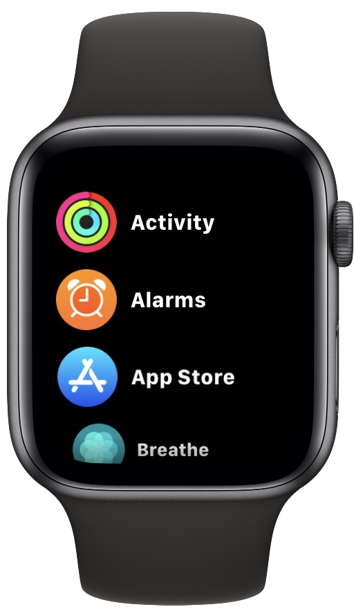
How to See All of Your Apple Watch Apps in an Alphabetical List Instead of a Grid

When you think of the Apple Watch app launcher or Home screen, you think of the grid of icons that Apple shows in all of its promotional material. That’s become the way to use an Apple Watch. But for some users, it’s never been a great way to find apps. And even if you know where they are, tapping them isn’t always the easiest thing in the world. Apple fixed all of that in modern versions of watchOS by adding the option to see all of your apps in an alphabetical list instead.
And, reader, we’re here to tell you that this trick offers another way for users to browse apps on their Apple Watch from here on out.
Without further ado, let’s dive in and get right to the goods, shall we? We’ll cover how this works in both watchOS 7 and later, as well as watchOS 6 and earlier.
How to Browse Apple Watch Apps as a List
In watchOS 7 and later:
- Press the Digital Crown to see the home screen of Apple Watch
- Choose the “Settings” app
- Scroll and choose “App View”
- Select “List View” from the App Layout options
In WatchOS 6 and earlier:
- Press the Digital Crown on your Apple Watch to return to the Home screen.
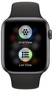
- Firmly press on the center of the screen.
- Tap “List View” to switch to an alphabetical list of your apps.

And there you have it, now you’ve got apps in a list view on your Apple Watch.
If for some reason you decide that a list isn’t for you and you prefer the grid layout, no problem. Follow the process again, this time tapping “Grid View” when prompted.
Using the list view has an added bonus, too. You can more easily delete apps by swiping to the left and then tapping the trash can icon.
This is just the tip of the iceberg, too. We have a growing collection of tips and tricks for your Apple Watch. Why not check them out?


Well it did work on my Apple Watch 2. The last software seem to have stop it working on 6.9.2
A touch just makes them shake and no selection then comes up.
I think the next move on the App listing, would be a user defined ordering. Similar to how Stocks or Weather cities can be ordered. I would then definitely do the listing method. I figured out how to made the Grid display bigger, so I can push them easier. But moving them around to my liking has been difficult, because it wants to keep pushing up or pushing down a different one. Doing it on the Watch App on the phone is not much easier.
Why do you remove my comments?
Did I ever hurt someone in any way?
Often comments are automatically flagged by our filters for any number of reasons which can hold them for review (even my own comments often get flagged this way), sometimes they’re even erroneously flagged as spam too which is annoying. You’ve done nothing wrong, and we appreciate your comments, sorry about that!
Got it.
Thank you, I appreciate your reply.
Kind regards.
Doesn’t work on OS ver 7.0.2 :(
Instructions have been updated to include directions for watchOS 7 and later, where the list view is found in Settings instead. Sorry about that!
Doesn’t work.
Apps start to wiggle instead.
watchOS 7.0.2
Apologies, the article has been updated with watchOS 7 and later instructions, where the app layout option is found in Settings.
Hi Paul,
Please, you don’t have to apologize for anything.
Actually, I believe we readers must thank you for your daily tips.
Thanks for the kind words Alex, and thanks for being a reader!
Sometimes we goof up or miss something, but we certainly try to correct it when we do. Feedback is always appreciated!
Cheers,
Paul
If for some reason you decide that a list isn’t for you and you prefer the grid layout, no problem. Follow the process again, this time tapping “Grid View” when prompted.
I’m sorry but this does non work, at least on my series 5 with the latest OS version (7.0.2)