iOS 15: Revert Safari to Old Design & Get the Safari Search Bar Back on Top on iPhone Screen

Two of the the most common questions asked by people after updating iPhone to iOS 15 is “can I revert back to the old Safari design?” and “how do I get the Safari search / address bar back to the top of the screen?”
If you don’t like the new Safari design with the address search bar on the bottom of the screen, you’ll be happy to find out that you can reverse this change and get the old Safari design back again.
How to Move the Safari Address / Search Bar Back to Top on iOS 15 for iPhone
If you’re dissatisfied with the new Safari design you certainly aren’t alone, here’s how you can switch the search/address bar back to the top of the iPhone screen:
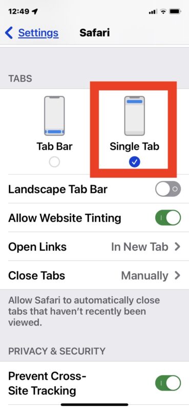
- Open Settings on the iPhone
- Go to “Safari”
- Scroll down and select “Single Tab” to restore Safari to the old design with URL bar on the top

The change is instantaneous, and the next time you open Safari on iPhone you will find the search bar / address bar is back to the top where it used to be.
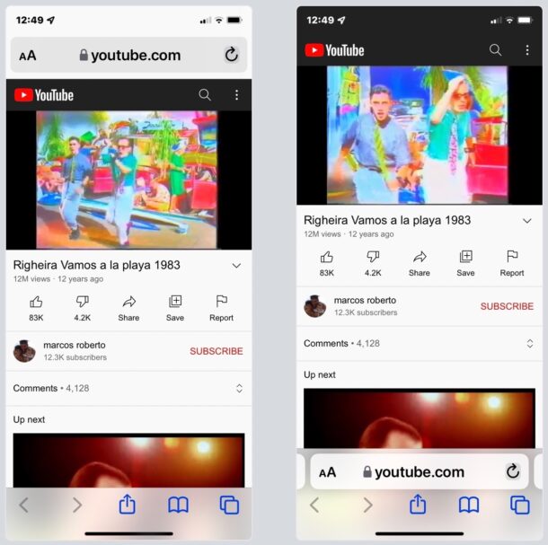
Here is the Safari Address/Search/URL bar back in top on an iPhone with iOS 15:

And this is what the same webpage looks like with the Safari address/search/URL/toolbar on bottom in iOS 15, which is the new default setting:

Other changes to Safari were made with iOS 15 as well that are proving too bother some users, like the search/toolbar color tinting, and the new card view of Safari tabs which some users say makes it hard to read the title of websites and webpages.
Users who don’t like the toolbar tinting in Safari can disable that in the same Safari Settings menu, by turning off “Website Tinting”.
The new Safari tab card view is not adjustable, however, so that is one you’ll have to get used to.
Do you love or hate having the Safari search bar and address bar on the bottom of the iPhone screen? Did you make the change to switch the address bar back to the top of Safari? Let us know your thoughts and experiences in the comments.


I too have ADHD and have to mindful to keep organize. The Rolodex card view of flipping one card at a time keeps my focus narrow, great. Now I have to rely on my speed reading ability to scan the many cards presented in view, okay. What I can’t stand is the order shifts visual placement location when deleting a earlier card. This of course doesn’t happen in Rolodex format. So each time the cards shift their placement, it’s a bit alarming having cards redirected to new spaces. Changes present difficulties to overcome. All unnecessary stimulations are annoying frustrations that slow me down.
HATE IT, HATE IT, HATE IT, LOTH IT!!!! At the very least Apple could have given us the option of these ridiculous tabs. Bring back our stacking tabs!!! NOW!!!!!
The new tab design is horrible! It’s harder to scroll through them at a glance. Before it was like flipping through pages in a book and was very easy to use, now you have to look at a whole table of single pages all next to each other.
Change it back!
Totally agree card view is horrible now in safari. I want file view back!!! Everyone who’s annoyed leave feedback to apple do maybe we can get it back as an option:
https://www.apple.com/feedback/
The “tab screen” (thumbnails) is very difficult for many of us to use. The more tabs, the smaller the “thumbnails” can make them confounding to separate from each other, too small for those with poor eyesight, and just plain annoying!! Please give us the option of having the screen style we’ve been happily using for so many years.
This is truly a problem. Perhaps you’re making it too difficult for many of us to use, especially on our small screen phones, and your company will find itself in a courthouse.
Thank you.
It’s terrible and the old version would be an update from this one.
Cards must be made back into files as a choice. Files were easily searchable and moveable. I can see fine and actually got a magnifying glass to figure out which tabs were which. They need to fix this!
Absolutely hate the card view design. Give me back the old safari!!
New card view is horrible
Dislike most all of new OS function
How do I revert back to older version I had
Agreed with prior comments- why waste precious developers resources to fix something that wasn’t broken
Apple strength is going downhill
These imstructions don’t work for iPads. There’s no single tab view that can be selected.
As others have pionted out, the new design is a waste of space and the thumbnail view is inferior in comparison to the old stacked pages view.
while it’s OK for a website to create a menu on the left or right side of the screen, it is not OK for a browser to do so. People run browsers to visit websites, they don’t run browsers for the app itself. What’s next, browsers that play brower-based advertisements whatever wed site you go to?
The card view wastes space. Changed the URL bar back to the top immediately as soon as I figured out how
FU Apple for changing a working app. Ready to switch to Android, Immediately!
iOS 15 SUCKS!!!
Seriously dissatisfied with IOS 15 Safari.
Don’t fix what’s not broken!
This is horrible. Going to revert to an older version just to o not deal with this.
Like others here, I just want the old interface back. All of it.
If put the address/search bar back where it belongs, so thanks for that, but that new card view is awful!
I absolutely HATE the card view. It’s beyond frustrating. I have ADHD and struggle to stay organized. This makes it 10X harder for me to manage everything. I like the groups of tabs but I don’t like the layout. I now just have over 100 open tabs instead of the minimal I usually have. Hate it.
sorry apple. I put the search where it belongs on top. I turned off the dumb color thing and really want tabs one across not two in tab view in portrait mode. the tiles are fine but let me zoom in and out like photos. The cards looked better and worked great as a stack. dont force change just add features with settings to keep either look etc.
I’m glad to see these options, as I really didn’t like the “new look”. Thanks for the help.
Card view is horrendous, all are too small to see and if I try to page left right with tabs so they are big their too slow. Horrible redesign. I’m going to have to abandon safari on my phone :( 0/10 for usability and speed
Can you make turn the tabs back to what they were before?
You can move the Safari URL/search bar to the top, and turn off the color tinting, but that’s about it. The tab screen (thumbnails) can not be changed.
IOS 15 is awful. I hate that design. Apple is dumb. No more apple for me next time. Hello Android someday.
Didn’t ever imagine that someone in the US may like the Italo Disco duo Righeira!