iOS 8.4 Beta 4 Released for Testing
 Apple has released the fourth beta version of iOS 8.4 to users participating in the developer testing program, the same build is also available to those in the iOS Public Beta program, though it’s labeled as iOS 8.4 Public Beta 3. The latest build arrives as 12H4125a and includes the newly refreshed Music app, complete with the Apple Music service.
The primary focus of iOS 8.4 seems to be the inclusion of the new Music app, though the accompanying release notes to the download mention that bug fixes and other improvements are included in the release.






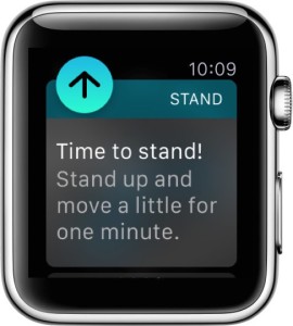 Apple Watch has a variety of fitness tracking and motivational features that are aimed at improving the wearers activity and health, or at least their awareness of it. One of the most notable features for Apple Watch users is the “Stand Reminder”, which, much as it sounds, is a gentle reminder to stand up every 50 minutes and move around for a bit. The Stand Reminder feature is aimed at combating the incredibly detrimental health consequences of sitting too much, something that nearly all of us with desk jobs do, and the gentle tap and chime can be quite effective to
 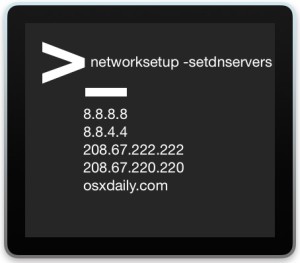 Advanced Mac users may find it useful to know that DNS servers in Mac OS X can be set from the command line, without having to turn to the System Preferences Network control panel. While the GUI Network control panel is undeniably the easiest approach for most Mac users, the command line method offers benefits for many use cases, particularly for troubleshooting, making temporary DNS changes, and remote management with
 If you spend a fair amount of time emailing from the iPhone, you’ve almost certainly come across a situation where you’ll be writing out an email, but need to get data or information from another email in your Mail inbox. That used to be a challenge, but modern versions of the Mail app in iOS support a really great minimize email feature, which, just as it sounds, allows you to minimize a current email composition or reply, return to the primary Mail inbox screen (and access other emails), and then be able to switch back and maximize that recently minimized email message.