Fonts Look Blurry in OS X Yosemite? Change Font Smoothing Settings
Some users of OS X Yosemite have found the Macs new system font, Helvetica Neue, looks blurry and is generally harder to read than Lucida Grande, the system font it replaced. The blurred fonts are sometimes able to be reproduced in screenshots but usually they show up looking normal, which makes demonstrating this issue a challenge for those impacted by it. It’s hard to know if this is because of a bug, differences in individual displays and monitors, a result of the font face itself, the generally smaller and thinner font size, or the level of text antialiasing used, but manually adjusting the latter by tweaking font smoothing settings can be helpful for some users who are having trouble with the fonts appearance, particularly if the font looks blurry or fuzzy to you on a Mac with a non-retina display.
We’re going to cover a few options and you’ll have to try them yourself to see which looks best for your eyes and your display. Some users report that fonts look best with the LCD Font Smoothing feature turned off completely in OS X Yosemite (which actually just reduces the level of antialiasing, rather than disabling it), while others may prefer the look of a modified level of antialiasing. After trying them out, you may even decide the default setting is the best, which is why you really need to see how they look on your own display, it’s going to be different for everyone.
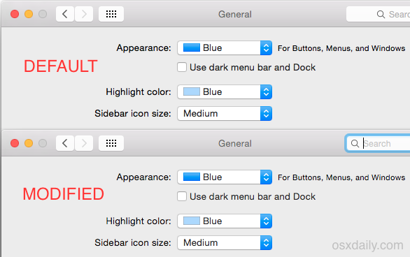
The differences are subtle, and some users probably won’t notice much of a change at all. This animated GIF cycles between the three options available; default, modified, and none, which gives an idea of how minute the antialiasing settings changes really are:
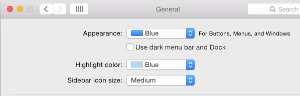
In full size screen shots, here is the default font smoothing option:
Here is the modified font smoothing option (set to 2):
Here is the font smoothing disabled option (which isn’t really disabled, it’s just minimized):
Subtle, right? It certainly looks that way in screenshots, but on some displays these minor changes can have a notable impact on how text looks on screen in Yosemite, so try out each setting yourself and see what you think.
Disable LCD Font Smoothing in OS X Yosemite
Antialiasing onscreen fonts and text has been a part of the modern OS experience for well over a decade, but something is different in Yosemite is different and in some situations it seems to cause fonts to look blurry our out of focus rather than smoother. If you find that to be the case, try disabling the setting:
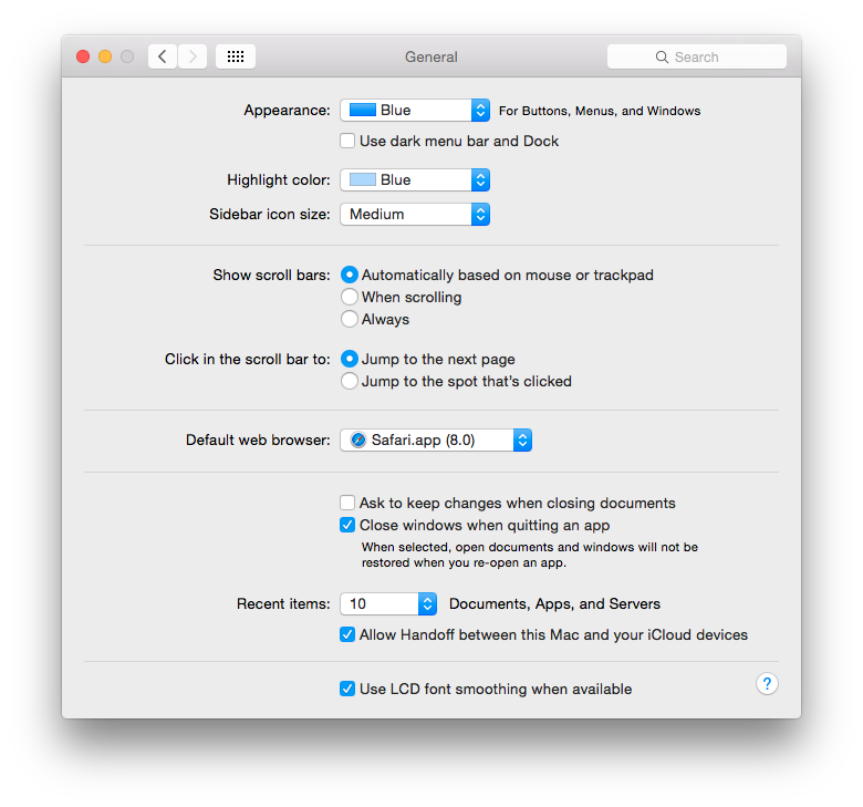
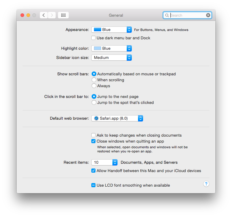
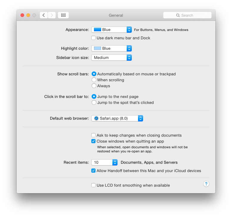
- Open System Preferences from the Apple menu and go to “General”
- Uncheck the box for “Use LCD font smoothing when available” at the bottom of the preference panel
- Log out and log back into the user account for changes to take effect everywhere
The downside to this is that fonts may appear a bit more jagged and perhaps even thinner, so it’s a bit of a tradeoff.
Another option is to change the font smoothing setting in OS X by turning to the command line. This used to be an easy to use menu in the General preference panel but Apple removed the option to adjust this through the preferences a while ago, making it necessary to use a defaults string to modify AppleFontSmoothing behavior instead.
Change Font Anti-aliasing & Font Smoothing Strength in OS X Yosemite
Changing the font smoothing strength requires using the Terminal app and defaults command strings. Having tested this for a while in Yosemite, it appears there’s only really three options available in Yosemite, regardless of the integer number attached to AppleFontSmoothing. OS X Yosemite defaults to using AppleFontSmoothing “3”, and there does not appear to be any visible difference between setting it to “2” or “1”, which in either case results in a lighter font smoothing setting than the default. Setting it to “0” is the same as turning it off in the preference panel, which again, doesn’t completely turn off font smoothing, it just reduces it to an even lower strength of antialiasing.
Set a Softer Font Smoothing Setting
Enter the following defaults string into the Terminal and hit return:
defaults -currentHost write -globalDomain AppleFontSmoothing -int 2
You’ll want to log out and log back in for the change to appear everywhere.
It’s important to note the differences are subtle, and many users probably won’t be able to distinguish one from the next. If you have a retina display, anything other than the default option may look poor to you.
Return to the Default Font Smoothing Setting
Using either of the following defaults commands returns font smoothing to the default:
defaults -currentHost write -globalDomain AppleFontSmoothing -int 3
Or use a defaults delete string:
defaults -currentHost delete -globalDomain AppleFontSmoothing
You can also simply go into System Preferences, toggle LCD font smoothing to OFF, then turn it back on within that preference panel. Follow this up with a log out and back in (or reboot).
This combined with using the Increase Contrast setting helps to make things a bit more readable in OS X Yosemite for some Mac users, though based upon comments, emails, and reviewing a wide variety of forums, many users are going to desire something akin to the iOS bolding fonts function for the Mac, if not an ability to actually increase the font sizes in use, also similar to what iOS offers.
If you’re bothered by the way text looks in OS X Yosemite, perhaps the best thing to do is let Apple know your thoughts through their official online feedback form for Mac OS X here.

I think I finally found a solution to at least ease the stress on the eyes without softening or turning off the font smoothing. In the “System Preferences window”, under “Displays”, in the “Color Tab”, there is a list called display profile. I am assuming that to be the color profile. Choosing a different option than the default one finally gave me a setting I was comfortable with. From what I understood, it was trying to use Mac color profile. But when I changed that to the one provided by the Dell monitor (this was somehow already present in the color profile list), I found a lot of comfort. Try it out and please let me know if this works just for me or is an actual solution.
Device:
Mac mini (Late 2014) connected to a Dell 24 inch monitor.
I have a Retina MacBook Pro, but honestly, I’ve always hated the LCD font smoothing even on my screen. It’s really hard to read and my eyes are very sensitive, a few hours on the computer and I’ll get headaches for the whole day. This is why I’m thinking of switching back to Windows (their screens are not perfect, but at least I feel fine even after almost a whole day of gaming on it), especially since they basically deleted every useful function from the new MBPro upgrade.
I just upgraded my 3 yrs old work Macbook Pro from Mavericks to El Capitan (because some Docker software requires OSX 10.11 at least). What a disappointment. I cannot read the screen any more. I tried everything in this thread and it helped a bit, but it is still not good.
Also the Terminal window is very hard to read now. I tried different fonts there, but they all look blurry.
I think I’ll downgrade tomorrow. (That is 2 working days wasted now)
typo “their” not there. Terribly sorry.
So frustrating, I have tried all of the above and still blurry awful. I have 20/20 vision even in my 40’s, and own everything Apple. Macs are such lovely pretty things, that are expensive and hence not disposable. Releasing OS updates that forcibly destroy slightly older screens (2/3yrs old) to increase sales may not be illegal, but is morally corrupt. If you buy something it should work, for the manufacturer to break it a couple of years down the line for what is clearly for there own gain is disgusting. SHAME on Apple and there money mountain.
Fred, I can relate, I hate the font in OS X Yosemite and I have a hard time reading it, it’s very blurry and difficult on the eyes, I have good vision and I’m in my 30’s so it is not an age thing and it’s not just you. The only solution I found was to replace it with Lucida Grande, which is the font that came with OS X Mavericks and before. I had to do this with a patch from GitHub, it is reversible so you can try it out:
https://github.com/schreiberstein/lucidagrandeyosemite
I replaced the font, then I used “Increase Contrast” to make things darker and easier to read, it looks a little clowny elsewhere, but the font is more readable because it gets darker:
https://osxdaily.com/2014/10/22/increase-contrast-mac-os-x-yosemite/
OS X El Capitan will replace the font with San Francisco rather than awful Helvetica Neue, which should offer some improvement as well, but that’s not until September. That Apple is replacing the horrible font after a year suggests we are not the only ones to be annoyed with it, I bet they received many complaints from people who suddenly got a headache reading their Mac.
All the images with a drop shadow do not render true. The text appears to have a white halo. Clicking the image and viewing the image by itself doesn’t show the white halo around text. Less than useless, misinformation. The images on this page aren’t even shown at 100% so there’s scaling. What’s the point? Great article otherwise, please correct the image rendering.
We compress images so they load at a reasonable speed to web users, uncompressed lossless images would be several MB each on a retina display, not practical for the web.
Anyway, this is one of those things that’s best tried yourself anyway, as each user has different eyes and each users display will show the fonts and smoothing slightly differently with anti-aliasing. Very much a matter of personal preference with how it’s viewed. I turned it off on my Non-retina Mac, for example, but have it enabled for a Retina Mac.
It appears that the font blurriness is a bug. I found this post on Apple Support:
“Adjusting LCD font smoothing won’t fix the issue. Simply restarting will fix the issue MOMENTARILY, but the issue will return after some time. Browsing through Open Radar seems like it may be related to bug in CoreImage… this will only be fully resolved in a patch from Apple.”
I found this to be the case. Sometimes the font looks crisper and then for whatever reason the font degrades again. It also affects the menu bar. It’s really frustrating.
This article is great, it goes beyond the changing the font type, more closer to the main source of the problem in Yosemite font rendering issue.
Helvetica Neue was created in 1983, with no intention to be used on displays, in contrast to Lucida Grande, which was created in 1999, with particularly displays in mind. Helvetica Neue works fine with retina displays, but not with non-retina displays. That’s just how it is.
Agreed, the light grey Helvetica Neue looks terrible on my Mac screens, it actually hurts my eyes which is something I had never experienced looking at a computer before. I used the hack to replace with Lucida Grande, but how many people know how to do that? What a mess, give us an option in the Appearance preference panel. At least let us bold the fonts like we can in iOS.
Agreed 100%.
hi all,
I just got a macbook pro and a iMac from my university…
After the usual first-days-crysis of a linux user approaching mac,
I am indeed still struggling with this damned fonts…I hope your suggestions will work
all best,
lltol
Very helpful. Visible difference with the LCD font smoothing turned off. Thank you!
This was super helpful, my eyes were not happy with any of that blurriness.
Unchecking smooth for LCD at the Fonts panel, and after log off and in, the screen looks now as cristal clear in my iMac 27 (2007 model). More, my iMac gets faster now.
Thank you for this article!
Here you can find new system fonts for Yosemite – Lucida Grande and Fira Sans. Gotham and Proxima Nova comming soon. Easy to install.
http://www.libor-lepka.cz/replace-system-font-helvetica-in-yosemite.html
Great thank-you. Anyone know whether he’s planning a version of Comic Sans?
default settings probably looks great on retina “How many Mac users have Retina Macs? 10%? 15%?” …yes, true, however, the retina MBPS have been around about 2 years now, and, Apple always builds an OS, whether it’s iOS or OS X, around a new piece of hardware, and thinking forward from there.
Yosemite (OS X 10.10) was developed in conjunction with the retina iMac. I think they offered beta testing with it to get more input on how well it works/looks with non-retina macs, for one thing. But, while Apple maintains compatibility with older Macs, to a certain extent, they aren’t going to limit themselves to backward compatibility, but, keep going forward. GM makes crappy cars and they are very backward thinking, and were the first to have troubles during recession. Hyundai/Kia on the other hand, are more competitive and forward thinking, improving and growing.
Yosemite was designed with retina in mind, this is the new look for some time to come. Next year will likely introduce Mac Pro update, retina monitor, retina MB Airs, …they might drop non-retina MBP too.
The fact is that beginning with Lion they have penalised people who do not have Retina displays. And they have also started penalising their ageing user-base for not having less than perfect vision.
Modified the setting to “2”. This works great! Now my eyes don’t hurt anymore!
I’m going to point out the obvious:
The reason the “font looks blurry” in OS X Yosemite is because it’s Helvetica Neue in micro font sizes ranging from 8 to 12 in LIGHT GREY against a grey background.
Unless you change the fonts to something like size 12-16 in BLACK, text is going to keep looking blurry. There’s no way around that. I don’t care what font smoothing setting you change.
there is stg right about this. Yes Lucida is better to read but not only that is the issue, they changes very bad contrast mechanisms (including colors). They made the fonts grayer (paler), rather than dark, and then they also made the fonts thin skinny, so each character has less pixels. This is similar to Win 7 experience I had to always use lower resolution to make fonts look darker. And even in retinas I have to use, for the first time for Mac when I tested Yosemite on imac retina.
Just applied this to my (see below) “older” iMac and then cancelled my optometrist appointment. Looks great now. iMac still running strong. Thanks for the script.
Model Name: iMac
Model Identifier: iMac8,1
Processor Name: Intel Core 2 Duo
Processor Speed: 2.8 GHz
Number of Processors: 1
Total Number of Cores: 2
L2 Cache: 6 MB
Memory: 4 GB
Yosemite sucks!
That’s all there is to say!
This article forced me to make an appointment with my optometrist.
I gave up trying to fix the blurry font in Yosemite and went back to Mavericks. So much better now.
I tried all the system settings and gave up. Instead I used the hack that installs Lucida Grande as the system font and my eyes are much happier! This is on an 11″ MacBook Air.
How do I do that? Can’t find anything about that hack.
This is what you’re looking for:
https://github.com/schreiberstein/lucidagrandeyosemite
Yosemite is the worst
Yea, don’t worry Apple knows. And don’t worry, Apple doesn’t care. They won’t change a thing.
https://discussions.apple.com/thread/6602718?searchText=font%20blurry
https://discussions.apple.com/thread/6603293
https://discussions.apple.com/thread/6602718?start=45&tstart=0
https://discussions.apple.com/thread/6623258
https://discussions.apple.com/thread/6611325
https://discussions.apple.com/thread/6607402
https://discussions.apple.com/thread/6629818
http://forums.macrumors.com/showthread.php?t=1751546
Remember iOS 7? Nobody liked it. You still have it. Suck on that, loyal Mac users.
Not tru. I like both iOS7/8 and Yosemite very much. I cannot confirm the problems people experience, with my Mac mini and 24″ LCD. I think it’s working great.
you are a rare example.
I don’t think any of you understand, Apple wants you to have a Retina Display with OS X Yosemite. If you don’t have a Retina display, your experience is suboptimal. This is not a conspiracy or a debate or anything, this is what Apple says repeatedly on their OS X Yosemite website. Here are direct quotes from APPLE.COM/OSX/
“New system font
OS X Yosemite has a modern, easy-to-read font throughout the system that looks great on a Retina display.”
http://www.apple.com/osx/all-features/
“For some, the choice of a font may not be a big deal. But to us, it’s an integral part of the interface. In OS X Yosemite, fonts have been refined systemwide to be more legible and consistent across the Mac experience. You’ll notice a fresh, new typeface in app windows, menu bars, and throughout the system. The type looks great on any Mac, and even more stunning on a Mac with a Retina display.”
http://www.apple.com/osx/design/
Don’t have a Retina Mac? Tough cookies, spend $2500 and buy one, or stay on Mavericks.
I agree, the new Yosemite font was reason enough for me to revert to an earlier back up in my Time Machine. I wasted the better part of the day downloading and installing the free “upgrade” to Yosemite, and within minutes, realized I couldn’t read the system font. I didn’t try changing it with all the steps mentioned. I just went back to Mavericks. All better! Apple needs to smarten up. We don’t all buy the newest machines. We use our Apples until they stop working. I won’t use Yosemite unless they go back to a readable font.
Captain Obvious. Thanks for the patronising ‘you don’t understand’ post.
I think people do understand. They don’t think it’s a conspiracy. People just don’t like it. Is that OK?
‘Buy a $2500 display or live with Mavericks’? Even Mavericks looks worse on non-retina.
No, the question is why Apple do not help people who cannot afford to spend the extra $2500, as you so clearly can.
The other question is why older people whose eyesight is slowly degrading get penalised with lower contrast, harder to read fonts. Agism from the people who wrote the Human Computer Interface Guidelines book?
And I also would like to add: Do not believe always what you are told. I tested imac Retina for a month, unfortunately via Yosemite. I had to use lower resolution than “best-for-retina” option to see better. It is definitely worse experience than macbook pro retina with Mavericks on it. I had for the first time eye strain issues. The problem is not only about the type of the font, I checked font rendering is changed, fonts are now thinner, makes it harder to read, even in Retinas, maybe only “looks good” , but read/write experience is bad.
I can’t tell the difference or maybe the difference is really that minor.
I forcibly installed Lucida Grande as my font in Yosemite. Then I used some junkhack tool to increase all system font sizes by 50%. Those two things made a difference, but we have to use some sketchy hack utilities to do it because Apple is forcing the Yosuckite nightmare onto us.
Now if only there was a way to change the font size in Safari. Oh I guess there is, it’s called “Google Chrome”.
Use Tinker Tool which is fee you can alter the fonts in the system and the fonts for safari no special hacks required
Doesnt work anymore..
I don’t think the screen shots here do this any justice at all, the changes are notable on my Mac connected to a 24″ display. I’m using the “None” option at the moment which I think it looks the best, though I still have to use the terribly ugly “High Contrast” mode in Yosemite which seriously looks like a bad joke.
Why do the fonts look so bad? Is it the font face of Helvetica Neue? It looks fine on my iPhone and iPad, but those are retina, perhaps it is that simple. How many Mac users have Retina Macs? 10%? 15%? Personally, I know one person who has a retina Mac right now. One.
I saw someone describe using OS X Yosemite as “wearing the wrong pair of prescription glasses” and that it induces eye strain, that pretty much nails my experience with Yosemite too. My eyes wind up bloodshot at the end of the day, and I feel exhausted by looking at the screen. Everything is too bright, but there is insufficient contrast, and the font size is so tiny that it’s nearly laughable. You have to squint to see anything. Am I just too old for OS X at the ancient age of 33? I don’t even wear glasses.
Let me put it another way, if your eyes are sensitive at all (I didn’t even know mine were until now) and you haven’t “upgraded” yet, just avoid OS X Yosemite. You will regret it.
Personally I would be happy if Apple just gave us the version of the OS X Yosemite UI they introduced at WWDC and still have on their website as a video:
http://www.apple.com/osx/video/
Clear, crisp, dark text and fonts. Sharper contrast. Less Blur.
So sometime between that Yosemite intro video and what we have now, we lost crispness to the fonts, all contrast, and gained a bunch of useless blur. Ugh.
The given URL is dead :-(
So no comparison possible :-)
Replace the Yosemite font with Lucida Grande
https://github.com/schreiberstein/lucidagrandeyosemite
you’re welcome