Humor: Use Comic Sans as the System Font in OS X Yosemite
If you’re not happy with the usage of Helvetica Neue as a system font in OS X Yosemite, why not go completely ridiculous and replace the Mac system font with Comic Sans? Yes Comic Sans, somewhere high on the list of worst fonts ever, can now be the universal system font on Mac OS X. Even if you don’t find it particularly amusing, at the very least it should give you a newfound appreciation for Helvetica Neue.
This is obviously a joke (and the idea originated as one too), but it works and makes for an amusing look to OS X Yosemite. You can cheese out your own Mac or play a hilarious prank on someone, or on a more serious note, it may be a decent system font for a kids workstation. As you’d probably expect, Comic Sans is a goofy system font and looks ridiculous. Want to try it yourself? Of course you do, it’s a piece of cake to install and easy to reverse too.
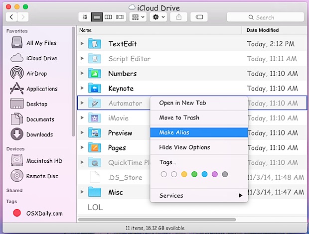
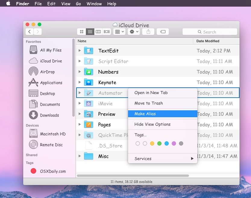
Here’s what you’ll want to do to replace the system font of OS X with the universally lambasted Comic Sans font face:
- Download the Comic Sans Yosemite Sans font pack here from FAT Lab (direct ZIP download link)
- In the OS X Finder, hit Command+Shift+G and go to ~/Library/Fonts (the user fonts folder)
- Unzip and toss the Yosemite Sans font files into ~/Library/Fonts/ then log out of the active user account
- Log back into the Mac with that same user account to experience OS X with Comic Sans
If you want to reverse this, and you most certainly will unless this is a prank, simply remove the two fonts you added from ~/Library/Fonts/ then log out and back in again. Super easy to undo. And yes, if you do this as a prank, you should absolutely let the target know how to undo this.

This amusing find comes to us from FAT Lab, who also provides this amazing screen shot of their own Comic Sans’ed Yosemite Mac, which is complete with a bunch of ridiculous Dock icons. Looks great!
And yes we’re poking fun a bit here, but the new thinner system font in OS X Yosemite has been fairly divisive and has frustrated many users. Some designers insist that readability suffers with Helvetica Neue (the new system font) and is significantly worse compared to Lucida Grande (the old system font in OS X). On a non-retina display Mac I tend to agree with the complaints, and I personally modified OS X Yosemite to use Lucida Grande again for that reason, along with Increase Contrast it makes reading the Yosemite interface on a MacBook Air with a regular display much easier on the eyes. Of course, another potential cause of some of the font complaints may be the odd font smoothing behavior in OS X Yosemite which curiously only happens on some Macs, with the result producing screen text that looks blurred and out weirdly out of focus.
Anyway, if you’re bothered by Helvetica Neue, Comic Sans is probably not the answer except to get a good laugh.

I think we need to change everything to Papyrus.
Wow, how to turn a bit of fun into a debate. Come on guys, it was a joke.
“When someone sends me something written in Comic Sans it makes me want to smack them”
Hahaha made my day!!! 👍👍 thx
Allways like Comic Sans and was quite surprised no one else does
I wonder how bad it must be to have the blurring thing… I guess my family is lucky and hasn’t got that problem yet.
The blurring font thing is very annoying, I have it on a MacBook Airs (and the blur even exports to an external HD monitor, so there is no respite except using OS X Mavericks where the blur problem does not exist), it looks like someone applied a light blur effect to screen text. The text is just enough out of focus to make your eyes ache as you read, it’s still readable but it makes you feel like you need to squint to enhance the sharpness, except that no amount of squinting improves it. Someone described it as picking up someone elses prescription lenses and putting them on, that’s fairly accurate. Or if you don’t know what that’s like, it’s kind of like trying to read while having wet swim goggles on, or even water in your eyes that you have to blink out a few times before vision regains itself.
I really don’t like OS X Yosemite, it needs a lot of work and shouldn’t have been released to the public in such an inconsistent state. The inconsistency drives me nuts too, one of my friends with a new MacBook Pro has no problems and I go use their computer and it looks nice and everything works. Then I use mine and it’s like a completely different experience. It makes me think Apple didn’t test OS X Yosemite on any machine older than 2014 model years (I have a 2013 MacBook Air 13″), they just put out the Public Beta, ignored everyones bug reports (I submitted a dozen, including about the text, none were addressed), and pushed it out to meet a deadline. Bad choice, it has been a bad experience for many of us and it makes me not want to update software from them again.
Well holy sh*t im lucky then. My MBA (mac book air) is about mid 2012 and has been chugging along fine without those problems… If only apple would be like Mojang (the people who made Minecraft), and actually listen to the community of the product they make and not be like “hur de dur dur lets go make something that makes everyone break their sh*t because we want more Isheep hur de dur dur.”
note:
Isheep = a person who believes that if they aren’t having problems with their mac, then everyone else is lying.
will be implementing comic sans system font soon and am grateful to be informed of the option.
the default in yosemite gives unsatisfactory readability on several system screens when i’m using my 2013 27″ iMac. as for it being a joke to anyone else – some folks must be desperate for humor. it’s a personal preference, pure and simple. no two people on the planet perceive everything in the visual field identically. if my preferences are funny to you, enjoy.
I’m always puzzled when people say they can’t read the font on OS X. Think about where the System font is used; The menu bar, finder windows etc. You really can’t read those? Seriously?
Get your eyes checked, you need reading glasses.
I’m 57 years old. I have fairly lousy eyesight. I can read the fonts on my non retina display 24” iMac from 2009. But i have to do it with reading glasses on. Duh!
There’s nothing wrong with Helvetica Neue. It’s not even a particularly light weight font compared to some others. And I have worked in the print field for the past 36 years, so I’m familiar with fonts.
Can you also not read magazines and books unless they are in large fonts?
I think the real problem here is people just want some thing to complain about and don’t like change. The same people are saying Yosemite has a bad interface, yet it looks almost the same as past versions of OS X, just cleaner.
Go back and look at OS X 10.0. It was gaudy, with pinstripes and shiny plastic buttons to match the iMacs at the time. Then it got the metal look when Apple went to the aluminum and titanium Macs.
This is the most uniform look its had so far. And all those shiny things had to go.
Wrong. The font legibility complaints are legitimate, whether it’s due simply to Helvetica Neue or how anti-aliasing displays in OS X Yosemite on some Macs, who knows. But I can tell you with 100% conclusively; the blurry text is nonexistent in OS X Mavericks on the exact same computers that are impacted and the source of complaints. I can literally reboot my Mac from OS X Yosemite into OS X Mavericks and the screen fonts are sharp, reboot back into OS X Yosemite and it looks like you have water in your eyes when you’re looking at the fonts, yes the menu fonts, finder windows, yes. So, if every other version of OS X on the same Mac renders text sharp and legible, clearly defined and doesn’t cause eye strain, but OS X Yosemite renders text blurry and illegible and looks like the text is being read while wearing the wrong pair of glasses, I can assure you the “real problem” is not people complaining, the “real problem” is something about the text in OS X Yosemite on these particular Macs.
I’m 32 and have 20/20 vision, I do not wear glasses, and I can read every bit of text on every interface element just fine in every version of OS X except in OS X Yosemite. The screen fonts in OS X Yosemite render blurry on some Macs, period. Why do you not want to accept that? If you would like to come over, I can show you, and you can see it for yourself. Perhaps you’re puzzled by the font complaints because your Mac does not have the problem, as apparently many do not, or maybe your self-described “lousy eyesight” can’t delineate the blurred text from crisp text to begin with?
Also notable, the text legibility problem *does not exist on a MacBook Pro 15″ with Retina display*, so clearly the font smoothing and Helvetica Neue font face itself was designed for use on that higher caliber of screen.
Trying to blame it on complainers is outright insulting and makes you come across as in denial, sounding like yet another Cult of Apple zealot apologizing for the companies recent poor quality software efforts. You may remember that Apple had to walk back the super thin font early in iOS 7, then going with a medium face, and then later in iOS 7.1 Apple introduced a “Bold Font” option. Was that because the problem wasn’t real too?
I don’t have blurry text. So it’s not inconclusive. It also looks find on my son’s older MBP and my ex’s Mac Mini with a Sanyo display. I’m not seeing a problem. The font used won’t make the display blurry. That sounds like the problem. Blurring the font will also make it look bolder. That’s what antialiasing does.
My lousy eyesight is corrected with glasses. Do you have your monitor at the native resolution?
The font used on iOS is much thinner. I set that to bold.
So use this trick to substitute a different font.
Installed Lucida Grande and it seems to have slowed down my late 2012 iMac. Could this be? Would like to uninstall it, but it is grayed out so can’t. How to I remove this app?
Changing the font would not impact performance at all. You can move Comic Sans out of ~/Library/Fonts/ or if you’re talking about Lucida replacement, re-launch the app to remove Lucida Grande, the README accompanying the download too.
the comic sans screenshots have an MAC OS9 look to it…👍
Well I like the Comic Sans font throughout. Yep, I use it for emailing and more. :-D
However I’m stumped, does this tip work on Mountain Lion and Mavericks?
Homer needs help.
This didn’t work for me. I have 10.10.2 on a Late 2009 MacBook.
A few years back, I started using comic sans for the kitsch / irony value, and then something horrible happened. I started to like the rage it inspired. I even started to like IT. Parents, learn from me — keep your kids away from ironic sans!
I have always rather liked CS too…..
And on my non-retina MBP and iPad mini have barely noticed the changed font
Perhaps when I am not concentrating on establishing a wifi connection I may the luxury of worrying about Yosemite’s aesthetics
When someone sends me something written in Comic Sans it makes me want to smack them.
I use Comic Sans, as the default font for ALL my email communication, both personal and professional
….that’s how I roll
I think it looks nice but seriously I wouldn’t use it for professional use unless you’re being sarcastic.
well, it´s better than the Helvetica at least. I use InputSystem font to replace Helvetica Neue and I llllllove it!
I just don’t get why everybody has decided that Comic Sans is somehow a bad font? Bunch of bloody sheep if you ask me!😣
Probably because it’s very overused, so it has become kind of a running joke. At least as much as a font can be a joke.
And Helvetica isn’t overused??
hahahaha, so true Helvetica really is overused
See, I’m on Mavericks with a Retina MBP and would love to have Helvetica Neue. I find it really classy. I guess the same can be done if the right H Neue font is placed in the fonts folder?
The system fonts replacement trick only works in OS X Yosemite, previous versions of OS X can’t replace it this way. But, older Mac OS X versions can use an app like TinkerTool to adjust the fonts. Lucida Grande is probably one of the best Interface fonts ever designed though, why change it?
Yea sure on a Retina display like iPhone or Retina MacBook Pro, Helvetica Neue usually looks quite good. It’s us peons with the apparently now unsupported non-Retina displays that find it unbearable to look at. Either way I think Lucida Grande is a better font.
By the way, Apple is subtly indicating Helvetica Neue is rubbish to look at by not using it on Apple Watch, anyone else notice that?
The Apple Watch font is called San Francisco, much more crisp than Helvetica Neue
Looks strangely appropriate for the awful gaudy user interface that puts a very difficult form way over any sort of function.
Maybe Comic Neue would be better?
http://comicneue.com
(“Make Your Lemonade Stand look like a Fortune 500 Company”)
I know this is a joke, but Comic Sans has a heavier weight with more spacing between characters, and therefore it’s actually more readable for an interface than default Helvetica Neue is in OS X Yosemite.
I hate hate hate hate hate Helvetica Neue as a system font, it’s absolutely dreadful for user interfaces. It is tolerably OK on the super high resolution iPhone screens, but it looks terrible on iPad 2 and it looks worse on every Mac I have seen it on – should not be surprising, no Macs have a 336PPI display!
I too replaced my font with Lucida Grande, but why should we have to do this? Apple, please offer a different font solution for OS X, Helvetica Neue is NOT it and we should NOT have to hack our Macs with replacements to read the screen!
The problem is less the font as it is the font smoothing, I am certain of it. There is a bug with how fonts smooth in OS X Yosemite, it looks blurry. Change the font to any font, the blur still exists, it’s only worsened in appearance by a thinner font like H Neue. Try Fira Sans, same thing.