28 Screen Shots of OS X Yosemite [Gallery]
OS X Yosemite offers a major visual redesign of Mac OS X, with heavy usage of translucency, transparencies, redesigned icons, a new appearance to the Dock, a completely redesigned Notification Center, and so much more. Set to be released this fall as a free download with tons of features to go along with the visual changes, let’s take a further peak at some of the official preview screen shots of OS X Yosemite (versioned as OS X 10.10 for those who were wondering), because it’s really best seen rather than described.
We’ve included screen shots and images of the OS X Yosemite Finder, desktop, new icons, new Dock, menu, various translucent effects, redesigned Notification Center, Spotlight, Safari, Messages, iPhone and iOS integration, and a variety of other pictures to help you get an idea of what to expect with the next major release of Mac OS X. These images are provided by Apple from their Preview page.
Quick side note before we get to the screen shots, we’ve had tons of questions about how to pronounce the Yosemite part of OS X Yosemite… well, being of Californian origins I can say that Yosemite is pronounced like “Yo-Sem-Eh-Tee” though some people also say “Yo-Sim-Uh-Tee”, either works. Ok, now that you can pronounce it… let’s move onto the fancy new Mac screen shots…
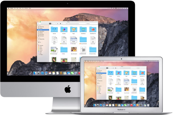
The New Desktop, Finder, & Icons
The general desktop appearance of OS X Yosemite looks modernized, bright, flatter, and generally pretty fancy.
(Click this image to see full sized)

Finder has been updated to flatten the general appearance, with simpler buttons and less use of bold text.
As you can see, the default folder icons are bright blue, while most of the document icons remain the same as they feature little previews of the file itself.
![]()
The window traffic light buttons are now completely flat too, appearing as solid red, solid yellow, and solid green.
Here they are in the Yosemite Finder:
And here they are in Safari:

Meanwhile, many default OS X app icons have also been redesigned, but most are generally modernized rather than going for the full-fledged flat appearance offered in iOS. Here are the redesigned Safari and Finder icons, for example:
![]()
![]()
They’re still easily identifiable, just brighter, and more modernized.
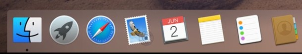
The New Dock, Menus, Flat Buttons
The OS X Yosemite Dock is flatter and looks borrowed from some cross between OS X Tiger and/or iOS 8, removing the three-dimensional shelf appearance and opting for a squared transparency instead.
The menu bar, drop down menus, and system menus in general have received a new look and a new font. The new font is generally thinner and modern looking, closely matching the default font of iOS 7 & 8, Helvetica Neue:
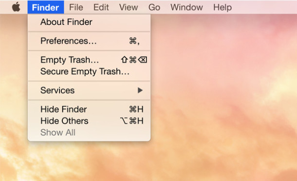
The general buttons and UI elements found throughout OS X Yosemite are flatter, but still easily identifiable as buttons.
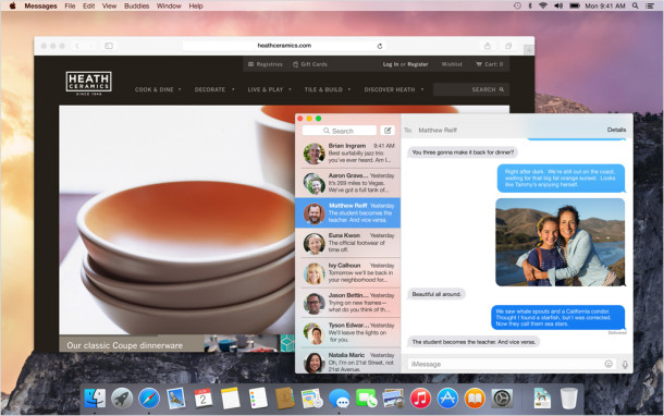
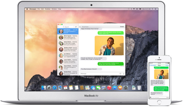
Many user interface elements in Yosemite are translucent, thus the appearance of things will change depending on the color of that which is layered behind it. For example, this screen shot demonstrates the Messages apps appearance changing as it’s hovered over an open web page:
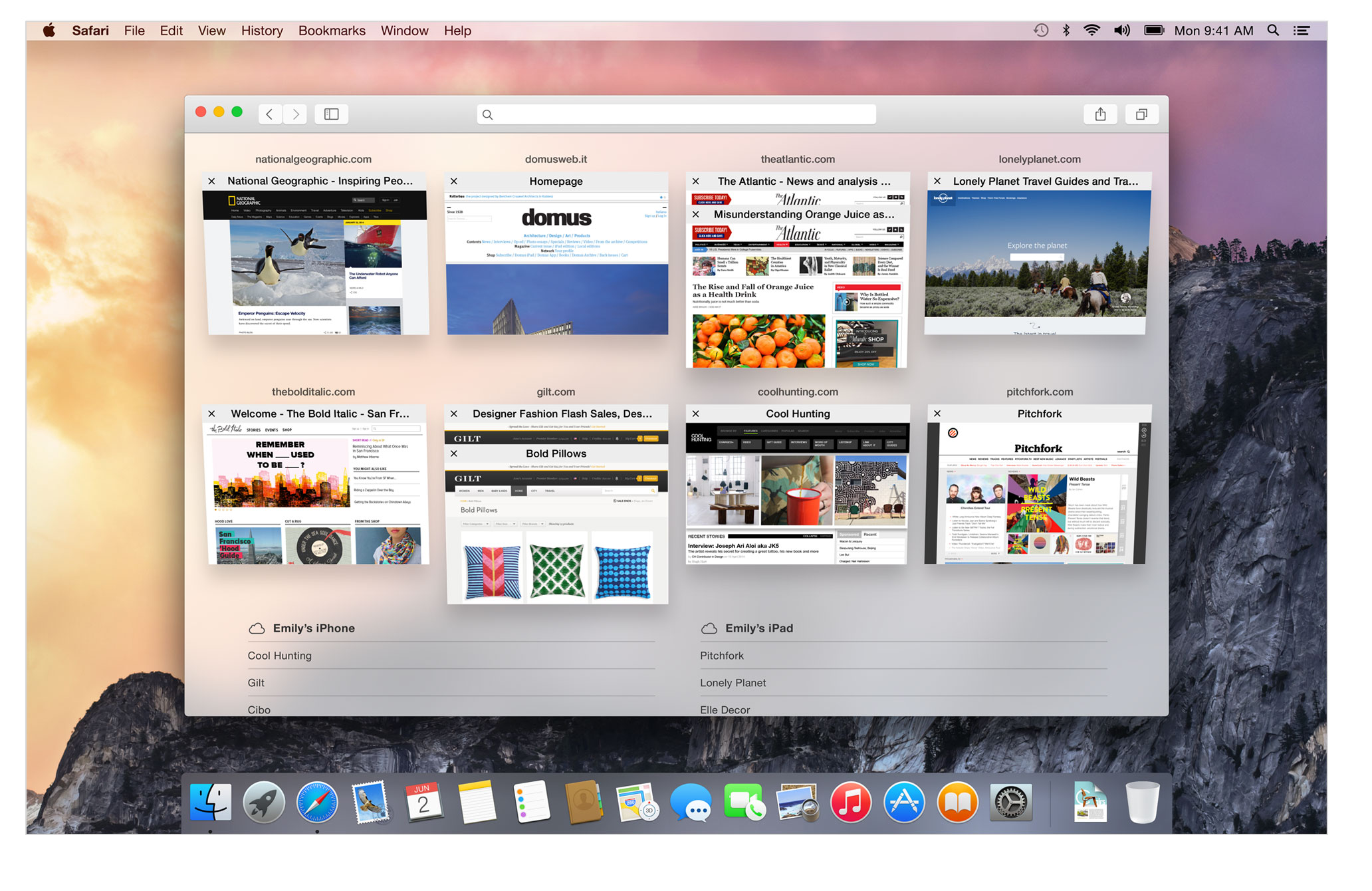
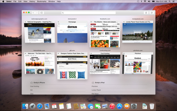
Safari’s Facelift
Safari gets a generally new appearance with a significantly improved tab viewer, a better way to browse iCloud tabs from other devices, and an updated slimmer UI to match the broader OS X Yosemite theme.
Of course, Safari also includes many under the hood changes too.
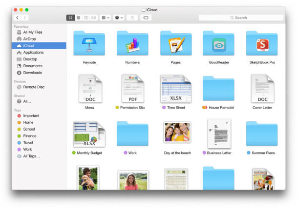
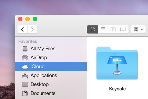
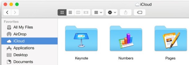
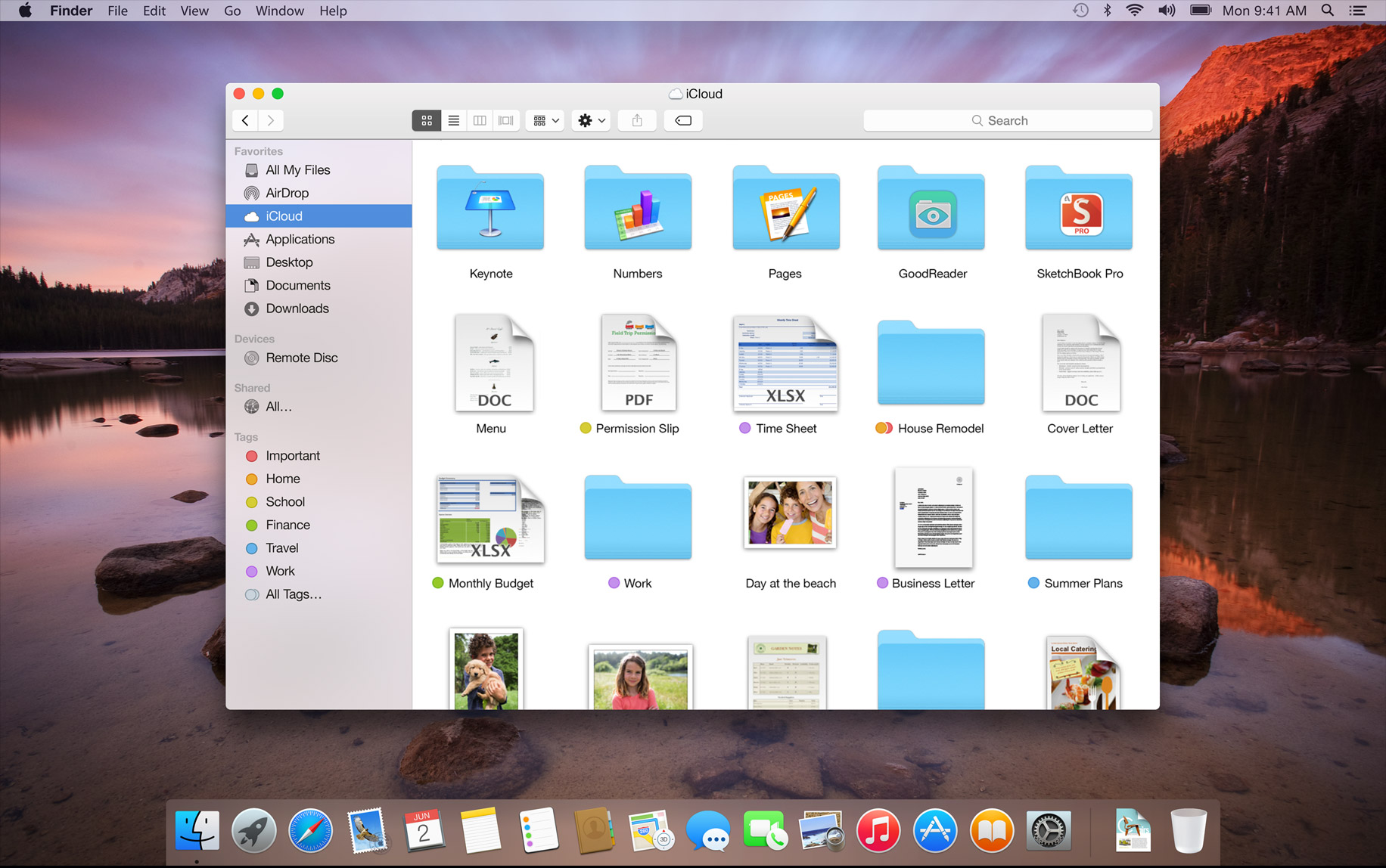
iCloud Drive
iCloud Drive is basically a Finder interface to iCloud files, a much desired feature that integrates seamlessly into the file system of OS X Yosemite. Copy files into iCloud Drive, they’ll sync to your other Macs and iOS devices. Looks easy.
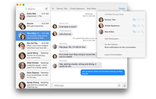
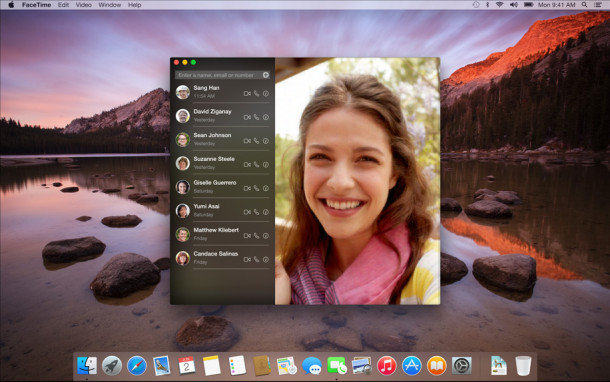
Messages & FaceTime Redesigns
Messages has been redesigned and modernized, largely matching the iOS Messages appearance, but better fit for the desktop and still maintaining the OS X esthetic.
FaceTime has also been modernized in appearance, though functionality still looks to be the same:
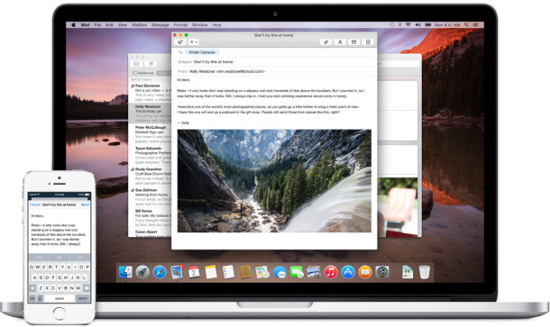
Mail App & Markup Tools
Of course Mail app in OS X Yosemite gets a flatter redesigned UI, but it also gets some pretty nice built-in markup tools that allow you to add notes, scribbles, signatures, and other details to email messages, right from the Mail app.

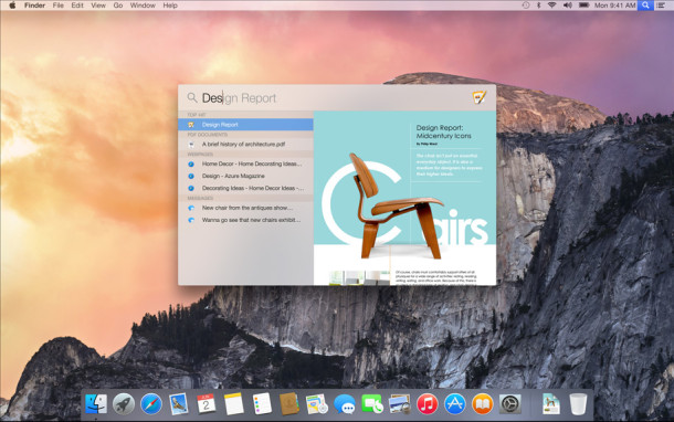
Redesigned Spotlight
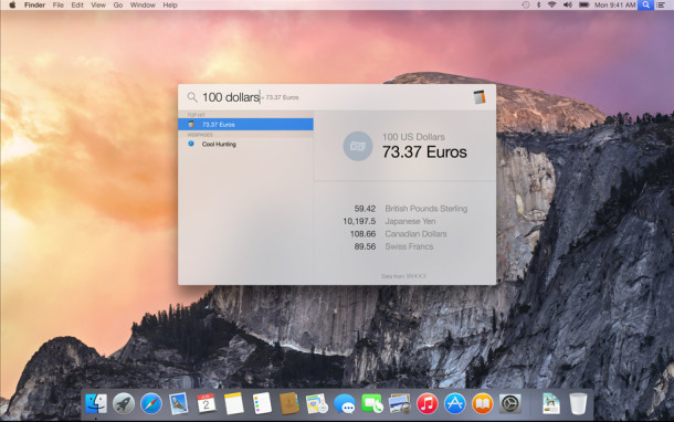
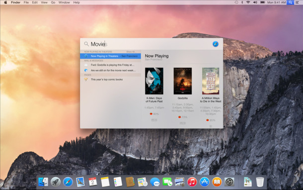
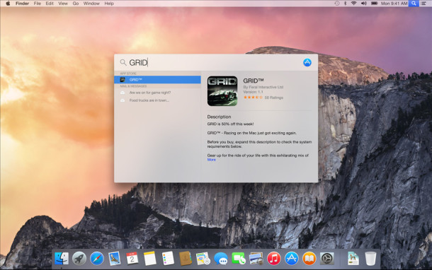
Spotlight in OS X Yosemite has received a major update. No longer will it sit in the upper right corner of the Mac desktop, instead when it’s summoned it will become front and center, hovering over everything in a nice translucent actionable window. It’s also not only able to search the local file system, but also iCloud files, the web, Wikipedia, App Store, Rotten Tomatoes, Yelp for Restaurants, and so much more. It’s really set to function as a full fledged search engine, built directly into OS X Yosemite.
Spotlight search files:
Spotlight can perform on-the-fly unit conversions:
Show local showtimes for movies playing in nearby theaters:
And Spotlight can be used as an application launcher, and interact with the App Store too:
Notification Center & Widgets
OS X Yosemite Notification Center should look familiar to anyone who has used a new version of iOS… it’s largely the same in appearance and functionality. And, like iOS 8, it includes support for native widgets too.
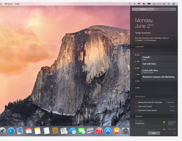
Users can interact with Notification Center much like iOS, and they can also add or remove widgets from third parties and applications.
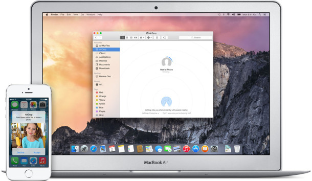
iOS to OS X Continuity, Handoff, Phone Integration, & AirDrop
The “Handoff” feature lets you continue a task started in iOS or OS X on another platform… for example, if you start writing an email on the iPhone but get near your Mac, you can hand it off to the Mac Mail client to finish writing the email. Many other apps apparently will support this feature too, offering improved integration between OS X and iOS devices.
This is part of a deeper feature layer called Continuity, that aims to improve OS X to iOS integration.
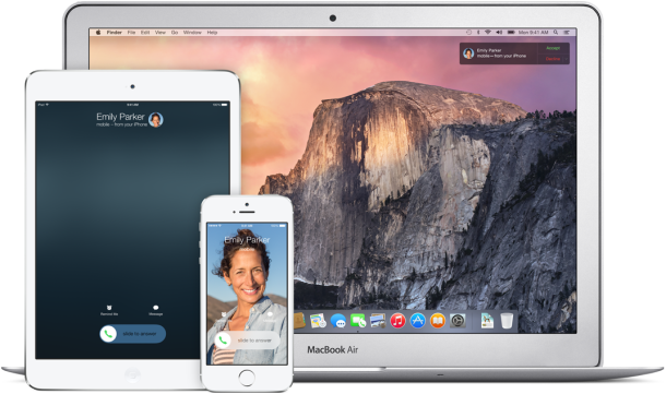
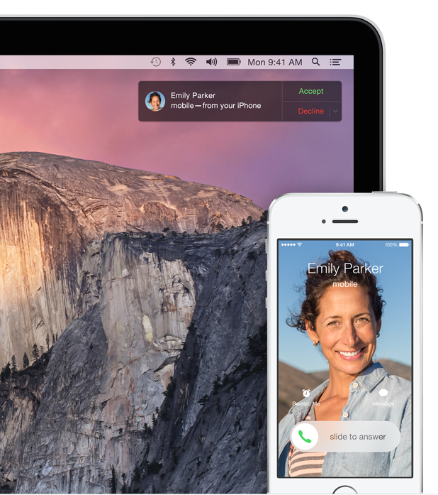
You can also now make a phone call from your Mac, by relaying it to your iPhone, basically using the Mac as speaker phone. You’ll also get alerts on your Mac desktop when a phone call is coming into the iPhone.
Additionally, users can AirDrop files directly between OS X & iOS devices:
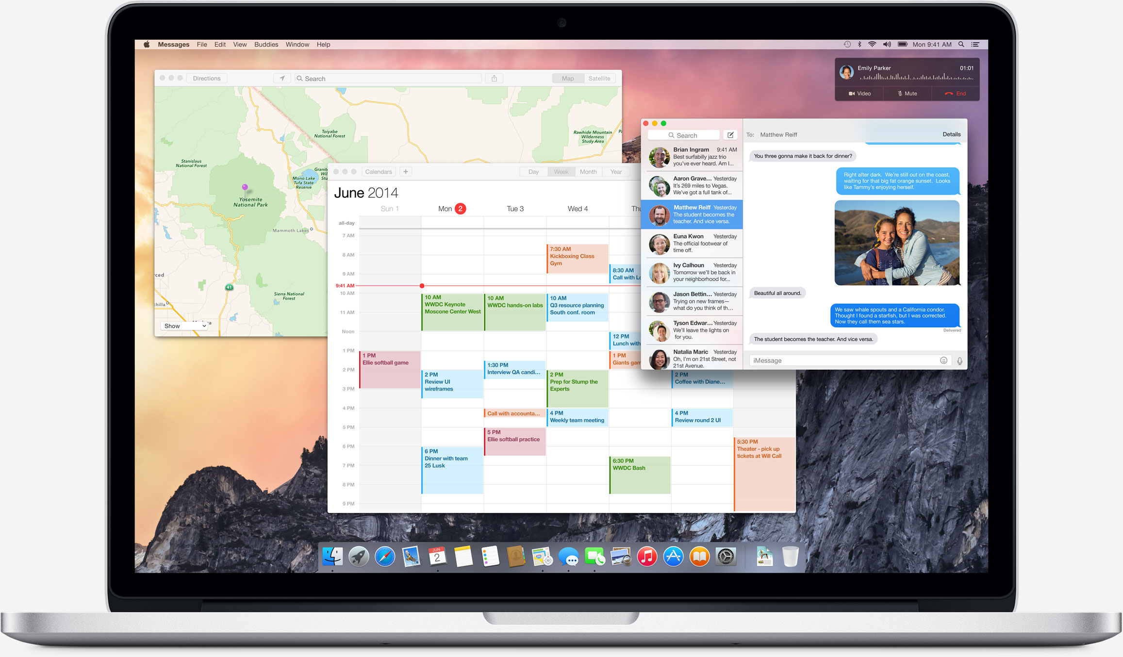
Misc OS X Yosemite Screen Shots
Here’s an OS X Yosemite desktop screenshot with Calendar, Messages, Maps open, while an active phone call from an iPhone that is being made through the Mac is visible in the upper right corner of the desktop.
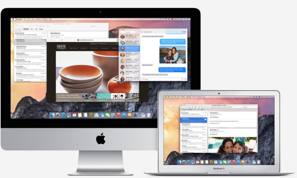
The OS X Yosemite desktop looks modern and quite nice:
OS X Yosemite will support a wide variety of Macs, and be available when it is released to the public in Fall 2014:
Many of the cross iOS-to-OS X capabilities will require the upcoming version of iOS, iOS 8, which is also set to have a Fall release date.
All in all, OS X Yosemite looks very nice. Keep in mind that these images, which are borrowed from Apple.com’s OS X Preview page, are from early beta versions of the OS X 10.10 release, and thus many things may change when the final release arrives this fall.
Want to see more? You can check out a first look at OS X Yosemite and some more of the new features, though the images there were captured from WWDC 2014 slides, making the pictures not nearly as appetizing as what’s seen here. Similarly, don’t forget to check out the iOS 8 features and first look too.

Ok, Anyone who thinks this is good UI design is just straight up out of their minds and knows nothing about UI design. This is just plain ugly. The icons are inconsistent, boring and amateur. The windows have this ugly gray blend that goes from top left to bottom right. The whole UI has absolutely no personality. Everyone thinks it looks like vista, windows 7 or windows 8, because there is absolutely nothing inspiring or unique about it. Apple needs to fire their UI designer quick.
Is there any way to get rid of/move the “archive” icon in mail?
1 million user-complaints about the “missing” color labels. But no Apple Dev cares?!?! The too small dots in lists are completely useless.
I completely agree with you!
Bring back coloured labels please…
This new version of OS X looks different but as long as it functions properly I’m not the one to complain.
Bring back coloured labels. These tiny dots are shite.
I agree with the users saying that Snow Leopard Looked the best. I don’t like “everything” being so flat. If that’s the case I’d get MircoCrap products. We don’t want it. Or if so, then let us have the ability to choose the “dock style” or themes. I love my current dock in Mavericks. They should let us keep it if we want!! If not may as well switch to Linux.
Cool
I normally don’t comment here, but the comments being left compelled me to speak…
Holy #$!@ crap, I have never, NEVER seen so many whining cry babies in one spot in ALL my IT career!
So many of you are dismissing this new OS X as junk because you don’t like the new white-emphasis and new icons?
GET A FREAKING GRIP PEOPLE!
I guess you really can’t teach old dogs’ new tricks.
For someone to shun a technologically-superior OS with phenomenal mobile integration and great usability enhancements is clearly not thinking straight and off their rockers. This isn’t the Windows 8 fiasco Microsoft introduced by trying to force everyone onto a touch-centric UI overnight on non-touch enabled machines. The core of OS X is unchanged here, and many elements still date back to 10.0. The changes are just minor cosmetic alterations.
You’re all acting like a bunch of spoiled Hollywood starlets that their dress isn’t the right shade of cyan! I can GUARANTEE that many of those complaining about how the new fonts look hard to read on non-Retina displays haven’t even SEEN IT in person yet!
This is still a dev preview, so how about we wait until at least Beta 1 before we start calling for Jony’s head. Personally, I welcome this change, just I welcomed iOS 7 with open arms, and think this will usher in a new era for OS X and iOS.
And to the Jony character here that’s constantly encouraging everyone to file a bug report on the interface, just suck it up and shut up before I file a report of you spamming this article!
Actually it’s not about whining and crying. A lot of people have found the new UI design a hardly useable. The brain and eyes used to deal with objects but not with symbols. Our senses tuned on perspective, shadows, textures even if they are artificial. We did’t say Yosemite is bad. It just looks uncomfortable. What we are doing when we work on computer? We work with UI. For most people computer is UI. And when it’s hard to work with UI that equal that it’s hard to work with computer. Changes can be good but not itself. I installed iOS7 on iPhone in immediately after release and I still regret. I think design should be functional. It’s not just new bright or dark icons for our entertainment or surprising. It is place where some of us spend 8-10 hours each day. It should useful, comfortable, easy to understand. And now it looks like Apple wants to convince us that feel good with new changes. No we don’t.
This is Awesome.. I will install OS X Yosemite when my Beta invited has come
Can’t say I am too fussed. I am quite happy with the Lion interface. What really bugs me though is when Apple dumb down the Apps. I am still fed up with the latest Pages 5 which is missing a number of useful functions found in Pages 09 such as advanced search facility. As a matter of courtesy I think Apple should at least give you options to chose what you want (need), instead of imposing it on you. Apple are not alone. The latest interface of Spotify is a travesty – dark and gloomy – fortunately I found a way to roll back to a previous version.
Unfortunately they had to strip features from Pages when they tried to unify the iOS and the OS X version into a cross-compatible app.
Hence the reason they ‘dumbed it down’.
If you had Pages ’09, you should still have it in your Applications folder.
Maybe you’ll hate me after this, but just please, see the Gnome Headerbars, and some of the flat icons that have been developed for Linux, honestly, that look a lot better than this….thing.
Apple used to do beautiful design, but now, it looks that they learn nothing from Steve Jobs, he could never accept this as a professional look, I’m not designer, but I like that stuff, and this is the oposite of professional, it looks like a 10 years old kid make a drawing, and ta-da! here is the new UI design.
Please apple fix this, this is not you.
Please report this new UI as a bug on bugreport.apple.com
It will help them improve it if many people will let them know they don’t like the new design.
Unfortunately I’m not a developer, so I don’t have access to the bug reporter, but I would definitely report the UI.
I don’t understand why Apple can’t give us a choice with regards to the look of the UI. Just add a preference pane where users can choose between the current look (throwing in the old scroll bars as well) and this flat, childish garbage. If MS was able to do that 13 years ago in XP (Bozo the clown vs the old 95-2000 look), why can’t Apple?
It doesn’t have to change any of the functionality, just the look. Please, Apple, I’m begging you!
The faint font, coupled with the transparency makes it VERY HARD on older eyes, something Apple must not care about, all in the name of design. Getting rid of the Helvetica Neue Font on iOS and OS X would make many happy instead of ignoring folks with imperfect eyesight.
I agree, and my eyes aren’t even particularly old (I’m 31, heavy computer user, don’t wear glasses but imperfect vision and easily strained eyes). Helvetica Neue is a terrible font face for usability, looks cool at size 200 for marketing purposes, but horrible in a user interface. OS X Yosemite and iOS need a switch to have a readable font, like Lucida Grande or good old fashioned Helvetica Normal.
Please report this as a bug on bugreport.apple.com
It will help them improve it if many people will let them know they don’t like the new design.
I think this is why I feel the same way. I installed TinkerTool but don’t know where to change. I hope to just modify it instead of going through the hassle reverting back to Maverick.
a great big YAWN
Sounds like I’m in the minority, but I love it.
Can you, someone, please tell me,
A) air drop – where will the files, sent from my mac, go to on my iPad? There is no file browser there. Can i use the iPad as a storage device? Maybe I can AirDrop only files readable by an IOS app? Like when I drop a file within iTunes into the application?
B) iPhone calls – can I call/answer also from my iPad?
Yes you’ll be able to make and answer calls from your iPad if your iPhone is around in proximity. A very handy feature!
In regards to where AirDrop will store the files sent to iOS and from a Mac or vice versa… it’s not entirely clear (yet) but it likely depends on the file type. For example, a photo would probably go tot he Photos app, whereas a document made in Pages would probably go to the Pages app storage for that type of document (say an RTF or DOC file). We’ll learn more as testing continues, but keep in mind there is an NDA in place that prevents developers from discussing specifics about many of the features, which are continuously being developed and thus may change before release, beyond what Apple has already discussed.
Hate it! hate it! Hate it! It looks boringly flat (Microsoft messed up with Windows 8 and now Apple are following suit??), the colours are way too bright, it’s lost it’s finesse. I’ll be sticking with Mavericks I think.
Jony Ive, you need to be SACKED! You messed up our iOS and now this! Pathetic childish crayon-theme!!
Not happy! :-(
Total lost. I hate that 2.
Please report this new UI as a bug on bugreport.apple.com
It will help them improve it if many people will let them know they don’t like the new design.
Agree!
Jony Ive, you need to be SACKED! destroyed ios now finished with os x. Goddamn flat trend!
Still the horrible tag ‘dots’ exist,instead of the much better coloured labels.
And with that, I will not be upgrading to this version. I use the colored labels EVERY TIME I TOUCH A MAC. It is absurd how that they were removed in Mavericks.
I also despise how Apple is so dismissive about it and says “Oh there are plenty of 3rd party apps that give you functionality. It’s just as good” Oh really? How about I cut your arm off and then point you in the direction of a prosthetics store. It’s just as good, right?
me too i use the labels all the time. i do visual effects. every time i export quicktimes i use the labels to categorize them. now i can’t even look at a finder window with a bunch of files in it. it is exhausting to look at. so many other problems too. right now i don’t know how i can possibly do my work on this computer.
Hey… nothing about improvements on performance, communication, nothing technical…. Only cosmetics ??? I can’t believe…..
change from 10.9 to 10.10…. changing name… and nothing about the “core” ???
If someone knows anything about it, please clarify us…
Thanks,
Jupiter
Hey, actually there’re great features. You can call now right from your Mac and accept calls also. Handoff feature lets you start something on one device and instantly pick it up on another… This integration is a nice and clever thing.
But design sucks a lot. Looks almost like a sabotage…
Can’t believe they went to horrid flat icons with no life to them. Will definately be skipping the new OSX. Plus can’t read the font on IOS so I am sure it won’t be readable on OSX either.
So right.
Please report this new UI as a bug on bugreport.apple.com
It will help them improve it if many people will let them know they don’t like the new design.
They do not give a flick, some apple fan boy should answer there that it is not a bug, it is a “new” feature
Looks nice but Safari addressbar looks very silly, i hope they do something with it this summer. And icons!! WTF Apple?!
Why are you do this? Now it looks like some open source Linux distribution, icons are very amateur looks.
Compare it with Snow Leopard and see if you can ;-)
I also hope that transparency can disabled, it is also oldschool look. Vista is gone, don’t bring it back!
And the Desktop, its good, dont do it like iPad iOS, like Launchpad.
But generally this look like i jump over with it, maybe i go back to Snow Leopard, now i use Maverikcs, i hope you make many updates to this! :)
Please report this new UI as a bug on bugreport.apple.com
It will help them improve it if many people will let them know they don’t like the new design.
I wish this things would have a spring / summer release schedule. I miss the June releases of the iPhone.
Summer is back to school / back to real work. Would be nice to have all summer long and be ready to rock on day one of real life.
For god’s sake, who the hell is running the show there!? I hated the iOS 7 look and now they mess it up in OS X, too. The Mac used to be so beautiful and colorful and now this crap. I would go back to Windows, but Windows 8 suck, too. What is wrong with this planet? The aliens control the designers’ brains? Why is everyone go nuts for this stupid, flat look? Apple used to have a slogan: Think Different. Now they keep thinking the same thing as everyone else. I am pissed! Guess I will just have to stick to Mavericks for the rest of my life.
I guess.
So the complaint is that it “used to be so colorful”, but now it is too colorful?
Right.
This is not Apple. This is flat day for Apple. This is not happy.
Agreed. Someone who is responsible for the UI design has no taste at all and Tim has no taste either. Steve and Scott Forstall were the key persons.
agree totally. weird buttons, ridiculous blue and childish gradients are hideous.
Totally agree!
I TOTALLY agree with Ted! If it was a such a good move people everywhere would respond positively with “Great” “Amazing look” and “I want it now” comments… this is not the case if you read all the posts on the subject around the world. Apple didn’t care and didn’t listen to those comments with iOS7… and now they are going to bring this awful look on iMac… Terrible choice.
Indeed, iOS 7 had a major backlash over it’s user interface overhaul, especially the terrible icons, but OS X 10.10 will probably not be like that if the “Dark Mode” feature is implemented well and tones down the bright and distracting childish colors. The icons (except for the neon blue folders) look good. Windows are just a tad too bright. Overall it looks modernized but a little too much like a kids computer, so hopefully we get some customization to the appearance that can make it look more professional before Yosemite ships. I am excited for it, features are good, so it would be a shame if the window dressing was not improved.
thx paul and gerty for link…
Can anyone post stock new wallpapers… from OS X 10.10
There’s only one available in the current OS X 10.10 DP1 build, expect more to surface as later builds come out.
Oy vey, the new font, Helvetica Neue is basically unreadable on non-retina displays. If Apple doesn’t resolve that by final release this fall, definitely will skip upgrading on anything that isn’t retina – which is all of my Macs right now, and 3/4 of what Apple makes right now.
Someone get Jony Ive away from fonts and the saturation slider! Stick to hardware design, please.
I find the font annoying but it could also be that this OS X version is too bright. Definitely not good at night and browsing the internet, even with the brightness turned down. Apple should offer a “grey level” slider option. So users can darken the windows and so forth.
The darkening of colors and windows that you describe is said to be available in the “Dark Mode” or “Pro Mode” of OS X Yosemite, it doesn’t appear in the current beta however. Nonetheless, it’s supposedly in the works as described by Craig Federighi during the Yosemite preview at WWDC.
I found it. Go into Preferences, Accessibility, and select Invert colors. ;)
Nevermind. That changes everything. I just noticed when I minimized Safari. :(
Weird, I have a non-Retina display and I can read it perfectly. Looks so much better than the dinosaur font they’ve been using forever.
This dinosaur font is perfect for daily use on a monitor. Clean and perfectly readable.
The font they’ve been using for a long time is excellent.
It just looks like a Linux OS now. Plus I don’t like how the maximize button is now the full screen button. How do you maximize without going into full screen mode?
I think you hold down the Command key to get the old maximize behavior back… probably a defaults string somewhere to get it back to normal.
It’s the option key. ;)
Doh, yes thanks, Option key it is!
:)
I feel this should be reversed, if they want to combine the two. Most users will most likely want to maximize and not go into full screen.
If you have not enabled “Double click on window title bar to minimise it” option, then just double click on the window title bar. It will get maximised without going to full screen mode.
Hey guys for those wanting it, the default wallpaper of OS X Yosemite is available to download here
http://cl.ly/VrU2
Found it on Twitter
If anyone wants to get a ‘feel’ for what OS X Yosemite looks like on their Mac, download the full sized version of this desktop pic:
http://cdn.osxdaily.com/wp-content/uploads/2014/06/osx_yosemite-finder-view.jpg
– Save it to the Desktop
– Open it in Preview
– Go into Full Screen Mode
And there you go, OS X Yosemite on your Mac.
I think it looks good, but I don’t like the narrow font which is all Jony Ive and not practical at all. It hurts the eyes. Much like iOS 7 and iOS 8, the narrow system font is genuinely difficult to look at for those of us without perfect vision. Ugh, that’s the worst part, otherwise I am looking forward to this.
I agree, the Helvetia Nue is terrible for order eyes, I guess Apple doesn’t care about Senior Citizens with any of its OS or Apps!
This is actually not a proper preview of OS X Yosemite, as the image is rendered on a higher-resolution MBP or even rMBP, and hence everything looks thinner and smaller on a non-rMBP.
I can almost guarantee it’ll be FAR MORE easy to ready on non-Retina displays than most of you cry babies are whining about.
It’s bemusing how it is assumed the font Helvetica Neue is more modern. Helvetica was originally designed in 1957, recut as Neue in 1983, although it is based on Akzidenz-Grotesk (1896). Lucida Grande, which Apple has used up till Mavericks in OSX, was designed in 2000. Equally as good, clean and unambiguous fonts would include Avenir Next (2004) and Myriad (1991), which is incidentally Apple’s corporate typeface (website, packaging, display etc). These are far better choices than Helvetica, which is not designed to be used as small text and slabs of it! A font with variation throughout does make for an easier read; Helvetica’s uniformity has a role in display design and can be kerned to look quite elegant, especially in light and heavy, but not as intended for such every-day use in Yosemite.
It’s hideous! It’s look like a noob created this interface. I can not say how well it looks on a retina display but otherwise… what is Apple thinking? I won’t be using the version of OS X unless they make a major change to it.
I like it, looks good. But the general look, which is much more modern than current OS X that’s for sure… does kind of look like Windows Vista, which was released in what, 2006? Don’t get me wrong, OS X Yosemite looks great, but it just feels like Apple is lagging in the UI design department. Better late than never, I suppose, right?
Oh and the icons, not a fan of the super blue folders (looks very Aqua), but the general icons look so much better in OS X Yosemite than they do in iOS 7 and iOS 8… why doesn’t Apple push the OS X Yosemite icons over to iOS? EVERYONE would be happy with that change.
Anyone know what the OS X Yosemite Dark Pro mode looks like that was talked about on stage but never properly demoed? I can’t find any screen shots of it online either.
Anyway, I’m excited. Debating installing the beta build on a secondary Mac, but will probably wait until the public beta instead… early reports sound buggy.
I’m most interested in the ‘dark mode’ too, because right now this looks very child-like and will be hard to take seriously. I hope it’s a full inversion of the window appearances and greyscale icons, because all the whites, super bright colors, and the hideous blue folder icons, are very distracting even in screenshots.
I believe Windows Vista only had a transparent menu bar and border, but not entire surfaces. It also didn’t extend that transparency to the window’s own content. In Yosemite, the menu bars overlay the content, whereas sidebars overlay the wallpaper (or other windows).
Looks nothing like Vista (or Windows 7, since they’re both almost exactly the same interface). It’s more like Windows 8, which looks a lot better than Vista/Windows 7.
Likes all new funktions in osx10.10 but not the look. They need to have it look like Mavericks before I go to the 10.10.
I think i go back to Snow Leopard some day :D
Gimme back my Tiger!!!
All this “flatter” = “duller and more boring”
I don’t want my laptop to look like a $&#@* phone!
I agree. I refuse to update to IOs 7 for the same reason.
They have taken what looked and felt like an expensive European sports car and replaced it with a Fisher Price toy!
They need to sack Ives and put an adult in charge of the design.
Me too! Snow Leopard was the best so far.
These new flat “simpler” icons are dumb, and the bright blue folders are really in the way!
yap!