How to Change the Default System Font in OS X El Capitan to Lucida Grande
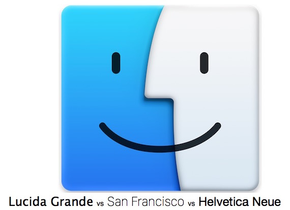
The Lucida Grande font is known for its crisp and obvious readability which makes it a great user interface font, and it rightfully served as the Mac OS X default system font for many years. Then along came Yosemite, where the Mac system font was changed to the generally unpopular Helvetica Neue. Apple has since improved font readability considerably by changing the default system font yet again in OS X El Capitan, this time to a new font called San Francisco. While the San Francisco font is considerably better as a display font than Helvetica Neue, it’s still not quite as readable for some Mac users and on some non-retina displays as Lucida Grande. Fortunately, with a little effort you can change the default system font on a Mac with OS X El Capitan to Lucida Grande again, and return to the classic user interface font.
This app changes the system font, used in menu bars, menus, the Finder, Dock, window title bars, and elsewhere. If you like the system font the way it is now, or don’t even care, you likely won’t benefit from this application.
Replacing the Mac System Font in OS X El Capitan to Lucida Grande (from Mavericks)
- Consider starting a backup of the Mac with Time Machine and waiting for it to finish if you haven’t done so in a while, it’s unlikely you’ll have any problems but backing up is good practice anyway
- Go here to download the El Capitan Lucida Grande app, it’s free and open source if you feel like poking around the code yourself
- Right-click (or Control+Click) on the “El Capitan Lucida Grande.app” file you just downloaded and choose ‘Open’ – this will launch the app beyond Gatekeeper
- Choose the “Patch & Install & Clear font cache” button in the launcher app, then enter the administrator password when requested, the admin login is necessary to create a new file in the /Library/Fonts/ folder, which is the system level font directory*
- When finished, quit out of the app and reboot the Mac for changes to take effect throughout OS X
When OS X reboots the system font will be changed to Lucida Grande from San Francisco. Here’s a before and after shown as animated GIF, the change is subtle:
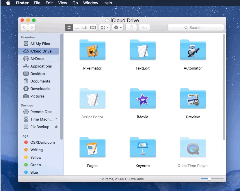
Here’s a still before and after as well, this is what a Finder window and menu bar look like in OS X with the default San Francisco font (the before):
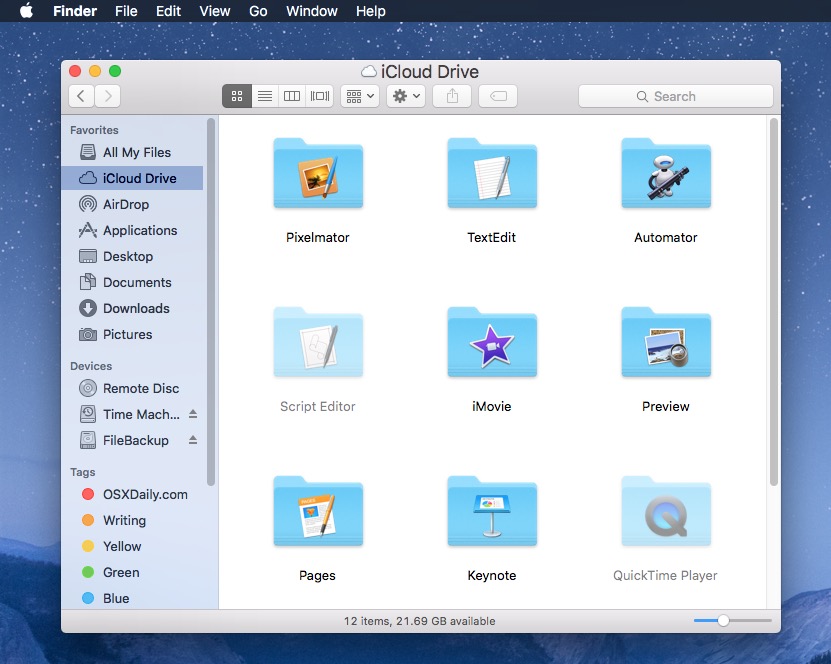
And here is what the same Finder window and menu bar look like in OS X with Lucida Grande font (the after):
As you can see, the changes are extremely subtle. This animated gif gives you an idea of just how subtle the change is, with Lucida Grande being ever so slightly bolder, slightly wider, with slightly more spacing, with the result being it’s slightly more readable to some individuals.
Looks Interesting, But How Does this App Replace the System Font?
For those who might wish to understand what this app is doing to replace the system font in OS X: it’s quite simple, the “Lucida Grande El Capitan” app works by creating a new patched version of the Lucida Grande font and placing that system font file in /Library/Fonts/ called “LucidaGrande_modsysfontelc.ttc”. In other words, it’s simply creating a new font file that is recognized by OS X as being the default system font, thus when Mac OS X boots it loads that new system font file version of Lucida grande rather than San Francisco — it does not replace or modify any system files.
The Default System Fonts Are Barely Different? What’s the Point?
Indeed, going from San Francisco to Lucida Grande is much more subtle than abandoning Helvetica Neue for Lucida Grande or for Comic Sans, so if you’ve never thought twice about the system font in OS X El Capitan let alone in Yosemite or Mavericks, you probably won’t even notice the change, meaning this isn’t really aimed at you. But, for users who either just prefer Lucida Grande due to longstanding habit, or because it’s easier for them to read on a particular display, this little unofficial font patch is a nice modification to Mac OS X.
Perhaps in the future Apple will introduce a ‘bold fonts’ option in OS X Accessibility preferences to make default font text easier for some Mac users to read, much like the bold fonts choice in iOS. But that hasn’t happened yet, so in the meantime, if you’re not thrilled with the system font in OS X El Capitan, consider changing that system font back to the classic Lucida Grande, because for many it’s just easier on the eyes and easier to read.
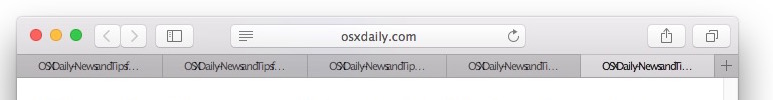
A few known font display bugs
Indeed there are a few text kerning and spacing bugs with the initial release patch, presumably a fix will resolve those issues shortly. The most annoying is likely found in Safari where multiple tabs start squishing the text together in a tab title, here’s what it looks like:
Again, a future release of the Lucida Grande replacement font will likely resolve that issue. If it’s a dealbreaker, just uninstall it and wait for the time being.
What About Changing the Default System Font to a Different Font?
If Lucida Grande isn’t your thing, there are other options for new default system fonts in OS X El Capitan which use the same basic idea as this app, many of these existed for prior OS X releases but have yet to be modified for El Capitan. Currently, other alternatives are:
- Fira Sans System Font
- SystemFontPatcher utility for any font
- Updating…
* Note that you can also install fonts and modified Mac system fonts in the user fonts folder at ~/Library/Fonts/, but doing so sometimes causes weird font display gibberish that isn’t remedied by dumping font caches in OS X, particularly with dialog and alert windows. Thus, if you’re replacing the system font, go with the root font directory.

Any chance on an update that will fix the messy kerning in filenames and tabs in Safari? TIA
Wonderful! Just, finally, upgraded to El Capitan, and HATED the font! This is so much easier on my eyes – the other was too bold as well. Thanks again for this article!
I just recently ‘upgraded’ to El Capitan from Mavericks on my late 2009 MacBook Pro (pre retina) and aside from the annoying aesthetics (kindergarten blurry low contrast looks, which is a downgrade from Mavericks’ sleek, crisp looks), one thing I noticed right away is that I was getting headaches from eye strain. At first, I didn’t realize it was because Apple decided to change the fonts to be just a tad smaller, I guess to allow better viewing on retina displays.
Anyway, I came across this article and glad I did. As soon as I changed the fonts via the app listed above back to what Mavericks had, no more eye strain and no more headaches!
Much thanks to the creator of this app and to you folks at OSX daily for this article.
Peace,
Olaf
I uninstalled the Patch and suddenly all system labels are question marks in boxes. Does anyone know how to fix this?
Uninstall the patch, you broke something and you didn’t read the instructions which clearly specify there are some font issues and also how to fix font display errors. No big deal, reverse the change and don’t do it again. Best saved for advanced Mac users only.
I almost thought my eyesight was starting to go. I changed the font back to Lucida and it’s like I can see clearly again! Thank you so much for this! I have so much less eyestrain and can once again spend hours reading happily! No clue what apple was thinking when they forced San Francisco upon us.
First it was Helvetica Neue, then it was San Francisco. With no ‘bold’ option available on the Mac, the fonts are unbearably thin and very difficult to read. It doesn’t help that the darkest text color on screen is a medium shade of grey either, against a light grey background. Indeed it makes it feel like you eyesight is going, but no, it’s just the terrible Apple UI fonts. Also, the fonts are very small on screen, as I’m sure everyone has noticed.
Apple likes to pride themselves on accessibility, but they are losing it here with the font situation.
Pencil, I totally agree about Apple’s font changes and their apparent loss of interest in accessibility issues. Aging eyes are a factor for me. However, restoring Lucida Grande with this app makes a huge difference. The screen shots really don’t do it justice.
I think it’s a case of change for change’s sake, and young software developers with perfect vision, who have no idea that their design decisions make life difficult for a lot of people.
Rather than change the font, how does one increase the size?
This is really helpful but i have question
did san Francisco font came in default with MAC El-captain OS
Yes, San Francisco font is the default font on the Mac in OS X El Capitan, and on iOS and WatchOS
Same here with safari.
the kerning problem on website tap label, almost no kerning between text.
Hope dev will be able to correct this issue soon.
This did not work well in some apps (it put the characters too damn close in some instances). Besides in my ElCapitan (latest) on a Macbookpro the font is NOT in the “standard” font folder in ˜/Library/Fonts but in ˜/.Fonts, which makes a hell of a difference.
For me it was the first thing installed after upgrading to El Capitan. Habit, yes, readability, yes, but to me it also feels more friendly, more “Hello.” Mac-like. So thanks, Schreiberstein!
I would like to install a more readable font in El Capitan but your directions are too complicated to follow. Can you generate a more straight forward method for the novice user?
Samuel, the directions are really quite easy, you backup your Mac (which you should always do, this is precautionary). Then download a free app from here:
https://goo.gl/33KNpm
Open that app, and click the install font button.
It doesn’t get much easier than that. Not to sound abrupt or rude, but if you can’t follow those simple instructions, you really should not be modifying any system files at all, because it’s very unlikely you would be able to remedy any potential issue encountered! Just let it be, that is my advice if it’s too complicated, not everyone has to be a techie.
how change default blue color of folders? not one, all of them. make them in mavericks color
I wish they would choose a real readable font – like Arial MT Bold, and allow size changes changes. Some days I need 16 point font, and others 20 point font.
I made the change back to Lucida Grande in Yosemite and look forward to making the change again in El Capitan. The problems with browser tabs and long filenames with LG and El C have me sticking with SF for now. I hope those problems are solvable.
I haven’t tested it yet in El Capitan, but I’m a huge fan of Input by Font Bureau and its system replacement version. Give it a spin!
http://input.fontbureau.com/systemfont/
I think that’s so very ugly when a “sans serif” font does have serifs on the “I”. I can’t look at that. It would seriously hurt my work flow. It’s ugliness of the level of desktops that slide open and calendars with faux leather. Good those days are over. Viva El Capitan and his font.
That font is awesome, I had it under Yosemite but is not working on El Capitan, sadly. It would be cool to have a tool that could convert this font to El C. system font though.
I loved it also, but it will not work for now in El Capitan because it was made to substitute the Helvetica sytem font family on Yosemite. No they have to disguise it to substitute San Francisco. I hope they’ll do it
Does anyone know how to change the system font back to Helvetica that was used in Yosemite?
You could patch it yourself with the font patch tool listed in the article. I wouldn’t be surprised if someone has already modified Helvetica Neue for El Capitan but I haven’t come across an easy installer pack yet.
Yeah, I thought about that, but I don’t have all the Helvetica fonts anymore. Or at least I don’t believe I do. I have plenty of Time Machine back-up’s. But I just want to make sure it’s the right font to replace.
Running the App and change is quite EASY…. but …
How to return back to original?
Probably this is the question some readers will do…
Thanks,
Good question. Easiest way is to run the Lucida Grande El Capitan application again, choose “Uninstall & Clear Font Cache”, then reboot.
Or you can remove the Lucida Grande system font from the fonts folder manually if you like to be hands-on.
Many thanks!
So much easier to read even in those screenshots on my iPhone.
Thanks, I installed Lucida Grande and it looks way better in El Capitan on the external display, less important on the builtin Retina.
There are some kerning issues in Safari, hopefully the developer will fix that in next release.