How to Enable Dark Menu Bar & Dock Mode on Mac OS X
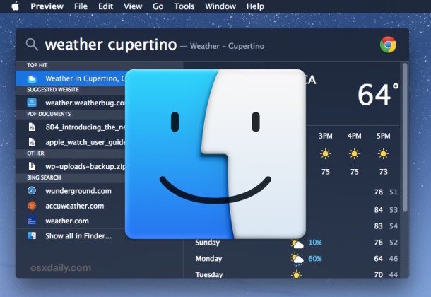
Enabling Dark menu and Dock mode on the Mac is a subtle user interface change to make which allows both the menu bar and the Mac OS X Dock to appear as black backgrounds with white text or icons overlaid on top. The result is a higher contrast menu bar and Dock, which is also a little less intrusive visually than the default light grey menu bar and Dock, and the dark menu and dark Dock will appeal to some users for a variety of reasons.
Enabling (or disabling) Dark Mode is really easy in Mac OS X, and this will impact how the Dock appears, all menu bars, menu bar items, and menu bar dropdowns, as well as the appearance of Spotlight on the Mac.
Enabling Dark Menu Bar & Dark Dock Mode in Mac OS X
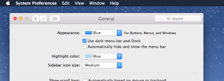
- Open System Preferences from the Apple menu and go to “General”
- Near the top of the preference pane check the box for “Use dark menu bar and Dock” to enable Dark Mode
You’ll instantly see the change in the menu bar at the top of the screen.
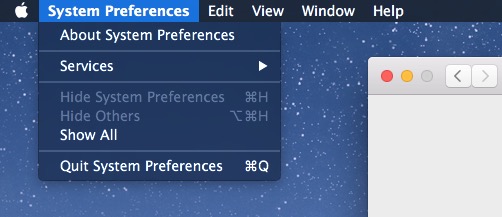
Pulling down a menu bar item reveals additional dark mode theming:
And the Dock at the bottom of the screen will appear against a transparent dark background rather than a transparent light gray background:

Some users may find the light text to be challenging with transparency, so disabling that or enabling Increased Interface Contrast can remedy that.
Disabling Dark Mode in Mac OS X (the Default)
- Return to System Preferences from the Apple menu and go to “General”
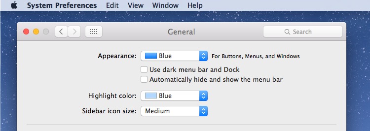
- Uncheck the box for “Use dark menu bar and Dock” to disable Dark Mode and use the default light menu bar and Dock
This returns to the default settings of light mode in OS X, visible in the menu bar:
Light mode default settings are also visible in pull down menus:
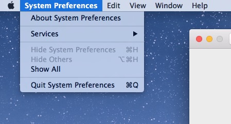
And the default light mode also offers a much brighter Dock on the Mac.

The video below demonstrates the appearance with dark menu and dark Dock being toggled on and off:
Though most users will likely want to keep the setting enabled or disabled, if you switch things up often you can use a keyboard shortcut to toggle Dark Mode off and on at any point from anywhere in OS X too.
The Dark Mode feature is only available in OS X 10.10 and later, including OS X El Capitan. Perhaps it will expand in future versions to encompass more user interface elements including windows, titlebars, much like exists in the Photos app editing UI, but for the time being, it’s limited to the menu, dock, and Spotlight.


This isn’t as useful as similar functionality on Linux and Windows. Apps still have white windows, which are absolutely intolerable in the dark. The only thing that fixes that is “Invert colors”, but that ruins images.
MacOS is truly a “worse is better” system. To Apple, simplicity of design is always more important than correctness.
I enabled the dark mode but it switches off after some time. I would need to go in system preference again and check the box again. Is this normal or is there something that resets this automatically?
Same problem here, when I restart the Mac it goes back to the light theme by default…
Haven’t figured out why – can anybody help?
Martin
Love Dark Mode… reminds me of Kaleidoscope back in the day.
People today would go nuts over the choices we had for interfaces – thousands of different styles, colors, patterns, etc, etc… there were some real horrible ones too though, but the user had a choice other than one. :/
A trouble with dark mode is that, when using cmd-tab to move through the open apps, it is quite hard to see which app is selected, since Apple still surrounds its icon with dark gray. Now, that’s stupid.
F.lux allows you to automate the switch. You can use the normal grey mode during the day, and it’ll switch to dark mode as it dims and reddens the screen at night.
Too bad it doesn’t work in older versions of OS X… For those of us who can’t upgrade due to hardware limitations… (Sniveling)
Yeah, too bad… (Blowing his nose)
We were abandoned… (Sniveling… Again…)
Utility called f.lux, that adjusts display color based on current daylight, has option to switch to dark UI mode automatically. I find that pretty handy.
Darkness mode is good
If you want a more complete “Dark mode”, you might want to try VoiceOver’s “Invert Colors” mode (System Preferences/Accessibilty/Display/Invert Colors). But be aware that e.g. videos played back will also have their colors reversed.
Guy
Enabling Dark Mode really improves the look of the menu bar and Dock when Reduce Translucency is also enabled.
Be aware. Enabling dark mode can cause problems with videos in full screen. Dock and menu bar tend to pop up and stay. Unless Apple fixed it.
I wish I could toggle my girlfriends Dark Mode on and off so easily!
Yea I can relate to that one, if only it was so easy! I would toggle that off permanently
I’d like to use it, but those boxes don’t appear with OS X ML.
Reread the last paragraph.
I have this enabled because it improves the UI in the glaringly bright OS X quite a bit, but I wish it carried through to windows and other elements as well. When you’re in Photos app or some Adobe apps and editing images, the entire UI is dark grey and black, THAT is dark mode. Apple needs to have THAT true dark mode with windows and buttons and all as an option system wide.
Agree. What IS it with Apple and using only varying degrees of gray. Everything looks washed out and dull.
A little color never killed anyone. Remember when Apple used to use color?
Use this all the time, really like it. Reminds me of the Unsanity Haxies of the Tiger days.