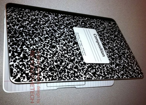
Make a MacBook Air look like a composition notebook

The MacBook Air is tiny and very notebook like as is, but one MacBook Air owner decided to take that idea one step further and create a composition notebook skin for his MacBook Air. The MacBook Air is beautiful as is, but I kind of like the topsheet and bottomsheet cover idea, I can’t say I’m a fan of the ruled pages appearing on the inside of the Air though.
It’s almost like camoflauge if you just keep it on the exterior, certainly making the MacBook Air blend in with regular day to day notebooks and writing pads… so this could be useful for some.
You can see more pictures on the Flickr and even download the PNG files yourself if you want to make your own, in case you’re super dedicated to the customization thing.
Personally I prefer stickers and what not on my MacBooks, but there are plenty who are satisfied with the plain shell that comes stock, admittedly beautiful in it’s stark aluminum glory. What about you? Do you customize the look of your Mac?


[…] | OSXDaily Imagen | flickr beyondthetech Descarga | beyondthetech […]
If it ain’t broke, don’t fix it
That just looks a bit ugly if you ask me