If Apple Made iOS In 1986 This Is What It Would Look Like
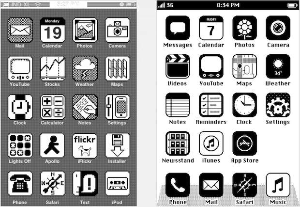
Update 2/22/2012: Want your iPhone to look like this? Here’s how to install the iOS 86 theme on an iPhone and iPod touch!
What would iPhone’s iOS look like had it been made in 1986? Maybe this, and it looks awesome in that retro sort of way. This is just concept art from a few designers who posted their ideas to LiveJournal, but I know I’m not the only one secretly hoping that someone will make a jailbreak skin or theme that matches the concept art, and if it happens we’ll certainly let you know.
Check out some more pictures below:
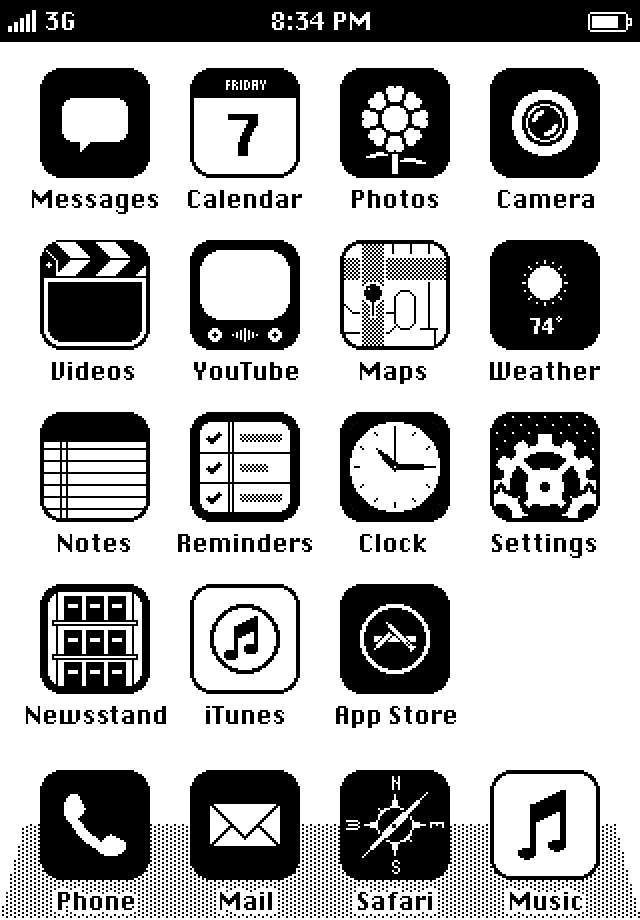
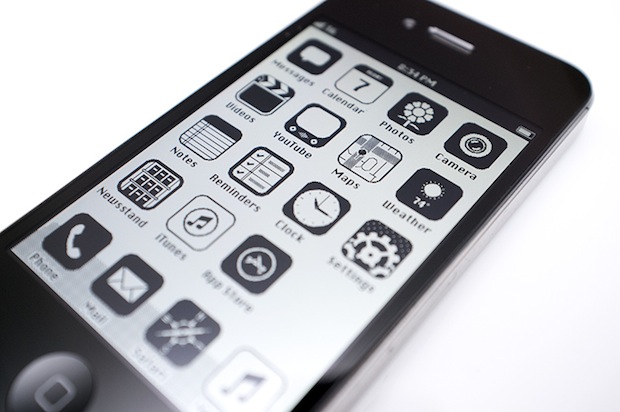
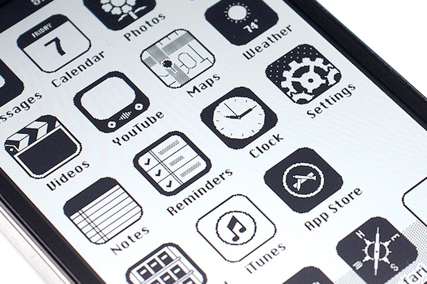
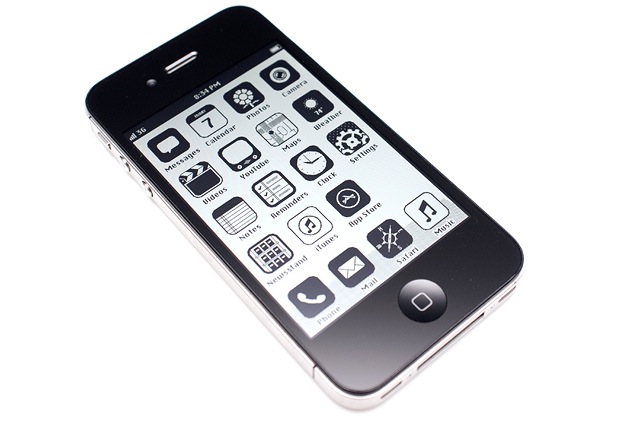
This iPhone theme combined with one of those 80’s block cell phone cases and you’d be the envy of everyone 25 years ago. This is a fun find by Gizmodo, but if you can’t wait until this skin gets (possibly) designed, you can try to run Classic Mac OS on the iPhone too.


Silly Amiga fanboy, if Commodore had done it then it would look like that horrible early 90s video toaster aesthetic that Tim and Eric parody.
Would certainly improve battery life.
Change 3G to AMPS, TACS or NMT, and make the phone 2 inches thick and weigh 8#, and then we’re really getting somewhere.
“If Apple Made iOS In 1986…” well they didn’t, can we move on now?
But it still wouldn’t have had C&P until 3 years after every other phone had it.
Needs Donky Kong….. seriously its that retro I am flashing back to dual screen handheld Donky Kong.
Man that was fun….and hell what version did we have to wait for to get copy and paste. Sigh
And I was whining about Iphone, my bad.
… or Pong …
that is not at al what it would of lookeed like! to modern… make it like some type of wood or plastic!
In first left image, the phone carrier id is IND XL.
Is it means XL Axiata?
This is not how it would have looked, think sinclair spectrum, teletext or ceefax the alphabet was almost unrecognisable never mind graphics. As for touch, try hitting the return key several times then unplug wait and try again. Wait for the analogue sound then you can start, but I don’t see a slot for 2 pence pieces so that you can make a phone call. Nice try but not authentic enough try Tetris for your symbols then you will be nearer too the mark. I wonder if the person who came up with this was born in the 80’s ? or after.
Here’s an iPhone / iPad app that recreates the calculator from the classic Mac (Steve Jobs actually sat down and designed this calculator, which was used on the Mac up through OS 9). http://tod.fm/x/3l
Wow that is awesome, too bad it’s $1 for a calculator that’s otherwise free
Would there even be a touch input availability back then?or even an iPhone 4
???
Still better than Android.
If Amiga did it, on the other hand, it would look pretty similar to how it does now.
…and this is what the ipad looks like back then http://oldcomputers.net/pics/newton-right.jpg
Beat me to it.
touchscreen in 1986. c’mon man this was pointless. at least make the hardware look like something out of the 80’s. all you did was make the screen monochrome. wack!!!
You need to go back to the top and read it again because they did mention
“The Ultimate Retro iPhone Case Turns Your iPhone Into an 80′s Block Cellphone”
For the ultimate look and feel. ( just too bad it doesn’t have an extra battery compartment in their.)
As far as touchscreens in the 80s, go to Wikipedia and look it up or if you don’t trust them, go get yourself a book.
I’ll save you the trouble of looking it up.
“Bent Stumpe with the aid of Frank Beck, both engineers from CERN, developed a transparent touch screen in the early 1970s and it was manufactured by CERN and put to use in 1973.”
“In 1986 the first graphical point of sale software was demonstrated on the 16-bit Atari 520ST color computer. It featured a color touchscreen widget-driven interface. and was the first commercially available POS system with a widget-driven color graphic touch screen interface.”
Don’t make blind statements without proof.
Granted Wikipedia isn’t always accurate, but the information can’t be far off.
and the Apple Newton message pad, was 1st available in 1993.
That means that Apple had to be working on this for at least 5–10 years before release, waiting for the cost of technology to come down in price, size And power consumption.
I still have my mint(kinda) working Apple Newton in a box around here somewhere.. it’ll be worth something one day…
What, no Hypercard?
Forgot about Hypercard! That brings back some memories.
3G doesn’t make sense haha back then there was like GSM 1.0 or whatever ! ;)
[…] that retro iOS ’86 concept theme for iPhone that popped up recently? We were hoping it would become an iOS theme, and it has. […]
You’ve invented the MiniFinder.
What I wonder is why they seem so adamantly against choice. I can sort of understand their rationale that they want to defocus the UI to allow better focus on content. But that’s not an issue for me, nor does it seem to be an issue for many Mac users I see commenting about these matters. Why not, for instance, allow the option of using aqua scroll bars?
It would have been more fun if they used actual apps used in those days like write paint, etc.
Now THAT would be a good theme.
Why if? Haven’t you heard? In line with Apple’s design strategy to stylize icons by making them grayscale in Lion, in iOS 6 the UI will be monochrome. These are just leaks of the prototypes ;)
so how about now? i cant see grayscale lion or ios6. -.-‘
Pointless and absurd like most posts on this page!
But the remark is more pointless and absurd than the page itself.
The hardware looks too modern.
Not only that, but I want the level of graphics in the actual apps to match the look of the icons. Go everything retro, 100 percent.
YouTube in 1986?
VHS tapes.
Beta…
“Now Apple wants to go back to grayscale or black and white, and everyone thinks that’s amazing.” It’s not Apple, just designers and some consumers.
But I see your point.
Just look at a popular game now… Mindcraft! I can see the appeal but sometimes I just want some advance graphics.
there is no mindcraft… its called Minecraft. -__-
+1
*Is an avid ‘crafter who hates it when people call the game ‘Mindcraft’*
Jeez, I had Macs like that back in the day. For years, we would clamor for color. They eventually gave us grayscale, and we thought that was amazing. Then they finally gave us 256 colors, and we thought that was amazing. Now Apple wants to go back to grayscale or black and white, and everyone thinks that’s amazing. Sigh.
I’m with you my friend… Let’s not repeat the past!
Well Apple doesn’t want to. I agree with you though; retro in this form does get old.
Hipster iOS
OMG I want this. How hard could it be to make this into a theme really?