Use iBooks Themes to Improve the Reading Experience on iPhone & iPad

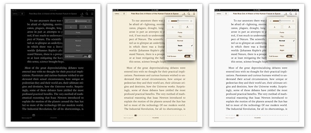
The iBooks app includes three different color themes that can be used at different times of day to improve the reading experience. Accessing the themes is easy:
- Launch iBooks and open a book
- Tap the “aA” button at the top of the screen and tap on “Theme” to show the three choices; Normal, Sepia, and Night
Normal shows classic black text on a white background, this is great for mid-day reading when the ambiant lighting is brightest, but later in the day it can be harsh on the eyes.
Sepia offers dark brown text against an off-white background, making it perfect for dimmer lighting in early mornings or evenings when the surrounding light isn’t quite as bright.
Night is light grey text on a black background, which is ideal for reading in the night time in darker rooms. Not only is it easier on the eyes, but the inverted screen colors stop the iPhone or iPad from illuminating the rest of the room like an artificial lamp, making it less obnoxious if someone in the same room is trying to sleep. You can also take the Night theme concept system-wide by inverting the iOS screen, making it easier to read web pages and use other apps in the darkness.
The Sepia theme is probably the best all-around choice to use if you don’t want to be tweaking themes throughout the day. Use it in combination with adjusting the screen brightness and you can read comfortably in just about any lighting conditions. The dimmer the surrounding light, the lower the brightness should be, this makes it easier on the eyes and has the added benefit of improving battery life of an iPad or iPhone.


[…] discussed how important changing the color theme can be, and alongside adjusting the text size it’s perhaps the next best way to reduce eye […]
Some ibooks do not show a theme option under the aA icon. I would like to be sure that my book does. But I can’t find where an author should ensure that the option is included. Any advice?
having the same probelm… the ‘theme’ button is not showing in my ibook to allow for night theme… called apple… they had no idea how to fix this.. at first they said that if i publish (instead of preview) it will become available… but not happening… HELP !
Thanks for this tips but doesn’t solve my problem which using iBooks mainly for reading PDF files.
I have another fix though. :-)
– Enabling “White on Black” through triple-clicking the Home button.
Steps:
Setting > General > Accessibility
Select “Toggle White on Black” for the last option – Triple-click Home.
Next time when opening iBooks or Safari for bed-time reading and don’t want to hurt your eyes too much. Rapidly tap the Home button 3 times and viola! :-)
Call me crazy but I think this is less necessary on iPad 3 because the screen is so much more yellow to begin with. Check out some of the pictures, it really is this stark a difference!
http://falklumo.blogspot.de/2012/03/apple-ipad-3-first-screen-evaluation.html
http://cdn.macrumors.com/article-new/2012/03/colors.jpg
http://arstechnica.com/civis/viewtopic.php?f=19&t=1169773
Set to Sepia and forget the rest, looks very similar to Flux running on a Mac.