Re-Theme OS X with Flat White Windows & Retro Mac Pinstripes

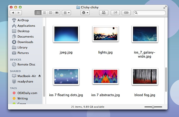
The general appearance of Mac OS X has remained mostly the same for several major OS X releases now, but earlier versions of the operating system had a brighter whiter look for window frames and panels, with some pin striping thrown in there. If you’re tired of the newer darker modern theme that exists throughout OS X from Snow Leopard to Mavericks, you can re-theme the appearance of things and get a retro white theme complete with restyled window elements. The resulting appearance is flatter and whiter, and other than the retro looking pinstripes, it actually looks a bit like something Jony Ive would do to OS X with inspiration from iOS 7, showing generally brighter colors, less shadowing, and a flatter look overall.
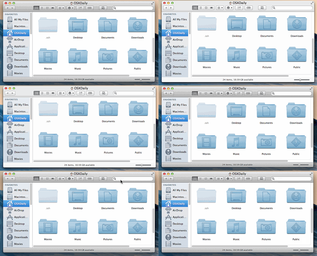
If the difference isn’t immediately obvious to you, it’s because the change in appearance is fairly subtle. This animated gif shows the two overlaying each other to demonstrate this, though keep in mind a GIF has limited color palette:
Re-theming OS X this way requires the usage of the Terminal app, found in /Applications/Utilities/, and though it’s a simple defaults command sequence, if you’re not comfortable with the command line you may want to reconsider whether or not to do this. Yes, it can be easily undone if you’re not happy with the results. This has been tested and confirmed to work in OS X Mountain Lion (10.8) and OS X Mavericks (10.9), though it may work in older versions too.
Re-Theme OS X Windows with a Bright Flat White Theme & Pin Stripes
Launch Terminal and enter the following command string:
defaults write NSGlobalDomain NSUseLeopardWindowValues NO
For the full impact to be system-wide, you’ll need to either log out of OS X and back into a user account, or just reboot the Mac. If you don’t have time for that, relaunching apps will cause it re-theme upon launch, or you can kill the finder to have the change take effect there first so you can get an idea of how things look:
killall Finder
Again, for the full effect to be applied system wide, you need to quit out of all apps and re-login.
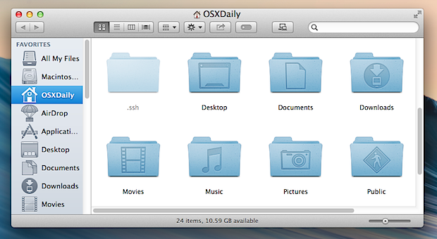
Here is a before image of a Mac Finder window with the default modern grey OS X theme:
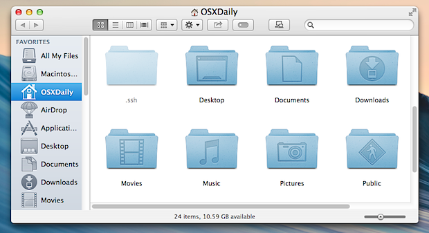
And here is the same Mac Finder window re-themed with the white window appearance:
And here’s a before / after of the System Preferences with and without the new theme as well, here it is before with the default Mavericks look:
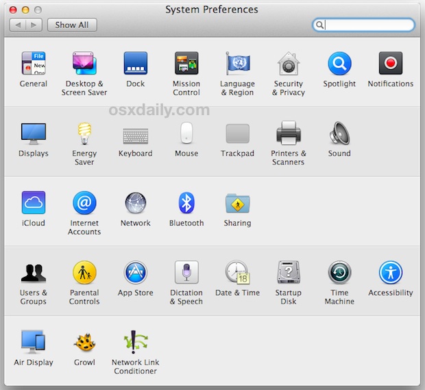
And here is System Preferences with the white theme, notice the pinstripes are faintly visible:
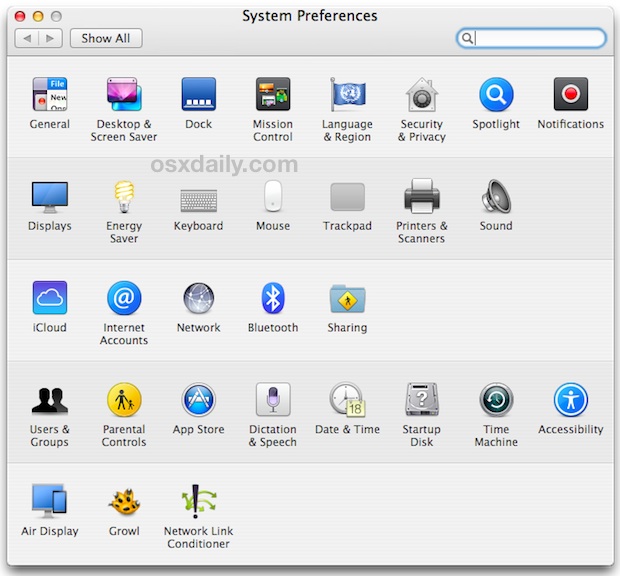
Longtime Mac users will notice this isn’t the super-bright candy color scheme found in the initial releases of OS X 10.0 and 10.1, but as the command string implies, it’s a later more refined version from Leopard.
The whiter flatter look goes well with other iOS-style tweaks that you can make on the Mac, so if you’re into the idea of making OS X look like iOS then you may want to go a bit further to complete your re-theming. Don’t forget to pick a nice wallpaper too.
If you’re confused on how to do this, the brief video below shows entering the command into the Terminal and killing the Finder so that the changes take effect there. For things to apply system wide you’d want to log out or restart though:
Revert Back to the Modern OS X Theme & Window Look
Not thrilled with the washed out white pinstripe retro theme? It’s very easy to go back to the default theme of OS X Mavericks, just go back to the Terminal and enter the following command string:
defaults delete NSGlobalDomain NSUseLeopardWindowValues
For a complete reversal, log out and log back in, insuring to quit all open apps along the way. You can also reboot, or if you only took the time to test it with the Finder initially, you can simply kill the Finder again to bring about the
killall Finder
You’ll be back to the new normal darker grey window scheme again.
As far as we know, the new default and this white theme are the only two significant window appearance options lurking in Mac OS X that don’t require third party downloads – if you find another let us know in the comments.
We’re big fans of customizing the way stuff looks, if you are too don’t miss our other customization guides and walkthroughs for making OS X and iOS match your preferences.


Is there any way to get the pretty back into OSX somehow? All this flat and gray makes me feel like the UI was designed by a soviet 1970’s engineer with a job description that allows for no taste at all.
As xpoint says, I also had the issue with the advanced settings in the network system preferences. When reverting back it worked again…
When I taken this change, I can’t open the advanced setting of network in system preferences, it’s works again until I revert back. so, be careful.
This is cool and all….but it caused a problem in my settings. It would not allow me to edit any security settings at all! When I revert back, everything worked fine.
I’m not a programmer, so I have no idea why that happened….
Do not install Flavours and google it first. My Mac became really unstable and malfunctioning (crashing native apps like Safari). I’m glad I only tried the trial, not bought it.
For Safari use this one:
defaults write com.apple.Safari NSUseLeopardWindowValues YES
;)
Although is a neat trick it has it’s downs.
On my Mac I couldn’t click on the Advanced… Menu inside System Preferences>Network .
At first I thought maybe I’d done something else, but after rebooting my Mac it didn’t work. And just after changing back this tweak, came back to work!
Or just get Flavours.app and apply a REAL theme like in good old Shapeshifter times.
You should also consider flavours http://flavours.interacto.net/
works fine with mavericks
Full screen in quicklook no longer works with this. Nice idea but reverted back
Doesn’t change Finder tabs graphic style, so if you use finder tabs, it looks like crap.
Also as it reverts to Tiger window corner radius on the top edge corners, many things look weird (like the full screen window titlebar buttons)
at one point apple started making the foremost finder window darker than the ones in the background. this defied intuition, though i guess that’s ancient history now.
what’s interesting about this tweak is that background windows / inactive windows are easily determined since they go pinstriped.
NICE! Finder looks so much better!
but doesn’t work well with safari or preview (so far).. so I’ll have to revert back new look. =(
I want my scroll-bar arrow buttons and Time Machine spinning menu bar icon back!