Access the Calendar List View for Specific Dates on iPhone with iOS
![]() The Calendar app list view is probably the single best way to quickly see an overview of events and meetings scheduled for a specific day. Widely appreciated for it’s convenience, the date specific list view was removed and obscured within iOS 7 in favor of a more difficult to access wider list view that encompassed events across multiple dates instead. Fortunately, that has changed moving forward, and now users will again find quick and easy access to the much loved date list view in the Calendar app on your iPhone and iPod touch.
The Calendar app list view is probably the single best way to quickly see an overview of events and meetings scheduled for a specific day. Widely appreciated for it’s convenience, the date specific list view was removed and obscured within iOS 7 in favor of a more difficult to access wider list view that encompassed events across multiple dates instead. Fortunately, that has changed moving forward, and now users will again find quick and easy access to the much loved date list view in the Calendar app on your iPhone and iPod touch.
If you’re unfamiliar with the date list view, or if you were one of those users who abandoned the default iOS Calendar app because the events list was lost, you’ll find it is now easy to get to, and that it quickly shows the scheduling details you’re probably looking for.
We’ll show you how to use the date specific view and the wider events list in Calendar app.
How to Use the Date Specific List View in iOS Calendar
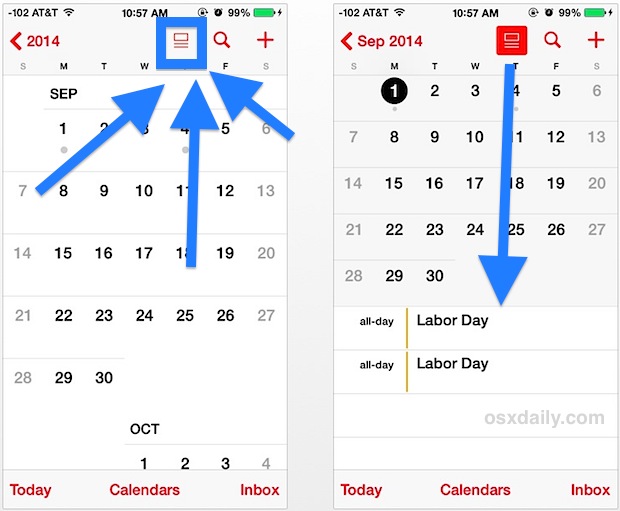
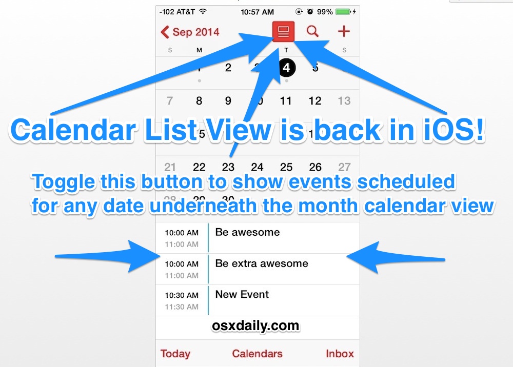
This will access the date specific list view, which combines a list of dates underneath the month view for easy viewing of schedules on specified dates:
- Open the Calendar app as usual and go to the general month view
- Tap on the box with two lines underneath it to reveal events listed underneath the month calendar, this button is what now toggles “List View” on (or off)

As long as the List View button remains toggled on, as indicated by the bright red inversion of the button, you can now move along to other dates with a quick tap to see what events are scheduled for those days.

Show the Wider Date Event List View in iOS Calendar
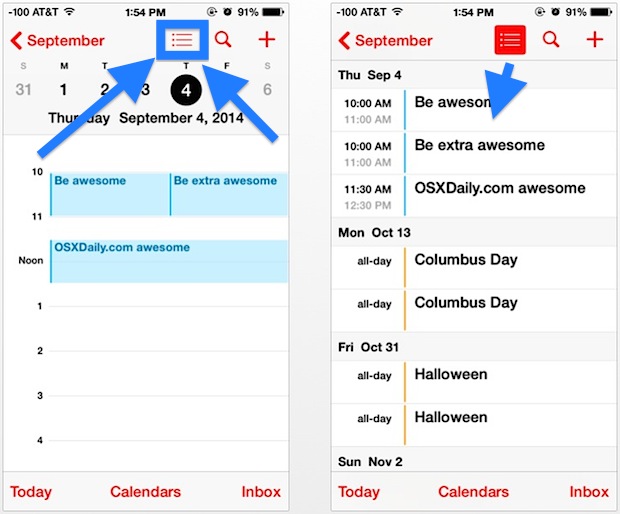
This will show the a wider list view, the same that was found in iOS 7.0 which continues to be accessible in iOS 7.1 too, though to get there users no longer choose the magnifying glass search icon, and instead use the same List toggle mentioned above:
- From the Month view of Calendar, tap on the list view to turn it off
- Tap on a date that you want to see the broader list view for
- Now tap the “List” button at the top of Calendar to show the wider event list view

These changes make much more sense than the mysterious magnifying glass trick that offered a half-solution in iOS 7. If you don’t see this option, be sure your iPhone, iPad, or iPod touch is on iOS 7.1 (or newer…) otherwise you won’t have access to the improved list view feature at all.

Longtime iOS users will know this ‘new’ feature is actually much more in line to what existed in iOS prior to the major 7.0 overhaul, making it a very welcome addition to reintroduce back to Calendar app in the latest versions. From here on out, it should stick around.


Great article, many thanks.
I don’t drink the Apple kool aid, and I only get involved when my family members can’t figure something out and they ask for my help. As in, letmegooglethatforyou.com. It seems to happen to me a bit more these days which may support some of the perspectives shared in this thread.
Thanks again for a very well titled, worded, and concise tip.
Thanks so much for this tip. I wasn’t aware of it before reading about it here. Apple overdoes its “it’s so intuitive we don’t have to work hard, or at all, to let you know about it” schtick.
Apple actually gets most things right. Once I got past the negative press and started using it, I’ve found iOS 7 to be very elegant visually.
But I’d agree that they mess up on some basic usability and requirements issues by taking away useful features.
It’s very surprising that a little basic inexpensive research didn’t point out that many people used the month-with-the-list-below view. It was my default view. I almost stopped using Apple’s calendar app until I learned the tip here about how the search function would show the full running list of every appointment organized by day. Funny, the clean design (I won’t call it “flat” — who knows what their marketing dept. was thinking) actually improves the compression of the full-month calendar to fit the list below it.
But whether OS X or iOS, Apple seems to continually make these weird mis-steps, and it’s puzzling: the Save As problem, the power button incorporated into the keyboard, awkward notes syncing, removing local iPhone syncing with iTunes using a cord instead of mandatory iCloud.
I’d add Apple waiting too long to add basic features as a problem of a different breed: finally adding copy/paste ability to iOS, finally being able to search all fields in a contact, which didn’t happen until iOS 6 if I’m not mistaken. Priorities for basics like these were too low on Apple’s to-do list.
I can’t see the Calendar on iOS or in OS X, so this tip doesn’t do anything. I enter appointments and reminders from outside the calendar and wait for the alerts.
This is all Jonny Ive’s fault. I would like to see him fired. He’s great at hardware design, but he is running amok, damaging everything he touches. It does not bode well for Apple that customer needs and requirements mean less to him than his ego.
I agree, the usability of iOS 7 is outright terribly confusing for most people. Yea sure tech geeks can “figure it out” but what about the rest of us? It’s confusing and difficult to use. Now imagine saying that 5 years ago… that APPLE produces products difficult to use? Everyone would laugh, that was the other guy! Right?
On the plus side, I’m sure Apple Support is totally inundated with questions about obvious tasks, so they are clearly aware of the usability issues in iOS 7. Heck, if you’ve been to an Apple Store lately you’ve probably overheard the questions yourself “how do I do this” or “how do I do that”. But, we’ll see if they do anything about it. So far, nothing but a bunch of toggles in Settings to make things uglier.
Happy to have this back, Calendar shouldn’t have lost it to begin with.
Here is what Apple’s new iOS Feature Strategy is:
– Add feature and let people use it for years.
– Remove feature that everyone used and loved.
– Wait 8 months.
– Re-add it back in minor point release and claim it’s a new feature, major selling point of updating to the new point release of iOS.
Can’t wait to see what iOS 8 messes up and then brings back in iOS 8.1 sometime in 2015!
That was their strategy for Pages. You omitted a step between 1 and 2: don’t use Apple products inside Apple.