Enable Button Shapes in iOS to Improve Usability & Make Tap Targets Obvious
One of the major changes that came along with the iOS visual overhaul was the removal of obvious buttons across the operating system and apps found on the iPhone and iPad. While the result is a cleaner, flatter, and more streamlined appearance in iOS, many users have found the removal of obvious buttons to be detrimental to usability, making it difficult to determine what is a tappable target and what is simply text on screen.
That hiccup is exactly what the optional Button Shapes feature aims to resolve, by bringing more obvious button shapes and tap targets back to iOS by using shading and underlining of buttons and actionable text elements.
How to Show Button Shapes in iOS
Enabling Button Shapes in iOS is just a matter of flipping a switch and if you decide you don’t like the effect, you can just as easily turn it back off. So grab your iPhone, iPad, or iPod touch, and do the following and try it out yourself:
- Open the “Settings” app in iOS
- Go to the “General” section of settings, and then choose “Accessibility”
- Scroll down a ways to find the “Button Shapes” option, and toggle that to the ON position
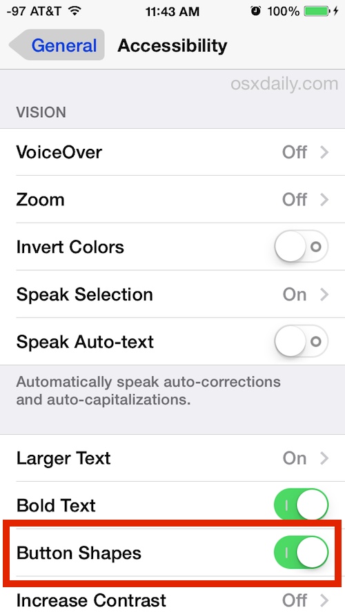
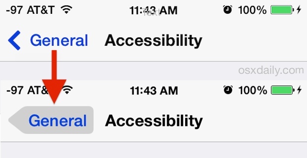
Toggling Button Shapes on has an immediate effect system-wide. You can see the first obvious example at the top of the Settings screen where you made the change, where the “General” back text now has an arrow shapes grey button underneath the text item, making it more obvious as a button.
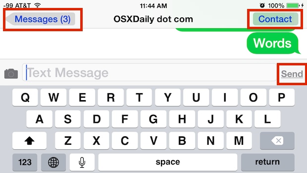
To know if you’ll want to keep this setting on or not, you’ll want to exit out of Settings and look around in other apps to see how buttons are now interpreted throughout iOS. Enabling visible buttons has different effects throughout iOS and in different apps. In many cases, you’ll get literal button shapes (well, shadows in the shape of a button anyway), while elsewhere you may just get an underlining of text to signify the element is a clickable tap target, similar to the way a link on a webpage appears.
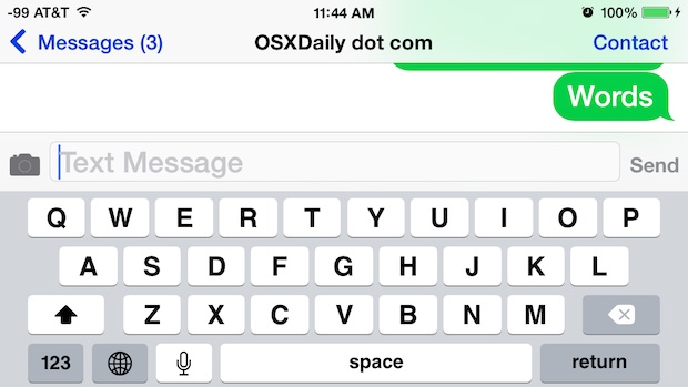
The screen shot below shows what some of the button shapes look like in the Messages app, highlighted to make it more obvious: you’ll see that the Back function has the gray button behind the text, the Contact button also has the gray visible button now, and the ‘Send’ text is now underlined, signifying it’s a tap target.
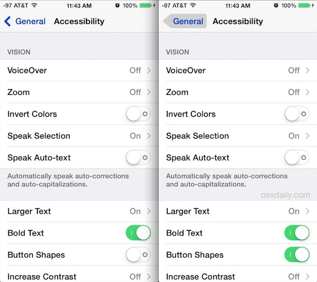
For reference, the screen shot below demonstrates what the same screen looks like before the Button Shapes toggle is enabled:
And here is what the same screen shot of the Messages panel after the buttons are made visible, (minus the marked up highlighting from the prior image):
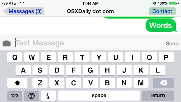
The result is fairly significant, with dramatically more obvious tap targets and a general increase in usability, particularly for users who are less familiar with iOS.
To have button shapes as an option you’ll need at least version iOS 7.1 or newer of iOS, anything less does not have the toggle available in Accessibility. Generally speaking, you should always try to update to the latest version of iOS anyway, so if you’re on a prior version this can be an extra incentive to update.
There are many other usability considerations to make with modern incarnations of iOS, all of which can make a significant impact on the iPhone and iPad experience. From bolding fonts for improved readability, to darkening the bright colors, reducing the white point which tones down the whites a tad, or following some more simple usability improvements you can make with iOS 7 (and 8 for that matter) to make things easier for all users.


In iOS 11.3, this “Button Shapes” setting underlines text that is obviously a button, such as the words in the “Cut Copy Paste” menu. I can’t imagine how that helps anyone. It just adds visual clutter. It was better when this setting actually made buttons shapes for navigation text, like the words at the top of the Settings app. In iOS 11.3, it just underlines those words.
This is amazing!I was looking for the answer for an hour now because i didnt know how to take it off!Until i came here.Thank you!!!
OS X Yosemite is not as flat and looks better. Obvious buttons. Better dimensions. Time to bring OS X back to iOS, not the other way around.
Well, the move away from the gorgeous 3-D look was just a stupid bending to the limitations of the phones and their apps and the limitations therein. Someday, someone will have ‘another’ brilliant idea and bring the 3-D shapes back.
It’s just stupid. People don’t see in 2-D, so why force it on them? I can remember when the 3-D look started and lots of folks wailed about it, too.
Jobs should be spinning in his grave about now.
This is good to know. Jony Ive has totally dorked up the look of this phone and made it more difficult to use. “It just works” has become “It just works when you can figure it out the nondescript UI.”
The world wants a Mona Lisa, and Ive has sold us black and white stick figures.
I still prefer Apple over Android, but it’s because of the base code. The Apple UI is sucking.
I have this enabled myself, and I turn it on for just about everyone who is a novice iOS user – it reduces the amount of tech support calls you get about an iPhone or iPad from family members quite a bit!