Use Reduce White Point in iOS to Subtly Tone Down Harsh Bright Colors
The iOS interface is easily identifiable by it’s ubiquitous usage of whites and bright colors, which can be both pleasing to the eye but also excessively harsh when an iPhone or iPad is used in darker ambient lighting situations. New versions of iOS offer an ability to adjust that bright whiteness with a setting called Reduce White Point, which offers a subtle reduction to the overall brightness of the user interface.
Reduce White Point will shift the display whites (and other colors) ever so slightly towards grey, which has an notable effect that could be described as being similar to an exposure reduction of a picture. Along with darkening text button colors and making text bold to be easier to read, these optional settings can offer an improvement to some users who find the default settings a bit overly stark if not outright harsh on the eyes.
How to Reduce the White Point in iOS 7
Note: the iPhone, iPad, or iPod touch will need to be updated to iOS 7.1 for this setting to be available.
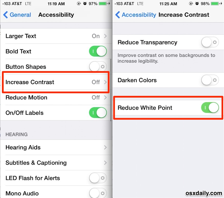
- Open the “Settings” app on the iPhone or iPad and go to “General”
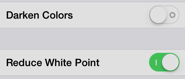
- Choose “Accessibility” and select “Increase Contrast”
- Flip the toggle next to “Reduce White Point” into the ON position
Toggling this setting produces an instant result, as the white point shifts to become slightly darker and whites move to be closer to a light shade of grey.
What’s the Visual Effect of Reduce White Point?
Because the setting is basically adjusting the display profile on the iPhone or iPad, the change won’t show up in screen shots. We’ve attempted to mimic the effect of a reduced white point in the mockup screenshot below:
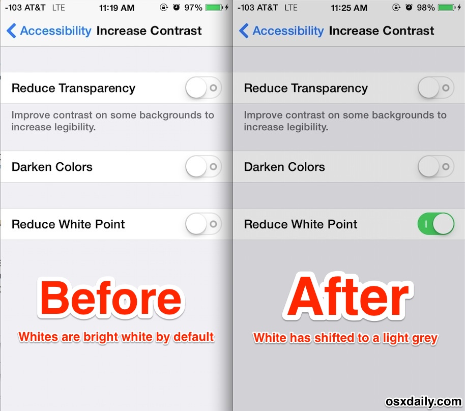
The animated GIF shows the subtle visual change induced with Reduce White Point as well, again this is a mockup:
In some ways, it has a similar effect to just reducing the screens brightness, but you’ll find it’s actually easier on the eyes than simply toning down the display brightness of an iPad or iPhone. There may even be a slight warming effect to the white point change, though someone would probably need professional display calibration tools to determine if the color temperature has changed with certainty, as it could be a matter of perception bias or differences in individual screens.
For iOS users who find this setting pleasing to the eyes, you can have similar impacts in OS X by calibrating a Mac screen and setting the white point to something your eyes are more comfortable with. Another option is to use the excellent Flux app on desktop Macs (and PC’s for that matter), which produces much more dramatic results but can really reduce eye strain particularly when used in the evening hours.

Reduce white point saves battery?
I reduced the white point and then started to read a PDF. I found out that the “white point” messes us the entire phone just to make the UI less painful.
There has got to be a stop to this flat design with its weird colors and its nuclear assault on the eyes. It is time for Apple to return to is previous philosophy of beauty and usability in the UI.
I showed the iOS newsstand icon to an Apple Store employee and asked, “What grade do you have to be in to draw that?” She gasped. The UI looks it was drawn by a fifth-grader with a ruler and crayons. The problem with iOS 7 goes far beyond setting “white points.’
‘There has got to be a stop to this flat design with its weird colors and its nuclear assault on the eyes. It is time for Apple to return to is previous philosophy of beauty and usability in the UI.’.
Flat design is not a trend, it’s just necessary. The ‘nuclear’ assault to the eyes is to see fake 3D effects, unreal texturing, glossy effects, shadows, a trend started with Web 2.0 when the high speed connections were starting to be spread all around the world, hence filling website with bells & whistles became a must. I didn’t mention responsive design, portability, I heavily simplified since it’s clear that You did not even asked to yourself the real matters before typing your meme.
‘I showed the iOS newsstand icon to an Apple Store employee and asked, “What grade do you have to be in to draw that?” She gasped. The UI looks it was drawn by a fifth-grader with a ruler and crayons. The problem with iOS 7 goes far beyond setting “white points.’’
I bet you can’t even draw a simple house with the sun shining on top and a tree at the side, since these skills have nothing to do with graduation, since I know colleagues (I am a doctor) who can barely draw better than a kid. Please next time don’t go to bother employees, stay in your cave. -Antoine
what will be the effect after reducing white point???
Are you serious? Perhaps you should read the article, which describes it in detail, or look at the pictures, there is even a very obvious animated GIF and another mockup displaying the before/after.
Pretty sure this just dims the screen 5% or so
Reducing the white point doesn’t change the coloration anything like as much as your gray examples. It’s more like adding a neutral density filter to a camera; simply less 6500 K light.
But when my eyes are really tired at the end of the day, I use “Invert Colors” which is very soothing, though not good for viewing pictures or videos.
Keep in mind that this throws off the white balance for photos too. If you are displaying photos, make sure the whit point is set to the default or else your photos will look muddy and dim.
when i turned on the ‘reduce white point’, my screen just flickers specifically when i’m looking at photos in gallery and when i’m watching videos on youtube. It’s really uncomfortable. Does this happen to anybody else? and should it happen?
“The iOS interface is easily identifiable by its ubiquitous usage of whites and bright colors, …”
FTFY
I am almost certain that it ‘warms’ the iPhone display and darkens it at the same time. Maybe it’s all in my head, but it makes a big difference on my iPhone 5.
This and “bold text” are absolute must-use settings, they need to become the default.
I disagree and pray they never become the default. I am a photographer and “reducing the white point” (a total misnomer in regards to what it actually does… highlight trimming would be more fitting) makes photos and quite honestly the screen look muddy. Bold text as a default? How about a pair of glasses? I tried the bold text and thought it looked horrid.
I am glad you are not a UI designer for Apple.
Me too