Change the Number of Apps in the iOS Dock to Get Minimal

The iOS Dock sits at the bottom of our iPhone, ipod touch, and iPad home screen, intended to hold the most commonly used apps for quicker launching. While it’s well known that you can customize the apps that are contained within the Dock, what’s lesser known is that you can actually reduce the number of apps visible from the 4 default, down to 3, 2, 1, and, if you really want to, 0 apps.
Reducing the app count in the iOS Dock is done by simply by pulling the apps out of the Dock. First, tap and hold on any app icon to make the home screen icons jiggle, then once when they’re wiggling around, drag the app(s) from the Dock back onto the home screen that you want to remove from the Dock.
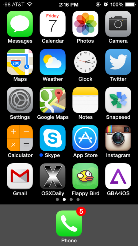
Here’s what the iPhone Dock look like with just a single app visible, the Phone app:
Reducing the Dock app count to a single or couple of apps may be practical for some situations, but it’s hard to imagine a reason to do clear everything from the Dock… nonetheless I actually had a friend ask to do just that… so, if for whatever reason you’re not a fan of having apps in the Dock or maybe you just want a clean slate, you can yank everything out out and start with an empty Dock.
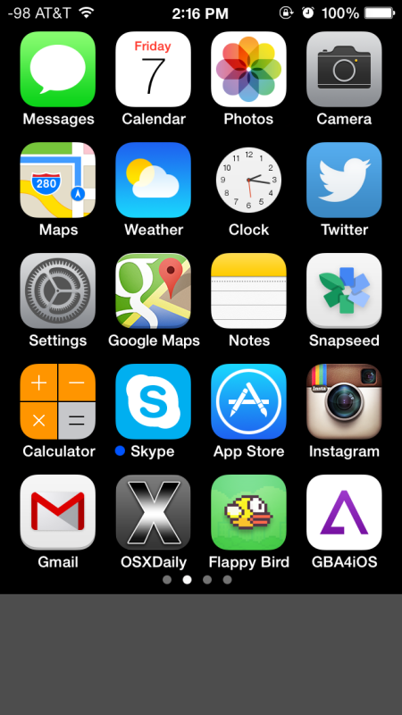
Removing everything from the iOS Dock is done the same way you’d move icons around in iOS in general: Again, simply tap and hold on a Dock icon to start it jiggling, then move each app icon from the Dock and onto the Home Screen. Repeat until it’s totally empty, and you’re left with an empty Dock. This is what this looks like with a home screen still full of icons:

Having nothing in the Dock is really a waste of valuable screen space, because unlike in OS X, it’s not like the iOS Dock hides itself when it’s not in use. Instead, it’ll just take up a considerable portion of your home screen without serving a purpose, making this a rather pointless exercise, but yes, it can be done if you want it done for some reason or another.
If you’re aiming for minimalism, a much more practical endeavor may be to create a completely blank home screen instead, which emphasizes the wallpaper. This is my personal preference, and I use it to keep a home screen that is free of any icons until you flip over to see them. For users like me who mostly use the apps in their Dock icons, this can work without interfering in productivity:

Combine the above trick with reducing the total number of icons in the Dock to a lower number and you may be able to find a happy medium too, particularly if you feel like the default amount of 4 for the iPhone and 6 for the iPad is too busy. But going with absolutely nothing in the Dock or the initial home screen? Well, that’s possible, but as you can see, it looks quite funny, you are left with literally a iOS blank screen of nothing:

Perhaps it would look better with a custom wallpaper, but again, it’s hard to imagine a scenario where it would be practical. Regardless, it’s nice to know that iOS has that level of customization, able to suit whatever your dock needs are. Don’t forget that you can also change the Dock appearance by adjusting the transparency settings or changing the wallpaper used too.


Hello, I’m new to osxdaily. Is there any speed, memory or operational advantage to removing something from the dock you don’t use or is it just aesthetics? Also: How did you change the “bars” to what looks like db signal strength?
273 new messages!!! Read your email man.
LOL, I do… sometimes at least. I get so many emails that I can never respond or read them all, it would be a full time job to email alone.
;)
I learned this trick from Bryan Espiritu of The Legends League.
A folder in the dock works wonders. I personally have 4 folders on the homepage and 1 folder in the dock.
Having a Folder in the Dock is a great tip
4 apps in the dock. Anything less doesn’t make sense
iPhone autocorrect is horrible too
A lot of people have accretive touch down there instead of apps.