Change the iTunes 12 Font Size to be Larger or Smaller

iTunes 12 brought about some fairly significant user interface changes to the media player app, one of which is the size of the font shown in playlist and music views. The new default iTunes font is smaller with tighter padding between list items, and accordingly it can be difficult to read for some users. But unlike most places in OS X, iTunes does offer an ability to change the size of onscreen fonts, which can help make that playlist and music text more readable.
You’ll also find another benefit to increasing the text size used in iTunes is larger padding between the playlist items, further increasing the readability of text within iTunes 12. Making this adjustment combined with showing the sidebar in iTunes 12 can make the media player resemble the prior user experience a bit more if you’re having a hard time adapting to the changes of the newest release.
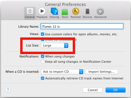
- From the iTunes app, go to the iTunes menu and choose ‘Preferences’
- Select the “General” tab
- Next to “List Size” choose “Large” (or Medium or Small) to adjust the font size of playlist text (yes you adjust ‘List Size’ to change the actual font size)
- Click “OK” to set the change and return to the Playlist or My Music list views to see the difference

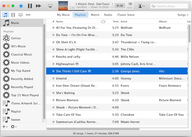
This is what the Larger font size looks like in the iTunes Playlist view, the text size itself is larger and the padding between list items is more significant:

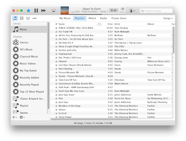
For many users without a Retina display, the Medium font size or Larger font size will likely look the best, but there is a “Small” option. The image below shows what that small font size looks like in iTunes 12 playlist view, which is going to be desirable for some users as well, particularly since it allows for large amounts of playlist data to be seen immediately on screen without scrolling further into the iTunes library:

Note the sidebar font size is not controlled through this setting, by instead through the broader OS X sidebar size setting found in the “General” System Preferences.
For users in OS X Yosemite who make this change but think the iTunes font also looks blurry or difficult to distinguish, changing the font smoothing setting and using the Increase Contrast option can help to improve the text appearance, particularly for Mac users without a Retina display.
Of course or those who really dislike the changes brought about in iTunes 12, downgrading from iTunes 12 to 11 is an option, but over time iOS devices may run into issues with newer iOS versions on older iTunes builds, making that an impractical solution for many.


And this does absolutely NOTHING for increasing the font size when looking at movie titles.
I am 75 and I need a darker ink or a larger font size than “large” in general preferences. Please correct this.
The font size is not big enough (and I’m 25)
I use iTunes for live performance. Was very happy with older versions of the app, but since upgrading to a new Mac and iTunes 12, it’s horrible. Even my band members have commented how the text is difficult to read. And yes, the larger font only succeeds in putting LESS ITEMS IN THE PLAY LIST, which is totally impractical for me… and I STILL CAN’T READ IT!
I’ve had to scroll the entire screen to make it even remotely readable, but that also tends to hide needed controls. Seems that Apple feels that if they don’t ‘improve’ something the customers feel cheated. When something works, I wish they’d leave it alone!
I don’t want to update to iTunes 12, do you know if it is necessary for sync with ios 8.1 devices?
I do not want to update to iTunes 12, how do I stop the daily notifications that updates are available? There seems no way to disable this feature. I have all options unchecked for the App Store in System Preferences but I still get the daily nagging to update.
Why are the song titles so fuzzy now? The little notification flags have them in bolder print, but the regular iTunes window makes it look fuzzy. Doesn’t work well with my vision impairment. Is there some kind of app or plug-in / adjustment to make it bolder?
Indeed many things are hard to read in the new version of OS X and iTunes. The best thing to do is give Apple feedback about this:
https://www.apple.com/feedback/macosx.html
I want to know how OSXDaily was able to swap out Helvetica Neue for Lucida Grande in the screenshot examples above. More readable. Is there something we don’t know? Or, is it just me? Just checked it in Chrome and it’s the same font.
LMAO…I have on LARGE, but it is still pathetically small. Like someone said somewhere in cyber world, Ive must have bionic eyes. Fix that sidebar to make it clear would be excellent. I’m really sick of Apple taking away good feature for the sake of what…..
Hi I’m terribly sorry but I can barely tell the difference, the “LARGER” font size is what, size 12? Is that a joke? What’s the “Small” font size? 8?
iTunes 12 is the worst version of iTunes ever made, the entire thing is a step backwards. It’s like they got together and said “how can we really confuse everyone with iTunes 12? How can we make iTunes really bad? So that people really hate iTunes? How can we accomplish that, while simultaneously destroying usability?” Well, they certainly succeeded in that.
All poor form over function, the form is terrible. What on earth is Apple doing? Are iTunes 12 and OS X Yosemite a parody?
Oh I see the font size is basically the same, the only difference is the amount of PADDING jammed between list items. Gee because having 30 pixels of padding between size 10 list items makes that better.
Apple is notorious for padding everything.
But I miss the iTunes of days gone by.
I am equally as frustrated considering that the traditional sidebar navigation model was broken by iTunes 12, but it is still very much alive in Finder for example.
Is Microsoft having that much of an influence over Apple? Seriously, if we’re forced to use a screwed up media manager might as well switch to Windows Media Player (did I really just write that?!)