Browse Many Images Easier with Split View in Photos for Mac OS X
![]() The standard viewing window of Photos app in Mac OS X shows a series of thumbnails for each image, and if you double-click on any particular image it gets larger and takes over the app. If you wish to view the next picture, most users will click on the back button, then double-click on another picture, and repeat that process. It turns out there’s a quicker and debatably better way to browse through multiple images in Photos app quickly, and it’s by using the Split View option.
The standard viewing window of Photos app in Mac OS X shows a series of thumbnails for each image, and if you double-click on any particular image it gets larger and takes over the app. If you wish to view the next picture, most users will click on the back button, then double-click on another picture, and repeat that process. It turns out there’s a quicker and debatably better way to browse through multiple images in Photos app quickly, and it’s by using the Split View option.
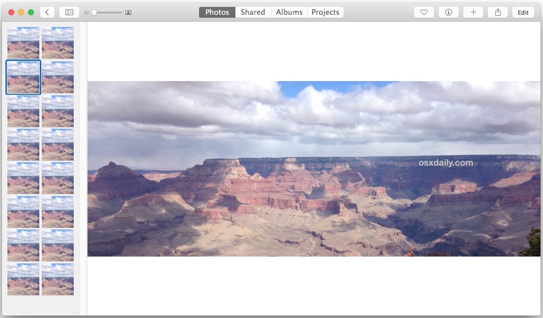
Split View places the primary picture into focus on the right-side of the Photos app display window, with a split panel of thumbnails of other pictures in the same gallery visible on the left side. Simply clicking on another picture on the left split thumbnail view makes that picture open on the right side.
You won’t find the option available instantly in Photos app on the Mac, but here’s how you can access the split screen thumbnail view quickly in Photos for OS X.
- Open Photos app if you haven’t done so yet
- Double-click on any image to open it as the primary focus in Photos app as usual
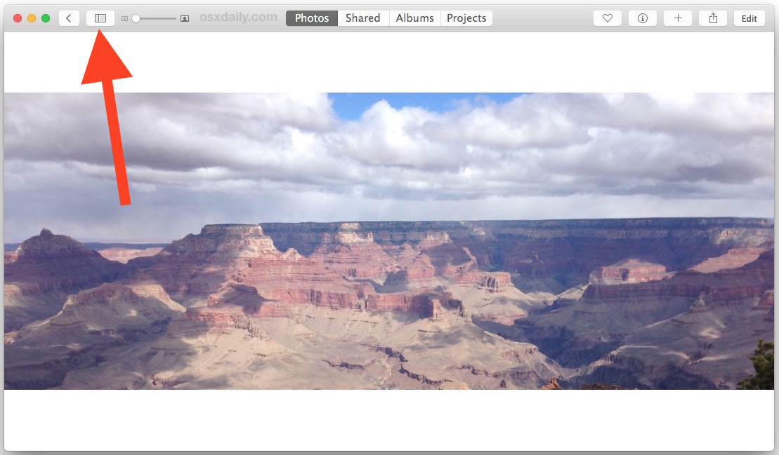
- Now look in the Photos app toolbar and click on the little split view icon as shown in the screenshot to instantly switch to Split View

Here’s what Split View looks like, note the thumbnails on the left side from the same gallery / event, shown alongside the currently active image in Photos app:

With split view you’ll see thumbnails for all other images within that same gallery, which usually means other photos imported from the same date or event. Click on any picture to make it the focal point of Photos app while maintaining the split screen view.
You can also hover over the left or right of an active picture to reveal subtle backward and forward arrows, and using those you can navigate beyond the current date or event and skip into the next one in the Photos app library, with the thumbnails on the left side automatically updating accordingly.
Split screen view is useful enough that once you start using it, you’ll likely keep using it in Photos app, as it does offer a simpler way to navigate through many images in the library. Of course, if you don’t ant to see Split View anymore, just click on the toolbar button again to disable it instantaneously.


Anybody able to create a split view WITHIN the Photos app? I’m working on a Project (Photo Book) which provides thumbnails of my photos in a “bottom bar” when I’m working on the book. However, I can’t make those thumbnails bigger, and so I find myself clicking back into “Photos” in the sidebar to view the image at a larger size. Everything I read about Split View in OS El Capitan says that it works to see two apps; I want one app with two windows. Any ideas? Help greatly appreciated.
Now all that is needed is for the main Photo browser and the editor window to have a selectable 18% grey background to facilitate accurate perception of Mage colours & contrast.
Neither stark white, nor glossy black are suitable.
Why is Has Apple assigned clueless interface designers to software development. Junior designers should at most be limited to designing internal corporate memos, at least until they comprehend design basics.
A probably lousy suggestion would be to copy all the event folders elsewhere, delete them from Photos, and import in your preferred order.
Doesn’t help for subsequent “older” photos however.
Thanks for posting this. I will make use of it!
On Mac OS X, Split Screen is also accessible from the menu bar when you open Photos. (BTW-This menu bar disappears if you choose “View full screen” until you move your cursor against the top edge of the window.)
It says Photos/File/Edit/Image/View/Window/Help. Click on “View” and a whole dropdown menu shows up that includes the choices “Hide Sidebar” and “Show Split View”. By hiding the sidebar, the photos in the view screen are larger. The sidebar is a list of your albums so if you are used to having that “there”, be sure to choose “View” and tell it to “Show Sidebar” again. The other choices in “View” are very useful, too.
Thanks for the tip. Now, if only the “events” (= “moments”?) and photos could be arranged by date taken rather than date loaded . . . any suggestions?