How to Find “Details” Button in Messages for iOS 13 & iOS 12

If you have updated to iOS 13 or iOS 12, you may be wondering where did the little Details “(i)” information button go in Messages for iPhone or iPad? The “i” info button in a Message thread used to be always visible in the upper right corner of a message conversation thread on an iPhone or iPad, and when tapped on you get to a “Details” screen with more information about a message thread including details about the contact, a quick ability to call or FaceTime that contact, send and share location with them, hide alerts and adjust read receipt behavior, see attachments and images, and more. Like a variety of other changes in iOS 12, the conversation details and “i” info button has moved in Messages app for iOS 12.
If you can’t find the little tiny “i” info button to get details about a Messages conversation, read on to learn where you can locate the missing ‘i’ button to get more conversation info and options at the Details screen in Messages for iOS 12 and iOS 13.
How to Find the Info / Details Button in Messages for iOS 12+ on Phone or iPad
Accessing the “info” button and details screen is the same in iOS 12 or later for iPhone and iPad, here’s where to look:
- Open the Messages app in iOS 12 as usual, and then open any message thread or conversation
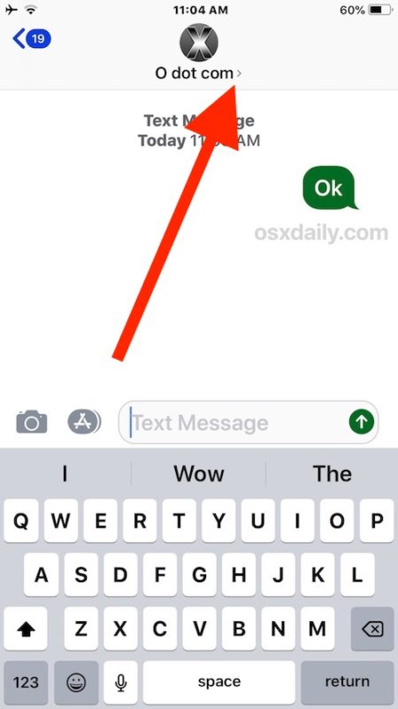
- At the very top of the screen look for the contacts name and icon, and tap on that right where the tiny light grey “>” button is
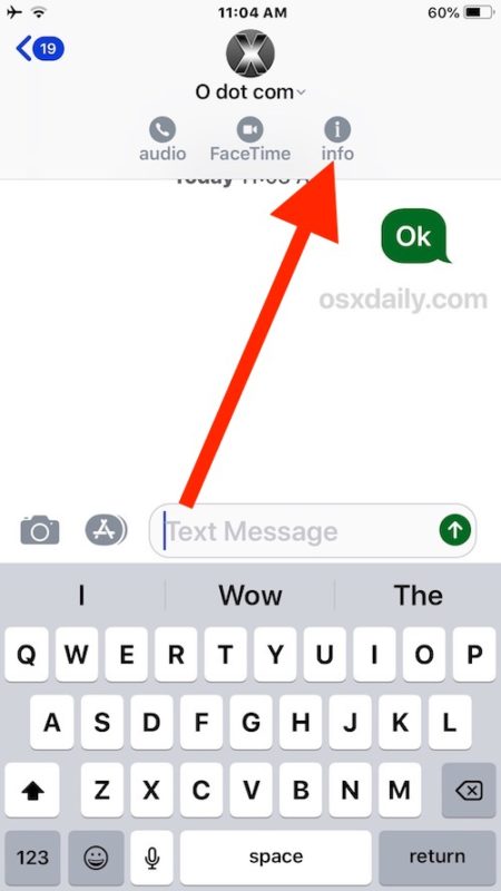
- This will reveal three additional options in a Message conversation thread: audio, FaceTime, and “info” – the latter option is the same “(i)” information button that used to be prominently visible all the time in Message app, so tap on that to view the message conversation details for that particular thread
- Perform whatever actions you were looking for the Info section for and then tap “Done” to exit out of the Message thread conversation details and information section


These steps are the same for finding the Info / Details button in any Messages app thread or conversation on the iPhone or iPad running iOS 12.
If you weren’t able to find this on your own, don’t feel too bad. Tapping on the contact name doesn’t necessarily look like a button, but it is, and the three button options and light gray text that appears immediately underneath the contact name at the top of a message thread can be easily overlooked, thus if you overlooked this you’re probably not alone. Just remember to tap on the contact name and then the “info” button that appears next.
The animated GIF image below demonstrates tapping the contact name which then reveals the “info” button for Details about a particular message thread:

One nice perk to changing this function to the way it is now in iOS 12, is that the same trick to reveal the “info” button now also gives users very quick access to immediately call or FaceTime a contact right from the primary Messages thread screen.
This change is fairly subtle and a lot of iPhone and iPad users may not even have noticed the change, at least until they go looking for how to access conversation details and info about a contact or thread (like if they’re going to mute a Messages group conversation in iOS or leave a group message conversation in iOS to get some peace and quiet from a busy conversation).
It’s perhaps worth noting this isn’t the first time that Apple has changed this Messages panel, and in prior versions of iOS it was once visible in the upper right corner of any message conversation as an ‘i’ button or as a “Details” button. This new variation makes the initial Messages conversation screen a bit more minimalist, particularly if you hide the Messages app icon bar full of colorful buttons and icons.
Accessing the Details / Info button in Messages isn’t the only interface and usability change introduced to Messages or iOS 12 and iOS 13. Another subtle change that has perplexed some users is the new ability for how to access photos and send pictures from Messages in iOS 12, which is now tucked into the Messages apps bar, and another usability change which has led to some confusion is the new method for how to flip the FaceTime camera in iOS 12 on iPhone or iPad during an active FaceTime conversation, where the flip camera button is now hidden behind an additional options button.
Anyway, if you’ve been confused about where the “Details” or “Info” i button went in a Messages conversation since iOS 12 and later, now you know! Just tap the contacts name at the top of the Messages thread screen and you’ll find what you’re looking for.


👍🏻Nice tip, just tap the name. Thanks!
👍🏻 Thank you! Good tip! Nice to just tap name.
No way to remove someone from a text string?? Or to add a person??
Driving me nuts.
When I upgraded to iOS 12.2 I lost the ability to send Read Receipts to individual contacts. I have Read Receipts disabled, but was previously able to send to select Contacts. Was this feature removed or moved somewhere else?
Read Receipts per individual contact is accessible through the (i) Details button that is described how to access in this tutorial. I use the feature myself, it is a good one.
I’m trying to name a text group and that option no longer is available under the info tab. Any ideas?
I still can’t name the group. Has this feature disappeared?
Yeah this sucks, plus it’s seems they’ve hidden or gotten rid of the “add to conversation” option so you can make a group iMessage. If someone has found it please let me know.
Thank You!!! I was going crazy trying to find it. Apple is always jacking something up! Jeezus!
Why does Apple rely on beta testing instead of running parallel systems current and revised for comparison?? Apple’s cheap labor is showing H1B workers are not so bright after all. Stop revising just to revise and make sure changes work!!!!!
I don’t mind this change is iOS 12, but again why….
More importantly, how about that new invisible Bluetooth indicator? Is it on? Is it off? Who knows?!?
LOL
not really.
I do mind changes made just for the sake of changing something, such as this one. Software and web developers constantly ignore the old saying: when something is working well, leave it; when something isn’t working well, then change it. They are all the times making changes just because…with no apparent reason.
May be the slogan should be:
Apple- intuitive …once you know how!
And if you know it will be changed next time. I have no understanding for always changing working interfaces. It sucks…
You don’t need to tap the tyni “>”, just tap the contact name 🤦♂️
You know what would be nice? If you didn’t have to tap something that doesn’t look like a toggle in the first place. Oh that was already implemented? Sounds too useful, let’s have some courage and remove that.
If it’s useful, courage it!
I am impressed with the way that Apple continues to break the user interface to match the performance of iCloud. They must be making an amazing effort to justify a new slogan – “it just doesn’t work”
Hi
Is this fix only for iPhone X? This does not work for iPhone 7 IOS 12.0.1 the header you mention does not appear.
Thanks
John Markunas
I have iPhone 7 and with iOS 12 I have to tap the persons name to see the options and Details button. It is the same on my iPad as well.
Thus this applies to all iOS 12, iPhone and iPad.
No it is for all devices running iOS 12. I do have it as described on my iphone 6s and 10.5” ipad pro.