Hate Safari Tabs in iPadOS 15? Get iPadOS 15.1 to Revert Them Back

If you’re an iPad user who updated to iPadOS 15 and did not like the redesigned Safari Tabs experience, where the tabs are hard to tell apart and differentiate from and look like strange buttons instead of, well, tabs, you’ll be happy to know you can rid yourself of this experience quickly.
Reverting the iPadOS Safari Tabs back to what they looked like previously (with iPadOS 14.x and earlier) is as simple as updating to iPadOS 15.1.
Mac users can achieve the same change by updating to Safari 15.1, or macOS Monterey.
Presumably this UI change/reversion will carry forward in future Safari for iPadOS versions too.
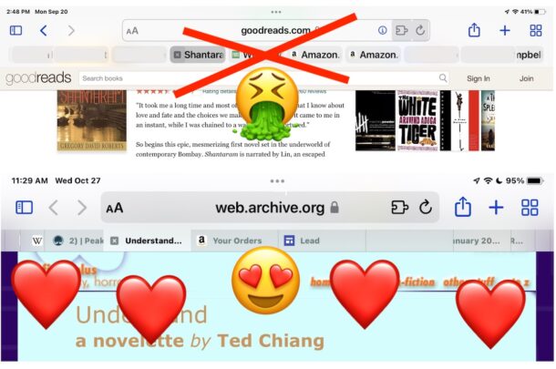
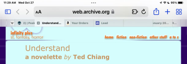
The new (old) Safari tab design with iPadOS 15.1 and newer:

Compared to the strange redesign where it’s hard to determine which is the active tab that didn’t last long in iPadOS 15:

The Safari tab redesign was fairly controversial with a lot of users and beta testers, but it carried through to the release of iPadOS 15 and Safari 15 anyway. The initial public frustration was largely ignored, until influential blogger John Gruber at DaringFireball wrote an excellent takedown on the changes, and why they are confusing.
Of course the tab look isn’t the only change to Safari for iPadOS, and if you don’t like the color highlighting then you might want to disable the color tinting effect of the Safari toolbar easily with a settings change.
This is obviously geared towards iPad because the tabs experience saw the aforementioned visual overhaul there, but iPhone users can move the search / address bar back to the top with a simple settings change in any iOS 15.x version, if you don’t like how that changed on iPhone.
For Mac users who are not thrilled with the look of Safari 15, updating to macOS Monterey offers a reversion of the Safari tab interface appearance too. Installing the freshly released Safari 15.1 update for macOS Big Sur also reverts the tab appearance changes, restoring the easy to scan look for Safari tabs back to the way they used to look on the Mac.


Great article, a shame you don’t mention HOW to revert to the old Safari. The modern rage-inducing offering has me using Windows 10 when I want to get something done.
If I am forced to suffer IOS 15 for much longer, I’m going to play frisbee with the iPad.
GO to Settings > Safari > and select the Safari tab design you prefer
I reached out to a few people in the Bay area were I work about how disrespectful this article is to the Apple designers of the new tabs design. This includes some Apple employees who have worked with me a few years ago. We all think these Apple designers did not deserve having their design compared to vomit. This was not a nice thing to do.
I told Apple that I did not care which design they use since I have been using the cards design to switch between web pages for almost 2 years now. I know people here I an reach out to in order to get the new design put back. I may still do that. If that happens, you’ll get used to it just like you had to get used to the removal of iphone jack.
You should check the news about Google’s problems everywhere. They’re getting addressed no matter what in both the US and Europe.
You’re telling people the new design is bad with screenshots, for Google. People should be allowed to choose what they want. Especially those who actually own and use those products. I use an ipad daily. I care about the design choices Apple makes. The new design worked better for the rest of us. The old design was disabled by several coworkers and myself in ios 14.
We live and work in the SF Bay area where many including Google employees are tired of the companies meddling into other people’s business. Stop helping them.
This is about Safari design, not about Google. There is nothing about Google in this article, I am perplexed as to why you think there is.
You can use DuckDuckGo, Bing, or other search engines as the default in Safari if you do not want to use Google search. User choice is a good thing!
How much did you get paid to write this article? It’s being forwarded to the US congress along with the many Google centric articles intended to get people to switch to Google services as an example if what type of parasite this company really is.
This is an article about Safari, specifically about changes to Safari tabs appearance on iPadOS 15 and iPadOS 15.1 or later. There is no mention of Google anywhere in this article. Whether or not you use Google with Safari is your choice, if you are interested in changing your search engine in Safari here are instructions:
https://osxdaily.com/2014/12/04/changing-default-search-engine-safari-ios/
Best of luck with your congressional outreach.
And how do you change it?