Check Out This Fun Video of Mac OS 9 Nostalgia, Imagining Zoom, Slack, Spotify, etc in Retro UI

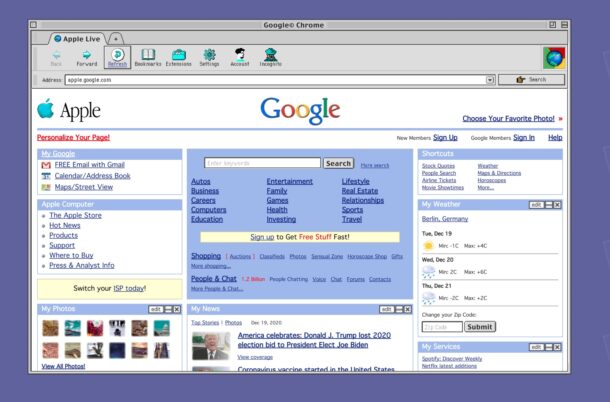
Have you ever wondered what modern apps like Zoom, Spotify, Google Chrome, Figma, or Slack would look like in the Mac OS 9 UI?
Designer Michael Feeney did, so he took it upon himself to apply the 90’s Mac OS styling to some common apps used in todays workflow. In his own words:
“(mac)OStalgia is exploring my 2021 work-from-home routine from a nostalgic perspective. How would have the same workflow looked like with the tools of today and the limitations of yesterday. macOS 9 meets modern software with unreliable internet, little disk storage and many more tech hiccups.”
Check out the video below to see what it looks like in action.
That good old Mac OS user interface is clean and simple, the buttons are obvious, there’s no guesswork as to what does what, leaving little wonder as to what interface elements do what. Of course now we have fancy design oriented interfaces, along with complex multitasking capabilities, super fast CPUs, and large amounts of storage space, so perhaps we traded simplicity and discoverability for power and complexity.
Wouldn’t it be kind of fun if you could toggle a retro mode on with modern MacOS? The closest you can get is enabling Increase Contrast in macOS preferences which sort of gives everything a simpler and more retro look, with buttons clearly defined.
If you’re feeling the need for more retro Macintosh computing nostalgia, you can run Mac OS 8 in an emulator as an all-in-one package here, though the self contained emulator of course won’t run any modern apps, nor does it have access to the internet, unfortunately.
We’re big fans of retro Macintosh stuff and having a little fun, so don’t forget to browse through those archives too.
This is a neat find via Daringfireball.


Something to be said for the simplicity of operating systems back when OS 9 and Windows 3.1 were around. If you were running a Mac back when OS 9 was around and then moved to OS X you found out that it wasn’t all that great and slowed down your Mac. The eye candy began the back and forth of hardware improvements that were negated by the OS using more resources. I liked it back when the OS was a minimal resource user of a PC.