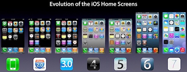
Evolution of the iPhone & iOS Home Screen
The visual change between iOS 7 and iOS 6 is obviously significant, and this graphic does a great job of showing just how the iOS home screen has evolved over time with the iPhone. Covering versions 1.0 through 7.0 and a time period of 2007 to 2013, it gives an interesting look into how things have changed in the past and how they are changing now:
Click here or on the image above for the full sized image
When set alongside each other like this the newest changes with 7 look less drastic, but certainly much brighter and more colorful than before. In some ways the iOS 7 home screen has more commonality with the original 1.0 through 3.0 releases than the more recent 4, 5, and 6 builds, at least in flatness and the Dock design. If you want to get a preview of what 7.0 will look like on your iPhone or iPod touch, load these iOS 7 preview videos and screen shots on your iOS device, they do a fairly good job of what to expect, at least with what we’re seeing in beta 1 and what is visible through Apple’s initial marketing materials.
Heads up to @applespotlight for retweeting this find


Why is there cydia on IOS 6?????