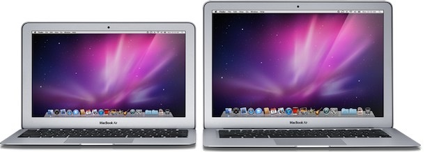
Why didn’t the new MacBook Air get a black screen bezel?

The black screen bezel is featured on MacBook Pro, iMac, iPad, iPhone, iPod touch, Apple’s Cinema Display, nearly the whole Apple lineup. It’s a prominent and attractive feature that makes a Mac even more identifiable in the wild. Why didn’t the MacBook Air get this distinct trait that has become a staple of Apple products?
One word: weight.
The MacBook Air needed to be light, but the black bezel is tied to a glass screen. If you’ve ever picked up glass, you’ll know that glass has weight to it. In the end it must have proven to be just too heavy to include in the MacBook Air given its strict weight requirements. The MacBook Air is the ballerina of Apple’s lineup, it has to be svelte. Just like there are weight limits in ballet, there are weight limits for the MacBook Air. Sorry black bezel, you’re beautiful but you had to go.
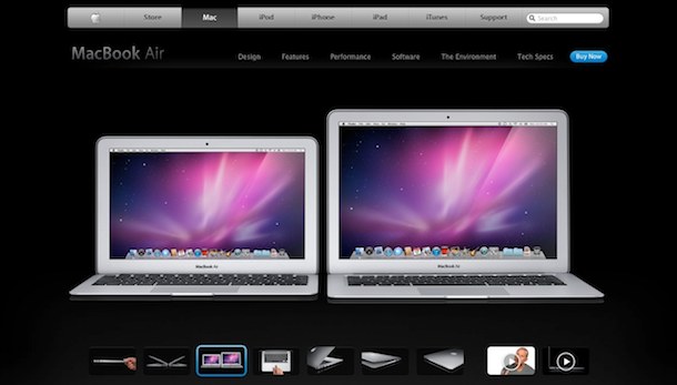
Of course there is some irony here. Apple knows black is a complimentary color, so what’d they do? Instead of using black to complement the actual screen of the MacBook Air, they used black to complement the entire product on the MacBook Air product page.

See that? It doesn’t cost any weight to have a black webpage background.
And there you have it.


If the MBA had the black bezel glass screen, why would anyone want to buy the MBP? Apple was smart; they had to create some demand for both products instead of just one.
Apple should give US the choice! I have a MBA, but the fact that it doesn’t have a glass screen easy to wipe is stupid!
No one would have pointed and laughed if glass were as heavy as lead or the air were a few hairs thicker. This is absurd.
I’m pretty sure there’s this stuff called “paint” that can change the color of almost anything. This “paint” invention, remarkably, has no requirement of glass in order to work.
What I’m saying is:
Paint the bezel black!! It would look so much better.
Just look at the MacBook, it has a white bezel. They could have made this one black but I think the gray looks better.
This page from Marco Arment:
http://www.marco.org/1361316116
says that the screen is plastic, and that’s where the real weight savings is coming from.
I struggle to believe this.
The black looks like it is reverse printed to the glass. How could the weight of the black ink possibly increase the weight compared to grey/silver ink?
It is more likely a marketing decision.
the screen on the new air isn’t glass, it’s plastic like the plastic macbook. significant weight savings but it feels/looks cheap.
To be more specific: The bezel of my 15″ MBP is the same in appearance as the MB Air pics above. Perhaps this is something Apple only does on high res screens now?
This is unique to the anti-glare/gloss-free screens, both the 17″ and 15″ have this when you order them without the glass screen, which also requires the high-res option.
I think the black bezel makes images on screen look sharper and it’s less distracting, but the glass makes it hard to work outside (iPad and iPhone have same problem).
I have a 15″ MBP that I bought a month ago. I got the high resolution 1680×1050 screen upgrade without a glossy finish.
The first thing I noticed when it showed up is that my new MBP has a brushed metal bezel with a black rubber lip around the edge to prevent keyboard/screen contact when closed.
Frankly I prefer the look of the silver screen bezel. Sets it apart from most of the other MBP’s I see around.
it would have added some thickness too
black looks so much better, it is sad :(
“given it’s strict weight requirements”???
it’s with an apostrophe = it is.
If you don’t believe me, look it up in the dictionary.
xsa, thanks for pointing that out.
Paul
“Its” is possessive, like “his” or “hers”.
“It’s” with apostrophe is the contraction of “it is”.
The article is correct.
Pretty sure they already corrected the mistake, so of course the article is correct.