Mac Setups: Apple Mice
Jan 15, 2011 - 4 Comments

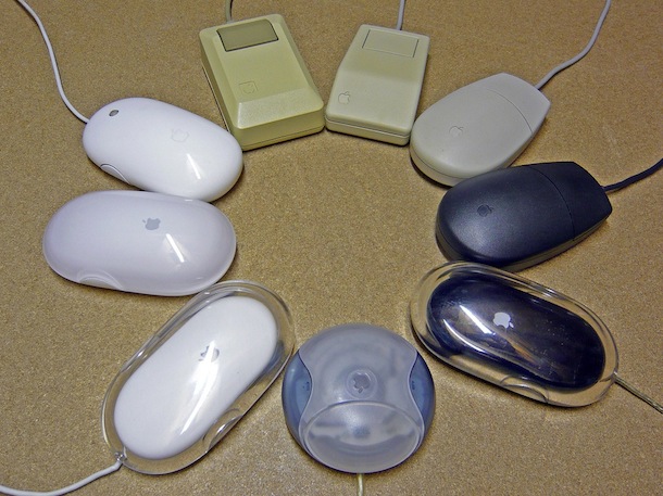
I just came across this picture on Flickr and I think it’s a cool tribute to all the years of the Apple mouse. It’s missing the latest creations like the Magic Trackpad and the Magic Mouse![]() but it still shows the evolution of hardware pretty well. Great picture!
but it still shows the evolution of hardware pretty well. Great picture!


I liked the original Mac mouse (beige, just before the 12 o’clock position) and the ADB II (white and black, at 2 and 3 o’clock). Enough has been written about the problems of the hockey puck mouse (6 o’clock) I won’t add more. The Pro Mouse I wasn’t too found of the feel, and the cords were fragile – I replaced a bunch of them at client sites where they lost connectivity. When they failed, I would perform a tailectomy – hold the mouse in one hand, the cord in the other and yank – so that the defective mouse was now obviously broken, and no one would try to use it again and wonder why it didn’t work.t
If the square original mice were two button they would be great. The hockey puck was a terrible mouse, no idea why Apple released that one.
Magic Mouse is a good concept but it’s too sensitive to touch, I constantly was activating things I didn’t want. I ended up just going back to a two button logitech with a simple scrollwheel. As Apple well knows, sometimes simple is better.
Actually, I think Apple has made the best mice in the world from a technical standpoint – they’re always the most accurate tracking, etc. But from a usability standpoint, yeah, they’ve always sucked.
The Magic Mouse is friggin horrible, second only to the hockey puck mouse, IMO.
I’ve said it before, and I’ll say it again. Steve Jobs hates mice. For a system based on GUI, Apple has always had crappy mice. The hockey puck was the absolute worst design in the history of personal computing. The lucite was cool looking, but if you had to do a lot of precise movement, the weight produced carpal agony.