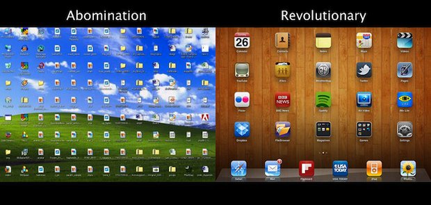
Windows vs iOS

Remember when seeing a Windows desktop cluttered with icons was a bad thing? Well, don’t look at your iPhone or iPad, because we have icons all over our desktops now too.
Obviously this is a joke and there’s a huge difference in usability between the two, but there’s a funny element of truth to this picture as well. Besides, we pick on Apple’s competitors often enough over here, and sometimes it’s only fair to pick on Apple too.
Heads up to @joshuaschnell for finding this image.


This is…dumb.
I’ve seen just as many idiot Mac users putting icons all over their desktops as I ever did Windows users. Maybe more of them. The “desktop” as a UI metaphor was dead decades ago, and lingers on only because people keep insisting on it. I don’t remember the last time I used my desktop for ANYTHING, on either of my macs, or my PC. It’s a pointless space for the desktop…and it’s only marginally better on my iPad.
Windows desktops are usually cluttered because if the average PC user put the file anywhere else, they’d never find it again.
That said, I’m withholding judgement on Launch Pad until I see how it is actually implemented in Lion. I agree with some other comments on keeping my desktop as clear as possible, and using Spotlight to launch apps, but I also like the app switcher that can be invoked with command-tab and if Launch Pad works like that it might be handy – especially if one can group apps and bring up a specific group easily.
I think it will be used but i don’t like it that much… cause i don’t want people to see what tools i’m using…
i have my dock very small always… and launch most things with spotlight…
i have great wallpapers and don’t want logos over it.. thats why my desktop is clean.
I understand the layout for something simple like a phone, but I have no intention on having something like that on my mac desktop.
Spotlight is amazing for launching applications, I am not sure why you would want the clutter.
True…but thats why you have folders…not all people who use Windows are a total wreak like that.
that’s exactly what i think every time i see the iOS screen. i can’t touch an iphone without going into convulsions remembering the horror of windows ’97 desktops of the old days.
the more OSX starts looking like iOS the worst it’ll be, in my opinion. i’m afraid for Lion, and what’s sure to come after…
One is a desktop OS controlled by a mouse, the other is a touch controlled portable device OS. Your argument would have merit if OS X looked like that, but it doesn’t.
Yeah, if the rumor is true that the new MacOSX is going to be like this (resembling the iOS desktop), I’m not thrilled. Hopefully, it will be optional. I still hate desktop clutter and see no point in having apps on your desktop when they are covered by open windows anyway.
lol this is funny because this is true
jst mv all the XP icons into a folder .. choose not to display certain Desktop icons .. clutter problem solved .. hahahaha .. big love Xx
One is by design and the other is by user failure due to poor design, there’s a big difference
“Obviously this is a joke and there’s a huge difference in usability between the two, but there’s a funny element of truth to this picture as well.”
It’s a humorous observation, but congratulations on missing the point.
P.S.
it’s a computer, not a religion.