Set Dashboard to Transparently Hover Over the Desktop in Mac OS X

Don’t use Dashboard often or maybe you don’t like Dashboard much in Mac OS X? It’s a great feature but it’s often underutilized, and if changing Dashboards background wallpaper wasn’t sufficient enough for you to start using it again, you can always return Dashboard behavior to the standard transparent hovering state that existed prior to OS X 10.7 (and 10.8 or 10.9 for that matter). This overlay ability makes the feature a lot more useful to many users since it’s quickly accessed and comes and goes on the screen when needed.
The end result of this change pulls Dashboard widgets out of their own dedicated Space in Mission Control, and instead shows widgets directly over the desktop and applications, just like it did in earlier versions of Mac OS X.
How to Set Dashboard as a Widget Overlay on Mac
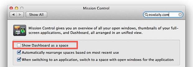
Letting Dashboard widgets overlay on the Mac OS X screen is a very quick settings change to make, though it’s not labeled that well. Here’s what you’ll want to do:
- Open System Preferences from the Apple menu
- Click on “Mission Control”
- Next to “Dashboard” choose “As Overlay”, or in prior versions of Mac OS uncheck “Show Dashboard as a space”
Now you’ll have to hit the good old F12 button to show the Dashboard instead of swiping left to the containing space with your trackpad. Note that some Mac keyboards may require the use of FN+F12 to activate the Dashboard, or you can just use the Keyboard control panel to set or customize a unique keystroke or Function key combo to summon the Dashboard.
This adjustment is also a great change for users who don’t have a trackpad or Magic Mouse, where swiping and gestures have no roll in their workflow anyway.
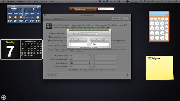
So what does the difference look like? Well, if you already forgot what Dashboard was like in Mac OS X 10.6, this is what it will look like. The difference is that widgets hover over the active screen with a transparent layer:

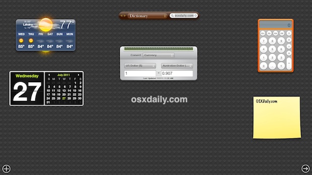
Compare that to the new default Dashboard behavior starting with OS X Lion, Mountain Lion, and continuing through beyond OS X Mavericks, where the Dashboard is a dedicated Space within Mission Control, interspersed with full-screen apps and virtual desktops:

What you use is going to be a matter of preference, but for many users having the Dashboard overlay the active desktop is a much more convenient solution.


Thank you for this. I can now go back to using the calculator while looking at the page I was on. Very helpful!
[…] them more to the forefront of your desktop experience. This is different from making Dashboard hover over everything again, because this actually liberates the widgets out of Dashboard turning them into movable […]
[…] you find yourself not using Dashboard much anymore, try taking it out of Spaces and make it hover over the desktop again, this simple setting adjustment takes Dashboard back to its roots and lets you access it quickly […]
Anyone know if there’s a way to make the Dashboard appear using a Trackpad swipe? I know you can do option-command-second mouse button, but a downward four-finger swipe, say, would be more convenient.
Not natively but you can use a free app called “BetterTouchTool”, which you can use to set custom swipes easily. Is a must-have if you use the trackpad a lot.
Yay! I set my widgets back to having a transparent background as instructed above (system preferences…mission control…uncheck “Show Dashboard as a space”.) I much prefer the transparent background because that way I can see things on the desktop when I’m using either the calculator or the translation widget — two things I use almost daily while looking at things on the desktop. Thank you!!!
THANK YOU SOOOOO MUCH FOR THIS INFORMATION. THAT MAKES ME FEEL BETTER ABOUT LION. I HATED USING DASHBOARD AS A “SPACE” AND NOW IT IS BACK TO ITS “NORMAL STATE”
I am much happier now. Why can’t APPLE let people know about things like this? Maybe they do, but I could not find it anywhere. I learned about this via the IOMUG apple user group
I agree completely it was driving me nuts and it kept switching screens on me. I am much happier with it back to the old way! Thanks! Maybe Apple should ask regular users before changing things like this!
I have pulled some widgets out of the dashboard, onto the desktop, but now… since we can have more desktops… is there a way to show them on ALL desktops?
oh, got it… after extracting one, you can go back to Dashboard and add another instance of the same widget, by clicking the “+” sign, which can then be placed on another desktop…:-)
Thanks for the tip…Missed the old Dashboard.
well, this leads to the conclusion that Leopard can predict the weather 3 months from now and Lion only the weather in the past ;-)
I use Dashboard more now that it’s a separate Space than when it was a function key
I like the idea of widgets, and dashboard. The deal breaker for me is the resources, cpu and memory that are consumed.