Create a Sorted Applications Launcher & App Menu for the Mac OS X Dock

If you keep the Applications folder in the OS X Dock for quick app launching you’ve probably noticed it’s just a giant list of all the apps installed. Sure you can change the display to use a grid, list, or fan, but if you have a lot of apps you’ll still end up with a humungous unsorted launcher with a lot of apps you probably don’t want in there.
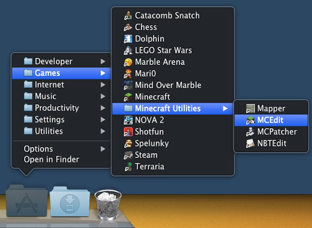
Here’s an easy way to get around those limitations and annoyances by creating a separate app launcher for the Dock that is sorted by defined categories, featuring only the applications you want. This is perfect for anyone with large amounts of apps installed who likes to keep things organized.
- First things first, pull the existing Applications folder out of the Dock
- Now create a new folder, preferably somewhere in the users Home directory like ~/Documents/ and name it “Applications”
- Within the newly created Applications folder, create subfolders for app categories, like “Productivity”, “Games”, “Music”, etc
- Open the primary Applications folder in a new window (Command+N followed by Command+Shift+A), and then drag and drop apps from the primary Applications directory to the respective categories folders you just created – in OS X 10.7 and 10.8 this automatically creates aliases rather than moving the app out of the Application folder, earlier versions of OS X will want to manually create aliases with Command+L
- Repeat until you are satisfied with the sorting, and then drag the sorted Applications alias directory to the OS X Dock
- Right-click on the new Applications folder and choose “List” as the view type
- Click to use the newly sorted and well organized Mac app launcher
You may want to remove the “alias” reference from each app name, or rename them as you see fit in general. Additionally you can complete the overhaul by copying the primary Applications folder icon to the sorted folder of aliases, this gives the appearance of it being the normal Application directory.
If you keep the Dock hidden by default don’t forget to remove the hide and show delays for much quicker Dock access too, it makes menus like these even more useful by rapidly speeding up their accessibility.
Thanks for sending in the great tip Jay!


I’m fascinated how Mac people truly deeply care about not looking like Windows. This religious component keeps amazing me. Computer is a tool to do the work, guys, it’s not a way to show the girls how “different” you are. If you’re unsure your identity, there are better ways to resolve that than getting a Mac and “being different”. Do you realize how SAME you are to all other Mac users? I see nothing “different” in that. Mac users are 10x more “same” than Windows users, because you can customize your copy of Windows much more, and be much more “different”. You’re funny, boys. SIDENOTE: I don’t care as long as the OS does the job. Currently I’m on a Mac because I got it half the price and it’s a strong machine. Next one? Whatever serves the purpose.
Because I’m using this method for long time, I already wrote little helper app, that simplify process of creating and maintaining of the folder, maybe somebody could use it too:
http://jirsoft.eu/EN/Goodies/files/AppFolderCreator.php
Advantage is:
1. it can create symbolic links instead of aliases (try to compare size of folder full of aliases vs. symlinks!)
2. remember user settings, easy to add some app later
3. printing of lists
I did this a while ago, but instead of having one folder like Windows, I made a folder for each of the main apps i use. For example: web, design (adobe and skitch), media (spotify, vlc), general (parallels, transmission). looks pretty sweet with custom icons.
Wow. Who cares if this feature resembles something in Windows. You guys really care THAT much? Are you too good for anything that resembles Windows? I use OSX and enjoy it a lot but I’m not going to ever be a snob about it. If Windows has a setting or a feature that would be useful to have in OSX in it too than by all means. In fact, I could think of a lot of things I do miss from Windows that I wish were in OSX.
Get over yourselves.
i am not interested in even going to the folder. cmd+space bar. first there letters of the app. forget about it.
i never want my mac to look like windows. that would be dumb.
spotlight is king and visuals are everything.
“7 steps to turn OS X into Windows 95”
I prefer Spotlight to launch an app or anything on my MAC. Just hit cmd+space and type in the first few letters of the app and you’re done !
I love OS X, but this is too much like a Start menu…
Customized, folder based, heirarchical Application menus were the norm with OS X pre-Lion :P Just change to grid (fan doesn’t work nice)!
yes, way to go, turn osx to windoze!
Thanks for posting my tip! A little hint if you prefer this to Launchpad: backup the .app (I put my Applications in ~/user/apps/, and app backups are there too), then run:
sudo rm -r Launchpad.app
If you want it back, drag it! This is nice for Snow Leopard pros who hate iOS sorting and prefer categorization.
And please, if you want to help me out and get more tips, visit tehninjah.tumblr.com!