8 Great MacOS Mojave Features You’ll Actually Use
MacOS Mojave is one of the more exciting MacOS system software releases in quite some time, with many new interesting features and capabilities tucked throughout the new release.
Some of those new features are more interesting and or useful than others however, so we’re going to focus on a handful of new features in macOS Mojave that you’re most likely to actually use and appreciate.
Obviously you’ll need macOS Mojave to enjoy these new features on a Mac, if you haven’t done so yet you can prepare for and install MacOS Mojave or go ahead and download macOS Mojave now to update to the latest MacOS version.
1: Dark Mode
Dark Mode is perhaps the biggest obvious pull for many users to update to macOS Mojave, and it’s also the most prominent new feature available to MacOS Mojave. Much as the name implies, Dark Mode turns all user interface elements away from the bright white and gray default to a deeper dark interface scheme, which not only looks great but for some users it may even offer a less distracting visual environment to work in.
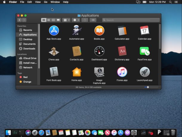
Users can switch between the two interface themes at anytime by going to the “General” system preference panel and selecting either Light or Dark mode.
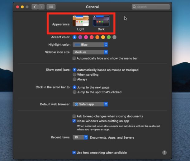
If you’re on macOS Mojave, you absolutely must try out Dark Mode, it’s visually interesting and maybe you’ll find yourself even more productive when using it! And if it’s not your cup of tea, no sweat you can switch back to Light Mode through the General preference panel in System Preferences.
2: Desktop Stacks
Desktop Stacks aim to clean up a messy desktop by placing all desktop files into organized ‘stacks’ that can be clicked on to access more of that file type (you can also choose to arrange Stacks by various date settings and tag, though Kind is probably the most useful for most people).
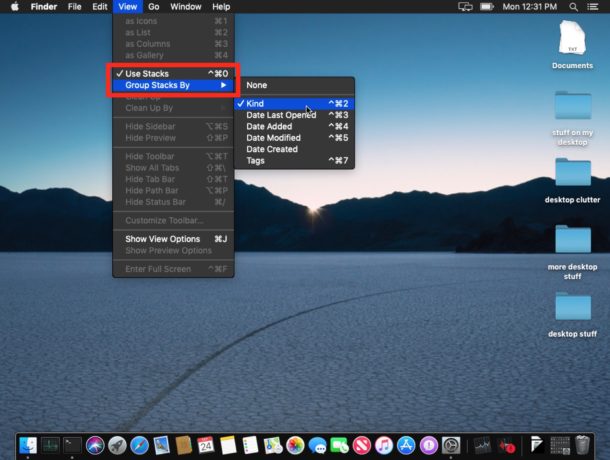
If you have a cluttered Desktop then Desktop Stacks is a great feature, particularly if you’ve gotten to the point of simply disabling and hiding the Desktop on a Mac to manage the desktop file mess. Now there’s no need, simply enable and use Desktop Stacks and your desktop will appear much tidier with minimal effort.
To enable Desktop Stacks, go to the Mac desktop then pull down the “View” menu and choose “Use Stacks”. You can also change how Stacks are sorted from the View menu by adjusting the ‘Group Stacks’ setting.
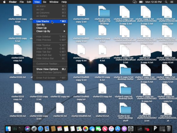
Once Stacks are enabled, you can click on the file type Stack (or however you sorted them) to reveal all of the files contained within.
3: Finder Quick Actions
Finder Quick Actions allow you to perform simple tasks like joining multiple files or images into a single PDF, or rotate a picture, directly from the Finder.
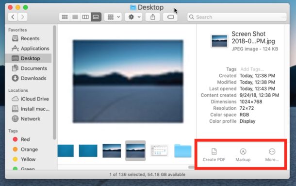
This is a great feature for power users and regular users alike, since you’ll no longer have to open Preview app to perform simple tasks like this.
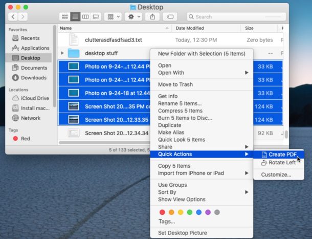
Quick Actions can be accessed from the Finder Preview pane, or from the right-click contextual menu.
4: Finder Preview Panel Shows Metadata
The updated Finder Preview panel now reveals additional helpful information, including metadata about files and images.
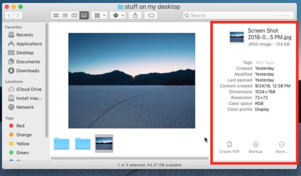
The new Preview panel can be accessed in Column and Gallery view, then simply clicking on an image or file will show the preview options.
If for some reason Preview is not visible (or maybe you want to disable it) you can show it (or hide) through the View menu by selecting “Show Preview”.
5: Quick Look Markup
Quick Look has been around for a long time on the Mac, and now it’s more useful than ever thanks to built-in Markup tools. You’ll see the Markup tools available right at the top of a Quick Look window:
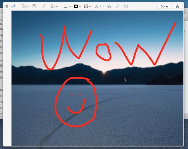
Having Markup in Quick Look means you can quickly add text, shapes, arrows, highlights, crops, signatures, and other simple image adjustments without ever leaving a Quick Look window.
6: Continuity Camera Captures Images from iOS to Mac Instantly
If you are a Mac user with an iPhone or an iPad (updated to iOS 12 or later) then you’ll have access to a great feature set that allows you to quickly import an image or scan to the Mac from an iPhone or iPad, by using the iOS devices camera.
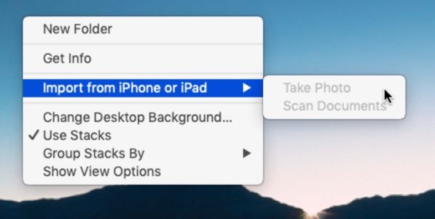
In the Finder simply right-click on the desktop or in a folder of the Mac Finder, and choose “Import from iPhone or iPad” then select either Take Photo or Scan Documents. You can also access the Continuity Camera feature from apps like Pages and Keynote via the File menu. Then you’re able to use the camera on the iOS device to quickly snap a picture or scan of something that will immediately appear on the Mac.
7: Privacy Controls for Microphone, Camera, Location, etc
Have you ever wanted to know exactly which Mac apps have access to things like your location, contacts, calendars, reminders, Photos, Camera, Microphone, full disk access, and more? MacOS Mojave makes this easier than ever before, making the latest MacOS release particularly nice for the privacy conscious.
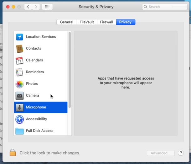
Go to System Preferences > Security & Privacy > Privacy to see and control which apps have access to these features of your Mac and more.
8: New Screenshot Tools & Keystroke
Taking a screenshot on the Mac has always been a fairly simple affair of pressing Command + Shift + 3 for a full screen capture, or Command + Shift + 4 for a single window screen capture. Those tricks still work in Mojave, but now MacOS has a new keyboard shortcut which will bring up a little screen shot capture utility with a full range of capabilities, including taking complete screenshots, partial screenshots, capturing windows or apps, and even screen recording tools.
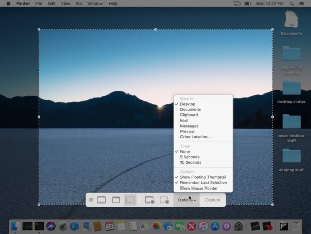
Hit Command + Shift + 5 to bring up the new screenshot tools in MacOS Mojave. Screen recording and capturing has never been easier on the Mac.
–
Do you have any favorite features in MacOS Mojave? Share them with us in the comments!


I hate 2 factor, and it won’t let you take a shot from the phone without it. No deal.
Been plinking away on the new features and changes, testing if and what to prepare to support when we switch our company Mac’s to Mojave.
So much whining here….
the OS is stable, Stacks is useful for users with a ton of stray files loose all around their multiple desktops, and overall its a nice tweak to High Sierra. Nothing revolutionary, but Apple still is flirting with breaking the rule of “if it ain’t broke, don’t fix it”.
Seems that an update to Chrome’s UX forced its way in along with Mojave.
VPN, anti-virus, and security programs all work fine as before.
Seems there’s enough bells and whistles that at least one of them will grab a retail user by the family jewels enough, and Safari’s vulnerabilities have been cleaned up a bit. Also the option key options on Safari’s menu bar.
Been with Mac’s since January 1984, seen a lot come and go, and this update is ready for prime time in a corporate setting. If you buy a new Mac or its forced on you through an autoupdate, enjoy, its fine.
So far so good in Mojave. I am a professional photographer so metadata and quick actions in the finder window are a huge plus. And desktop stacks are great for a quick cleanup. I’m hoping dark mode saves my eyes some from some fatigue. All my Adobe CC apps seem to be working fine which was my biggest concern.
i’ll give Dark Mode a try but give that literally every other white text on a black backdrop UI i’ve ever used causes eyestrain to the point of being painful (my vision starts to swim and my eyes ache. then the migraine begins.) i’m not holding my breath regarding its utility to me. it’s great they added it as an option for everyone else who’s been clamoring for it, though!
I am not going to challenge the merits of the new features, I prefer to test them first… however if you think pressing all those buttons to take a simple screenshot is a “simple affair” you’ve never tried taking one on a Linux distro, like Ubuntu or similar.
You press one key (Print Screen) which is there for that exact reason, and boom. A simple window appears asking you where you want to save. It has been like that for years.
Personally, I find it ridiculous that an OS which is overall quite easy to use includes nonsense commands for screenshots.
Or like the program Greenshot for Windows. User hits Print Screen – dragger shows up, and you can save or open in the built in editor, add squares or arrows, etc…
WOW. There are a lot of whiney crybabies posting garbage.
And there are a lot people bringing up legitimate concerns about Apple’s software reliability. I think a lot of what you hear are real frustrations people have with Apple’s increasingly questionable software quality. People pay a lot of money for Apple devices and expect a certain level of quality for paying that price…and they rightly complain when that isn’t being met. If you want people to just sing praises and not have an opinion, maybe North Korea would be more to your liking.
If they REALLY want to make an improvement, the millennial behind-wipes at Apple should bring iDVD back. Jerks.
and yet, moderators allow an ignorant comment like this. what gives? this guy is like a flat-earther or anti-vaxxer of the tech world.
Or maybe he really likes iDVD and wishes it would make a comeback? To each their own!
Guess OSXDaily doesn’t allow links from their competition.
In regard to how Mojave handles deleting data, the default bypasses the trash and immediately and permanently deletes any file you the user deletes. HOW STUPID IS THIS!!!!!
I tried to link an article that showed how to with a terminal command fix this so deleted files and folders go to the trash, but OSXDaily would’t post it so here is the terminal commands:
Launch Application > Terminal.
At the command prompt type (or, preferably, copy and paste):
sudo rm -ri ~/.Trash
Press return.
You should first be prompted for your account’s password; enter it, and press return.
You should next be prompted to remove any files and folders in the .Trash folder, followed by the .Trash folder itself. Type yes and return at each prompt. (This is a great place to notice if you’ve entered anything incorrectly above, too, and to press Control-C to halt the removal if you have.)
Log out of your OS X account ( > Log Out [user name], which closes all programs) and log back in. The problem should be solved, as OS X will create a new .Trash folder with the correct permissions.
I have used this on 3 macs so far and it works great, changing the idiotic bypass of the trash and all data deleted now goes to the trash as it should.
Hopefully OSXDaily will publish this.
Your comment and the link is fine, but it was held for manual review before posting because of the inclusion of a link.
For future reference, any comments containing any links (to any domain), or certain keywords, are automatically flagged for manual review while others are deleted automatically in an effort to prevent spam and abuse.
We get quite literally thousands of comments every day, many of which are spam or abusive or trolling, so auto-flagging based on these rules helps the moderation process.
Yet another idiotic “feature” in Mojave is how trash is handled. Apple engineers must think we are all idiots who never empty our trash, or never accidentally delete the wrong file or folder.
Default deleting of anything immediately deletes, bypassing the trash. In order to keep your trash working as it should, catching all deleted files and folders, requires changing the terminal command for this, how utterly stupid of Apple.
Anyway for those who, like me want their trash to stay being the trash, here’s an article that will give you the terminal command to do so:
https://www.macworld.com/article/3054001/macs/how-to-stop-os-x-from-deleting-trashed-files-immediately.html
Works great, and stops immediate permanent deletion of files and folders, sending them to the trash as should happen.
I did a clean install of Mojave and everything I delete is going to Trash and is not deleted immediately.
Don’t understand what’s happening there, this doesn’t happen to me after I installed macOS Mojave.
Upgraded on my i7 Mac book pro last night and have had nothing but problems. 1st, my 2nd monitor is totally inactive, 2. I have to disconnect my fire wire / ports to get the system to even load 3rd, my “magic” keyboard won’t connect 4. I have no sound whatsoever. 5. It completely wiped out my time machine files.
I’d say their beta testing was hurried and not well vetted at all. I should have waited for a later version to fix some of these basic items. I’d go back to the old operating system if I could.
CMD SHIFT 5 will not record the system audio !!! Is this intended?
You’re right – in Dark Mode, the dock stands out like a searchlight!
Nice save!
You’re right – in Dark Mode, the dick stands out like a searchlight!
That’s what my girlfriend says!
Dark Mode is new? I don’t think so. It goes at least back to El Capitan.
It looks like I’ll be using Finder Quick Actions, but not much else.
Dark mode across apps is new. Dark dock and menu bar date back to Yosemite though.
How to Get dark Dock?
Nice write up, thanks.
The real question for me is what will I have to give up?
Every OSX migration to date has cost me at least one frequently used feature. Hi Sierra? Suddenly my LaCie TB3 raid drive just wouldn’t boot, bam and of course had no issues with Sierra or Yosemite before that. I could turn it on after the mac booted and it would mount but not during the boot sequence. Nice.
In fairness I did wait until 10.13.2 before “upgrading” but to no avail. I was forced to connect via the slower but adequate USB 3 interface to get the drive to work.
I will wait as long as possible now before “upgrading” to this release, the eye candy is not worth the pain.
Interesting new features and they look fun, but not enough to risk the potential downtime for upgrading. I have to work in a reliable environment, I can not afford an hour of a non-functional computer let alone a day or two of twiddling to fix issues.
I am writing this comment from El Capitan 10.11.6, it is stable and works pretty good. It’s not as well-performing as my Mavericks machine, or my old Snow Leopard MacBook Pro which still runs like a dream, but all in all pretty good. I’m stunned by the resource bloom that occurred post Yosemite probably to accommodate the windowing chrome and glitter, it really squeezes the system resources.
I must say reading the comments here and on every other Apple website and forums, the attitude towards Apple has changed recently and people are sour on the updates, loss of performance, bloat, bad hardware, bad keyboards, etc etc etc it is really a shift that is being felt that Apple must correct! What used to be a lot of positive sentiment is now pretty hesitant or even negative!
I think most of us would all rather be giving praise and enjoying a fun user experience, but Apple has fumbled often the past few years …now, we’re all just paying a premium for mediocre performance & stale ideas propped up by marketing platitudes.
lol you “can’t afford an hour of downtime” yet you have the time to be ” reading the comments here and on every other Apple website and forums”.
I see!
Wife is professional photographer. Obviously, I don’t want iCloud for photos. Apple has decided I have to now, create a new folder to put the photos I want, on my phone. iTunes lets me select the folder, but all the photos don’t appear on the phone. I’m likely doing some thing wrong, but, c’mon already. What used to be user friendly is becoming user useless. Stop telling me what I want and how to do it. Change, I am for, but only if it serves a purpose.
A professional photographer is not able to get her photos to the phone? Heard of google? Or use any of the free apps to transfer photos.
As another pro photographer, I can empathize with Dennis. It’s not that I *can’t* figure out how to get pictures onto my iPhone, it’s just that as Apple does more and more to simplify the process for the average user, it actually makes things harder for those of us who prefer a different workflow– including removing useful features, requiring more confounding steps to make our workflow work, etc. It’s the age-old Apple conundrum for power users. Apple has the best, most stable, and most intuitive OS in the world (IMHO), but they often make things harder for power-users as they try to make things easier for the average user.
1: Dark Mode (Won’t Use)
2: Desktop Stacks (Won’t Use. I keep a clean desktop)
3: Finder Quick Actions (Haven’t found it)
4:Finder Preview Panel Shows Metadata (Haven’t needed it)
5:Quick Look Markup (Haven’t Tried it)
6:Continuity Camera Captures Images from iOS to Mac Instantly (Haven’t tried it yet and probably won’t since my iMac and iPhone are not close to each other when doing photography)
7:Privacy Controls for Microphone, Camera, Location, etc (Need to be extended to peripherals as well like external HD’s or SSD’s)
8:New Screenshot Tools & Keystroke (Have tried these yetr but Shift+Command+3 is still the fastest
I have a perfectly fine MacBook Pro (13-inch, Early 2011) but Apple in all it’s wisdom (greed) decided they couldn’t/wouldn’t make Mojave available to me. So, long story short, I won’t be using any of these stupid features. Bah humbug!
I have a Mac mini (2011) that’s perfectly fine. Really disappointed that Apple isn’t providing any new updates. Especially considering there is still not a new Mac mini.
Try this: http://dosdude1.com/mojave/
it is actually wise – he GPU in your Macbook doesn’t support the Metal API. That’s all there is to it.
Great points, because while Mojave is by far the most “feature rich” new Mac OS X release in YEARS the new features are mostly things that many of us already have solutions for.
I personally am waiting for a later release to update, I let other Mac users who are more adventurous sort it out, then I update at MacOS 10.14.3 or so…. just a guesstimate but could be sooner or later depending on what I find and what I hear. I have read some reports early in forums that dark UI is SLOW and resource hungry? Or something else is making it feel slow?
I also echo the other points made here… but like the new features and tips, look forward to trying them sometime next year.
…agree with your rundown, I really don’t see any utility in these new ‘features’. It seems to me that apple is only interested in forcing users to upgrade to new hardware.
@The Old Coot…..well aren’t you just a bundle of joy…I guess if the name fits…
For an old Mac user from 2007 on I find a lot of the stuff that Apple puts on their OS’s a waste of space and I’ll probably never use but at the same time they start fiddling with apps and thus break other apps that I used, thus I have to look for alternatives to keep the workflow going, so if you find me a little bundle of joy you know why.
Well, my personal opinion is…
1: Dark Mode (Installed macOS Mojave. Went to the Dark Mode and never looked back.)
2: Desktop Stacks (Love how all my images and documents are conveniently stacked up when not in use. Much better minimalistic view, keeps the crap off the messy desktop. I’m using stacks all the time.)
3: Finder Quick Actions (Have customised my own script-actions in Automator. Previously never thought about writing my own scripts, until now. I’m enjoying it.)
4:Finder Preview Panel Shows Metadata (One of the best new features of Finder. I have lots of multimedia so this has been a real help in organising my media collection. I leave Preview panel open all the time now.)
5:Quick Look Markup (Similar comment to above)
6:Continuity Camera Captures Images from iOS to Mac Instantly (Showed this feature to my wife who always found it laborious to take photos and scan receipts on the fly and then load it onto her rMBP and absolutely loves this feature.)
7:Privacy Controls for Microphone, Camera, Location, etc (Not looked at this yet.)
8:New Screenshot Tools & Keystroke (Much better control than before, and now with a helpful GUI tool bar.)
I would go so far as to say that this is the first OS update where I didn’t just look at the new features and think maybe someday I’ll use them, but actually have been using most of the new features in my daily workflow.
Good stuff, it’s nice to see new GOOD features on the Mac!
Now if only there was a GOOD MacBook Pro to enjoy these new features on! I wish we could get the internal specs of 2018 model in a 2015 chasis and keyboard for ports, keys, keyboard, etc…
Other interesting things are the new App Store, Voice Memos, Home, Stocks apps. But honestly the Marzipan apps are not ready for prime time and they worry me about the future of mac…. but that’s another topic :)
I don’t know what Marzipan apps are? Anyway, which apps are not working with Mojave? I would be interested. I have a MacBook Pro 2017 and finally I get accustumed to it and it works like a charme (now that I have all interface cables updated to usb-3 though killing the Magsafe was an error).
All apps that I’m working with are working well, so if you have any hints please share.