MacOS Ventura Unveiled: Features & Screenshots
Apple has announced the next generation MacOS operating system, and they’re calling it MacOS Ventura.
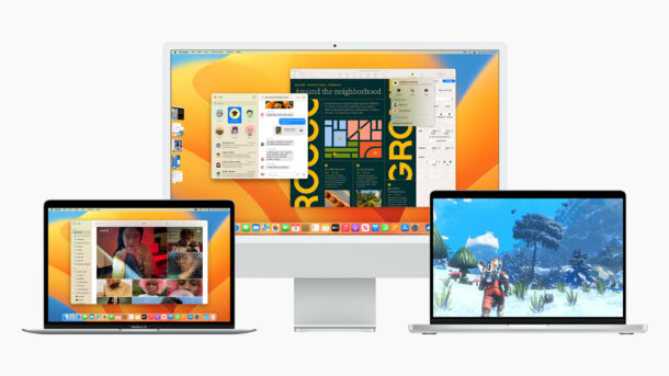
MacOS Ventura includes a variety of new productivity features, refinements, and capabilities that seem to be aimed at remote working.
A new Stage Manager feature makes it easier to switch between apps and windows while staying focused, by grouping windows on the left side of the screen.
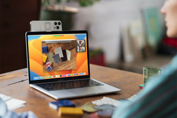
Continuity Camera now allows you to use an iPhone as a webcam on the Mac, including support for iPhone photos features like portrait mode, center stage, and studio lighting. You can also use the iPhone ultra-wide camera to use a feature called Desk View which allows the display of a users desk surface as well as the users face.
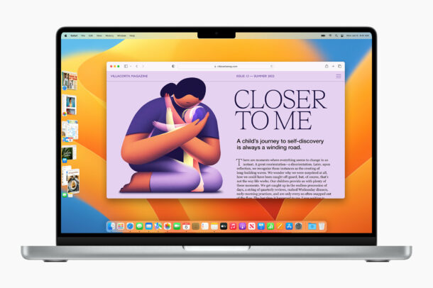
Other new features in macOS Ventura include the ability to handoff FaceTime calls, improvements to Safari, and the ability to share Safari tabs with someone else.
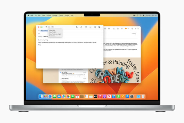
The Mail app also gets some new features, including the ability to schedule emails, and to cancel emails after sending them.
Messages app gains the ability to edit or undo recently sent messages, mark messages as unread, and to recover accidentally deleted messages. These features are also available in Messages app for iOS 16 and iPadOS 16.
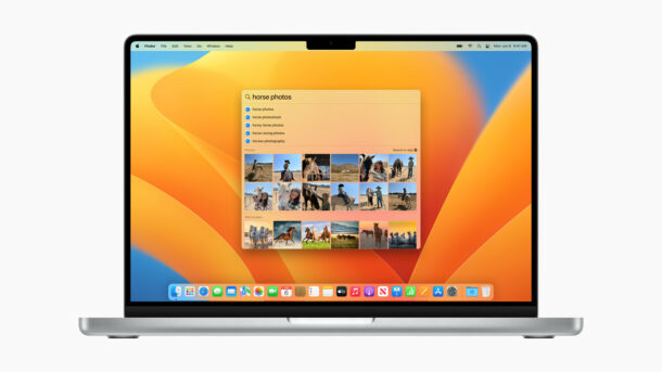
Spotlight in macOS Ventura also gains some new search features including the ability to find photos in your photos album, to search for things across the web, and to search for images by text that is inside the image itself. Spotlight also gains the ability to run tasks directly from Spotlight, like creating new documents, or running shortcuts.
Additionally, macOS System Preferences has been renamed to System Settings and features a redesign to more closely match iOS and iPadOS.
The first beta version of macOS Ventura will become available today on June 6 for developers, and a public beta will be released next month to anyone interested in testing it out.

They didn’t move the ‘+’ for new tab back to where the rest of MacOS put s it. So stupid.
My 0.000000000000002c that is a fortune for others, but meaningless for Apple who hires disciples, not thinkers.
I am looking at a PC flip laptop with stylus, but hard to find one I can spec to 4TB, 32-64GB, etc. Even 2TB is hard. PC makers shoot themselves in both feet not making such options available, and they make so many versions it’s hard to keep track of. Again, bad business choices.
Mac are turning to s***. Have for a long time. Such old UX ideas, pointed out by educated replies from others here. And that f***ing notch. And people still buy this crap.
Move to PC. Get a spec unit, get an Android phone, and give Apple the finger. They are the laziest, meaningless, UI/UX creators I’ve ever seen. Total trash.
How about they give us the ability for the Dock to sit on top of maximised windows rather than have empty space sitting behind it? Auto-hiding it is frustrating, but it’s the only way I can take full advantage of my screen real-estate.
Michael,
I fully agree. It’s good to be on top with technology speed wise. But having to adopt to new features all the time is a pain.
People tend to loose the knowledge and ease of the older command key features which seemed to be good and fast enough for me.
Apple please rethink and make thing’s easer and not more complicated.
Please, and thank you!
I’m disappointed with just about every operating system out there. I’m in my 50’s now and am begging to find it difficult to keep up with changes to how to do things (All over again) on a newer operating system.
If these developers of MacOS were really smart they would start developing the OS to be more ‘user’ friendly, instead of forcing the ‘user’ to learn new and potentially useless items with every OS update. I don’t need 10,000 emojis.
It would be nice to see ‘modes’ in Mac OS.. just like you have ‘safe’ mode or ‘Verbose’ mode, why can’t we have ‘nostalgia’ mode?
I have and always will love snow leopard. Yeah I might be stuck in the past, but I found it very compatible with my uses and my learning curve & work requirements. Now I’m using Mojave on all my Macs except for my M1 Pro which uses Monterey.
The other issue I want to touch on is handicaps. Why can’t I just make terrible websites like appleinsider to stop forcing videos onto my precious (I have DSL.. no HS internet) bandwidth? Would love to see a simple bandwidth ‘handicap’ mode in system preferences… oh wait, its now system settings that would cripple websites abilities to force video downloads on me. Same thing with commercials.
pffft. Make up your mind Apple. Change maybe good, but not for the older among us, if it ain’t broke, don’t fix it!
I agree, floating windows are not for me either. I also enlarge all my windows short of using fullscreen because I also want to have menu bar and dock always available. I guess they try new things hoping they have a winner but it doesn’t really matter, whatever new things I don’t like, I just never use. End of story…
I find this update pretty underwhelming if I’m being honest.
I ditched Safari earlier this year for Edge (and this new Safari still isn’t doing it for me).
Mail is still miles and miles away from Outlook when it comes to email and productivity.
Stage Manager is the only real “new” thing I can see and I struggle to figure out how that’s going to make my experience better? or how I will use it? small icons on the side which give me even less screen real estate? why?…
As someone that has an external screen (ultra wide Samsung) and no webcam, I welcome the idea that I can use my iphone when in Clamshell, that’s an awesome idea 😊
Ventura looks boring as can be, nothing in it interests me
I find it interesting that Apple and its developers continue to believe (in some way) that end-users always use the apps in small, floating windows randomly scattered around their desktops and displays. As a long-time Mac user, I very rarely have small, floating windows…I want my windows to be as large as possible without the ‘fullscreen’ effect that causes the menu bar or dock to disappear. Using Photoshop or any Adobe app (or design app for that matter) in a small window is not very logical (to me at least). I see little use (for me) for the Stage Manager since my windows are near-fullscreen…I’m sure I’m just not the target audience for that feature…but at some point you’d think they’d realize not everyone uses small, floating app windows. (and I KNOW I’m in a minority here…but I have bad eyes as well.) This just seems like another Touch Bar feature that’ll be turned off by a lot of folks. (my two cents…and it’s worth half that).
I agree, floating windows are not for me either. I also enlarge all my windows short of using fullscreen because I also want to have menu bar and dock always available. I guess they try new things hoping they have a winner but it doesn’t really matter, whatever new things I don’t like, I just never use. End of story…