Hide the iPhone X Notch with a Wallpaper Trick

Don’t like the prominent black Notch across the top of the iPhone X screen? You can hide it with a little wallpaper trick.
There isn’t any particular magic to this iPhone X notch hiding trick, it just uses a cropped wallpaper with rounded corners and a black bar across the top so that the Notch section is hidden within a black section of the wallpaper image. This effectively disguises the notch and the prominent “horns” on both sides of the top of the screen.
To hide the iPhone X notch yourself, download and save the wallpaper image, then set the picture as your wallpaper in iOS. You need to pinch to zoom out slightly when setting the wallpaper so that it fits properly.
Keep in mind that Apple could have done this themselves with a wallpaper or by pushing the iOS usable screen space down below the notch, but they specifically didn’t do that, instead they are embracing the notch appearance and notch design with content being pushed under the notch and the clock, cellular signal, wi-fi, and battery indicator sitting along the sides of the notch.
If you do use this wallpaper on your iPhone X home screen or lock screen, it has the effect of making the iPhone X screen look smaller. Personally I think iPhone X looks better in the default state, but if you hate the infamous notch then you can hide it away with the wallpaper, and surely many other similar notch-less wallpapers will appear for iPhone X.
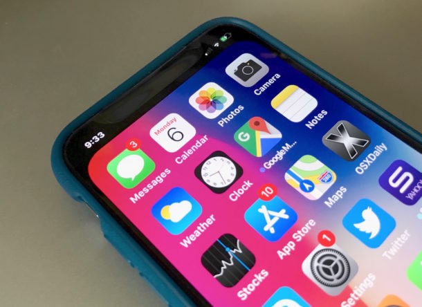
Here’s what the top of iPhone X looks like with the notch hiding wallpaper:

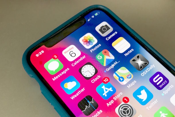
And here’s what the top of iPhone X looks like with the notch visible as usual, the default state:

For those wondering, the large black notch at the top of iPhone X holds the front facing cameras and Face ID detection hardware, but it also hangs down over some screen content on iPhone X and is quite noticeable against white images on the display. I’ve had the iPhone X for a few days now and the notch is consistently one of the first things people have mentioned when seeing the iPhone X for the first time (the notch and the loss of the Home button are thus far the two prominent commentary themes). Whether or not you like the notch is a matter of opinion, but if you don’t like it you can hide it with this wallpaper, and if you do like it, well, no need to change the wallpaper then. And in case you were wondering, if you take a screenshot on iPhone X the notch does not show up in the screen captured image, it fills in automatically.
The wallpaper comes from Twitter user @AHuberman1, thanks to 9to5mac for the discovery.
an #iPhoneX wallpaper I made 2 get #notchless homescreen https://t.co/lXTnNwginr must set 2 still / pinch out & drag down all the way 2 work pic.twitter.com/YVErxKruOc
— Alex (@AHuberman1) November 6, 2017
On a related note, the iPhone X notch (and iPhone in general) is currently the subject of a jabbing new Samsung advertisement for their competing Galaxy phone, which goofs on the iPhone and notch design by showing an individual with a strange notch-like haircut.
Will the notch be a longterm addition to iPhone hardware and iOS device screens? Is it a new defining feature of iPhone appearance, like the Home button was previously? Or is the notch only a temporary solution for iPhone X hardware until some other technology appears that allows the notch camera components to be hidden or disappear entirely? Only time will tell! Anyway.


“Click here to get the Notchless wallpaper image from here”
Brought to you by the department of redundancy department.
Was wondering why Apple released the iPhone 8…
You mean the 7S
Now, how about adding back in battery percentage? It’s gone in iPhone X.
They took the % away? Apple loves to take away any features people like. Sigh.
It’s in the control center. But yes, iOS 11 took away too many things without adding anything of value to me.
Battery percent is gone, worse yet the VPN icon is also gone.
Now the iPhone top looks like a Samsung.
It’s worse!
I actually like that better than the notch, I guess it’s a matter of opinion. I just don’t like that black notch protruding down from the top, it looks like an improvisation. If they couldn’t completely remove the top bezel, they should have left one just big enough to contain the earpiece, camera and sensors; just like what that ‘notchless’ wallpaper simulates.
I think it looks better in the default state too, but some people may not like the notch or find it distracting. To each their own!