How to Disable AMBER Alerts on the iPhone
May 1, 2014 - 29 Comments
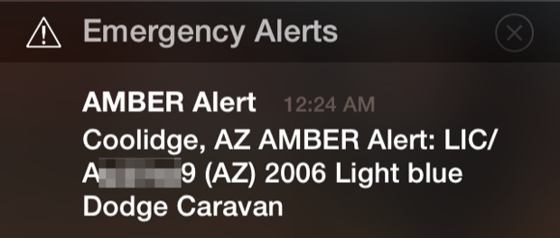
While the concept behind AMBER Alerts is fantastic, being startled by the iPhone belting out an extremely loud and terrifyingly blaring alarm sound in the middle of the night is not exactly a pleasant experience. This can be made even more frustrating for users who don’t know what the alert is for, and exacerbated by the very generous coverage region for an AMBER alert, where you may be hundreds of miles away from the event epicenter and still get the alarm sent to your iPhone anyway. It’s not recommended, but as with other weather and government alerts, iOS offers an option to disable all AMBER Alerts coming to your iPhone.
By Paul Horowitz - iPhone, Tips & Tricks - 29 Comments


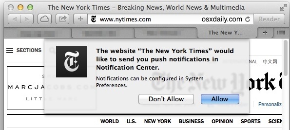
 Push Notifications sent to Safari in Mac OS X are generally thought of as really great or really annoying, depending on user opinion. If you’re in the latter crowd that finds Safari Push Notifications to be a nuisance, you can now set Safari in Mac OS X to never allow websites to ask for permission to send your Mac Push Notification alerts, effectively disabling the nagging feature that pops up a request on some websites. If you’re unfamiliar with what these Safari requests look like, here’s an example push alert request from NYTimes that pops up when visiting the home page: