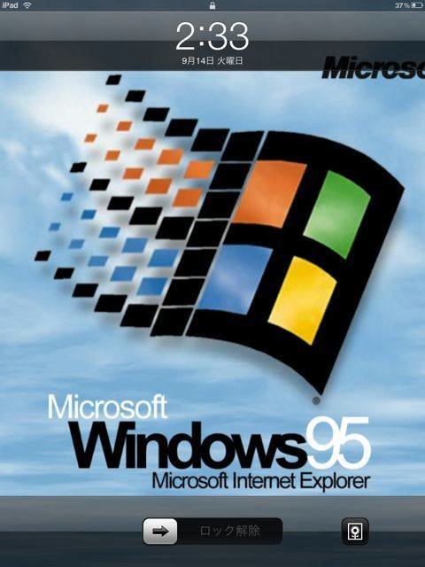
Worst iPad Background Ever

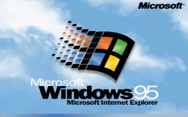
Feeling nostalgic for a horrible crash-prone user experience and ugly GUI? How about putting the Windows 95 boot screen as your iPad background? It won’t make your iPad run Windows 95 (thankfully), but it sure looks dreadful enough.
Now after seeing this amazing piece of artwork I imagine your first inclination is to set this exact image as your iPad wallpaper too, so if you’d like to do that here is a nice beautiful Windows 95 boot screen image for your wallpaper decorating purposes. Just save it to your iOS device (iPhone or iPad, you can decorate either just wonderfully) and then set the picture as your background wallpaper in iOS. Your iPad wallpaper will be the envy of your friends, coworkers, the entire neighborhood…. maybe. No guarantees, but you’ll at least have a Windows 95 picture as your wallpaper and that’s pretty great right? Right??
OK so we’re joking around a bit as we like to do sometimes (everyone needs to have fun, even us geeks like fun too!), but I got a kick out of that picture and anyone who remembers the Windows 95 experience with Internet Explorer probably would get a laugh too.
Now if you’re the serious type, then here’s a really cool iPad background to make up for this goofy one though, or browse through our great wallpaper posts and you’re sure to find something that is nice for your viewing pleasures.


what did windows 95 do to you 😭
Why is it in Japanese
I remember a time when I was delighted to see a Windows95 screen… in 1995, after a year of being forced to use Windows 3.1 at work.
Are you kidding me? This looks better than the iPad! Bill Gates you’ve done it again :D Fantastic! To be fair, they’re basically on the same scale as Windows 95…
its not that ugly =P
Windows 95 was the first system to copy the desktop´s apple way to work. Today are almost the same, because standars.
Actually, Apple was the first to copy when they copied the UI from Zerox (along with the idea of the mouse).
Licensed. Apple licensed Xerox’s UI and paid for it with Apple stock that would be worth a mint today.
It’s gorgeous. Of course Mac users wouldn’t be able to appreciate the irony of the thing and instead be all huffy and offended. Most of them were too stupid to know how to use a computer around the time Win95 was out.
With this little rant, why the h are you on OSX Daily, a MAC-related site in the first place?
So do you have the faintest idea how many people browsing a site called “OS X Daily” are Mac users? Of course you do. That’s why you’re a troll with doo for brains.
[…] up your iPad or Mac with a hilarious blue screen wallpaper, which easily ranks up there with that awful Windows 95 background on the worst wallpaper scale, and rest easy knowing you’ll never have to see that horrible […]
Beautiful
The Win95 background is beautiful–I use it on my tower and iphone!
I love it.
…for the nostalgia. Win 95 was the gateway to my software QA career. The broken-ness of that thing just inspired me.
[…] | OSXDaily […]
Ugly GUI? Could be worse … such as Apple’s offering at the time: http://en.wikipedia.org/wiki/File:Macintosh_System_7.5.3_screenshot.png
Ah, my eyes !, my eyes !
i never seen a better looking ipad than this one!
<3
ehak ohhhh
disgusting :(
[…] przykład mam mapę stref czasowych na świecie (już kiedyś ją pokazywałem). Tymczasem serwis OS X Daily opubliował dzisiaj zrzut ekranu z iPada z najgorszą tapetą zdaniem jego redaktorów. Tapeta jest […]