Revert Mail to the Classic Layout in OS X
![]() Do you miss the way Mail used to look, when you used to be able to see many more email messages all at once from the primary screen without scrolling around? As you probably know, Mail.app received a pretty significant makeover in Mac OS X Lion and that new default layout has stuck around in all versions of OS X ever since Mavericks and Yosemite included.
Do you miss the way Mail used to look, when you used to be able to see many more email messages all at once from the primary screen without scrolling around? As you probably know, Mail.app received a pretty significant makeover in Mac OS X Lion and that new default layout has stuck around in all versions of OS X ever since Mavericks and Yosemite included.
If you’re not a fan of the revised layout of Mail app, you can easily revert back to the classic Mail appearances original UI by doing the following.
- Open Mail app if you haven’t done so yet
- Go to Preferences (from the Mail menu, or hit Command+, to open it instantly)
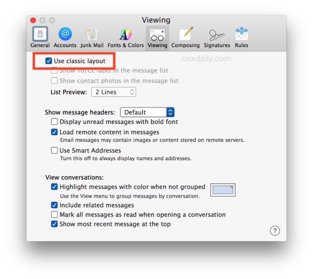
- Click on the “Viewing” tab and choose “Use classic layout” so that it’s checked
The interface change for your mailbox appearance is instant.

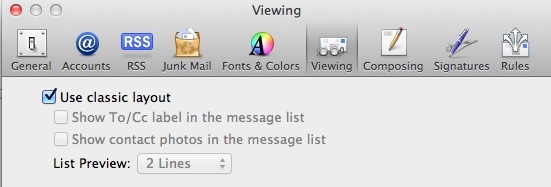
Above is what the setting looks like in modern versions of OS X like 10.10.x onward, and here’s how the setting looks in Mail app for OS X Mavericks, Mountain Lion:

That’s it! The switch is immediate, and you’re back to the way Mail looked in Snow Leopard and before, which keeps the message list on top of the mail message, and also displays about 3x more messages per screen without scrolling around.
That “classic” layout won’t show a message subject preview, but it does still show the sender, the subject, and the time stamp, and if you’re using VIP it will of course point out VIP senders as well.
Thanks to Jim for sending this in!


Thanks a million for this tip! I was despairing of ever having Mail back to the familiar, usable format again.
I’ve been searching for emails to match account entries (tax return…) and it was sooo hard to do with the latest mail setup.
Is there anything to make the classic setup a Mail default? Quit Mail and it reverts back to the new unimproved version so it’s back to preferences. Sorry, I just lazy!
[…] instantly see the difference by toggling this setting. This change became the new default with 10.7 and wasn’t particularly popular with many […]
Yes I prefer classic too. But I also want the mail message to the right. Not at the bottom!
THANK YOU! Oh, I’ve been suffering with the new ‘improved’ interface, and it feels SO good to turn it off.
Thank you!!
Brilliant… I much prefer the old mail interface. However, any way of activating tabs to include the search button?
Thank you! Just saved me from a big headache!
[…] if you don’t like the new interface of Lion Mail.app, you can also easily change back to the classic layout which shows the new mail on top of […]
Nice. All we need now is the same checkbox in Address Book and iCal. And Finder, come to think of it, regarding their silly monochrome icons.
Any idea if there’s a way to get ride of the new window animation? For example, when I hit send, the compose window flies vertically off the screen. Just another one of those frivolous animations that add little.
Type this into the Terminal app, then restart Mail (and any other open app):
defaults write NSGlobalDomain NSAutomaticWindowAnimationsEnabled -bool NO