The Mac “Differentiate without color” Accessibility Setting Explained
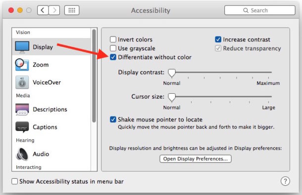
Mac users who have explored the Display Accessibility preference panels, perhaps to disable transparency or to increase visual contrast, have likely seen another setting called “Differentiate without color.” If you have wondered what that setting does or means, you’re certainly not alone, and you may have even toggled it on or off trying to see any difference through Mac OS X.
The best explanation of “Differentiate without color” setting is that it is intended to be helpful for users with visual difficulties or color blindness, and it aims to use shapes to to relay information rather than colors. This is great in theory, but the adjustments offered are not particularly obvious visual changes offered.
You can try this setting yourself on a Mac with a modern Mac OS X version by doing the following:
- Open System Preferences from the Apple menu and choose “Accessibility”
- Go to the Display section, and check the box next to “Differentiate without color”
Checking the setting on (or off) offers no immediately visible changes, but they are tucked throughout Mac OS X if you look hard enough.
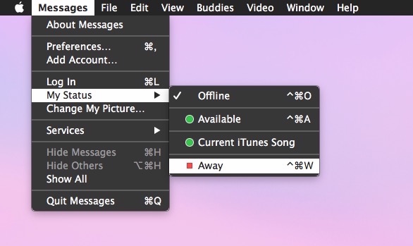
After poking around extensively trying to find what exactly changes, the only thing I could find was a reference to an extraordinarily subtle adjustment to some shapes in the Messages app for status updates. Here it is…
“Differentiate without color” enabled:
“Differentiate without color” disabled (the default):
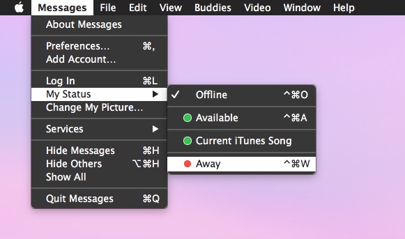
Can you spot the difference? It’s the tiny color shape of the “Away” status option, which switches from a circle to a square when the setting is turned on.
There almost certainly other equally subtle changes throughout Mac OS X when this setting is enabled, but I haven’t been able to find them. If you know of any others, do let us know in the comments.
This is a feature with a lot of potential, either to make options and buttons more obvious (kind of like you can do with iOS with Button Shapes toggle), or to greatly assist users with atypical vision, so let’s hope future versions of Mac system software expand on the idea.

I also noticed on the toggles like to turn on the “differentiate without color”, they get a little hash on or the little circle off. You can visually see the on off logo’s in the settings
I also noticed on the toggles like to turn on the “differentiate without color”, they get a little hash on or the little circle off. You can visually see the on off logo’s
Try an application called “Gamma Control.” Its Gray Balance slider can be used to make grays much blacker. It’s way bettter than trying to use Apple’s contrast adjustment. (It’s meant to be used to color-calibrate screens.)
If Apple is trying to help the visually impaired with different settings, why don’t they have a setting that will allow text to be black instead of gray. I have macular degeneration and have a difficult time reading gray text. I have searched for ways to change the contrast etc but none help.
I usually have to enlarge the print in order to read the smaller prints.
My eyesight is generally fine and I have a hard time reading the gray text, I wish it were black too like it was in Mavericks.
The most we can do on MacOS (Mac OS X) is enable “Contrast” in the Display setting but it looks a little funny and just turns things into a darker gray rather than black. https://osxdaily.com/2014/10/22/increase-contrast-mac-os-x-yosemite/
You may want to try XRevert
I do not have it but the reviews seem pretty good.
XRevert changes the system fonts and icons back to the fonts used in OS X Mavericks
https://sites.google.com/site/appleclubfhs/downloads/xrevert-info
In Preferences the checkbox Increase Contrast in Accessibility makes the tab names and other things, easier to read whereas the Contrast slider kind of flattens everything. Try that. I would to be able to make the Safari Tab Names but haven’t figured out how. Good luck!
I think the lack of obvious differences is down to a more simple explanation – MacOS X already avoids using colour for differentiation in most situations.
Checkboxes, buttons and other standard interface elements rely not on colour but on shape, the presence or absence of an indicator, or dramatic differences in contrast.
In fact I am having a hard time thinking of places where colour is actually used as the only differentiator. Finder tags in icon views are a problem, but the tags have alternate text names, and a file’s tags can be viewed and sorted on if you enable the “Tags” column in column view.
Unless I am missing something, I think Apple has already long since removed most of the elements that caused problems for people with colour deficient vision.
That’s a bit of a miss eh? Thought something was wrong with mine when I toggled it and nothing happened. Turns out nothing happens whether toggled or not! Blimey!
I was hoping if we enabled this feature we would get things like button indicators in the windows like what you see when you mouse hover on the close buttons, and button outlines, darker text. Light grey on lighter grey is hard to see, and I have normal vision.
Low hanging fruit, Apple, come on.